

7 Common DIY Website Design Mistakes to Avoid
DIYing your website? We love that for you!
These days, platforms like Squarespace make it easier than ever to get a beautiful website online yourself, which is especially handy when you’re starting a business and a fully custom website just isn’t in the budget right now.
Maybe you’re starting from scratch, customizing a website template, or somewhere in between. Either way, there are a few really common design mistakes we see on DIY websites that can make an otherwise great site feel a little less polished (or a little harder to use!).
And before we get into it, a very important reminder: Your website does not need to be perfect.
We’re big believers in “done is better than perfect” and getting your website out into the world is much more useful than obsessing over every tiny pixel for the next six months.
That said, there are definitely a few bigger design details that are absolutely worth checking.
So, if you’ve DIYed your website, here are 7 common website design mistakes to look out for, plus some simple ways to fix them.
Let’s dive in!
1. Not Checking Your Mobile Design
We’ve said it approximately one million times around here, but your mobile website is so important.
It’s really easy to spend hours making your desktop site look perfect and then treat mobile as a quick final check before launch. But your mobile layout deserves just as much attention.
Squarespace automatically makes your website responsive, but that doesn’t necessarily mean every section is going to look exactly how you want it to on a smaller screen.
Especially with Fluid Engine, you’ll want to switch into mobile view and take full advantage of the (almost entirely) independent mobile editor. Remember to check things like:
Is all of your text easy to read?
Are your buttons big enough and easy to tap?
Are your images cropping nicely?
Is anything overlapping or falling off the screen?
Does the order of your content still make sense?
Is there any weird or excessive spacing?
Are forms and menus easy to use?
And once you’re finished editing, check the actual website on your phone too. Don’t rely entirely on the editor preview because depending on if you have the latest iPhone or one from a few years ago, screensizes vary too!
Something that looks great on a big screen can feel completely different when you’re holding it in one hand and scrolling with your thumb.
👉 Mobile Optimization: Creating Responsive Squarespace Sites
👉 Hacks to Make Mobile Editing in Squarespace Fluid Engine Faster
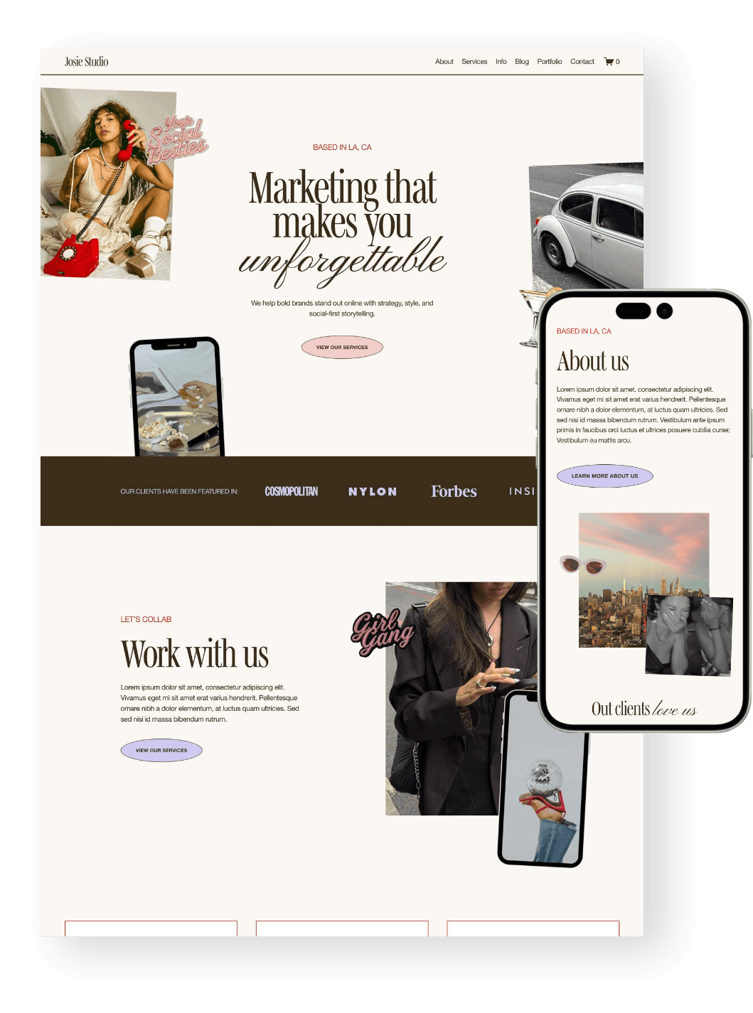
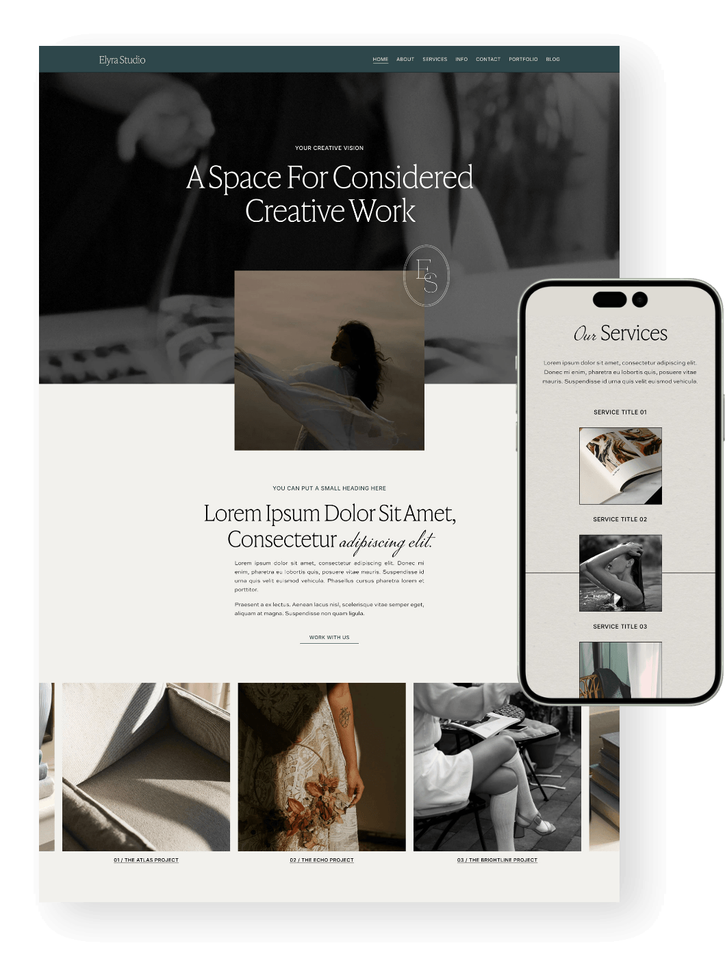
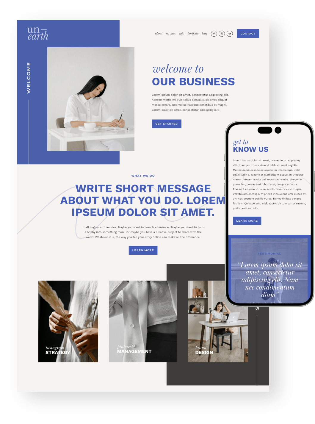
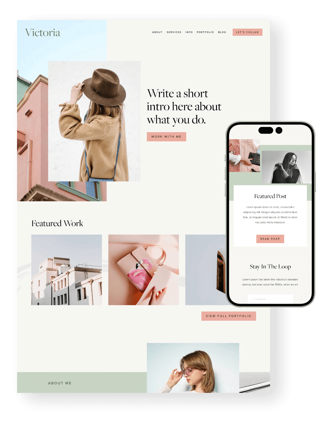
PS- Did you know that all of our website templates are optimized for mobile from the get-go to help save you time? Check out all of our mobile friendly designs below:





2. Using Low-Quality or Unoptimized Images
Images can make such a huge difference to how professional your website feels, but there are two opposite mistakes we see all the time:
Uploading images that are too small and end up blurry or pixelated, or uploading enormous files that look beautiful but make your website unnecessarily slow.
You want the happy middle ground: images that are large enough to look crisp on the screen, but properly resized and compressed before you upload them.
And whatever you do, don’t stretch an image out of proportion to make it fit a space. If something needs a different crop, crop it rather than squishing or stretching it!
A nice, clear image:

A pixelated image:

A stretched/distorted image:

A few quick things to check:
Your photos look crisp rather than pixelated
Images aren’t stretched or distorted
You’ve resized very large files before uploading them
You’ve compressed images where possible
You’re using the right image format for the job
Beautiful photography is one of the easiest ways to elevate a DIY website, but it still needs to be optimized properly behind the scenes!
👉 Top 10 FREE Stock Image Websites
👉 Your Complete Guide to Image Focal Points in Squarespace
👉 How to resize and crop images in Squarespace 7.1 Fluid Engine
👉 How to optimize images for Squarespace
3. Color Combinations & Low Contrast
Color can add so much personality to your website, but using too much of it can quickly make things feel busy or hard to read.
A common DIY mistake is assuming that because colors belong in the same brand palette, they’ll automatically work well together everywhere, but they might not always!
Try to keep things simple:
You don’t need to use every single brand color in one section.
Avoid placing two very bright colors directly next to each other.
Use your bolder colors as accents, and let your more neutral shades balance things out.
You also want to make sure there’s enough contrast between your text and background colors. If someone has to squint to read your headings or buttons, that color combination probably isn’t really working.
A quick contrast checker like Accessible Web can help you make sure your colors are easy to read and actually accessible for users who may have visual impairments.
The goal isn’t to use less personality, just to make sure your colors are helping people navigate and understand your website rather than distract from it!
👉 How to Create the Perfect Color Palette for Your Website (Easy DIY!)
👉 How to add a Custom Color Palette to your Squarespace Website
4. Not Enough White Space
Another really common DIY website mistake is trying to fill every little bit of empty space.
It can be tempting to add just one more image, graphic, shape or bit of text whenever you see a gap, but that empty space is actually doing a really important job because it helps your content breathe. It makes your website easier to scan, creates clearer sections, and helps important elements like headings and buttons stand out.
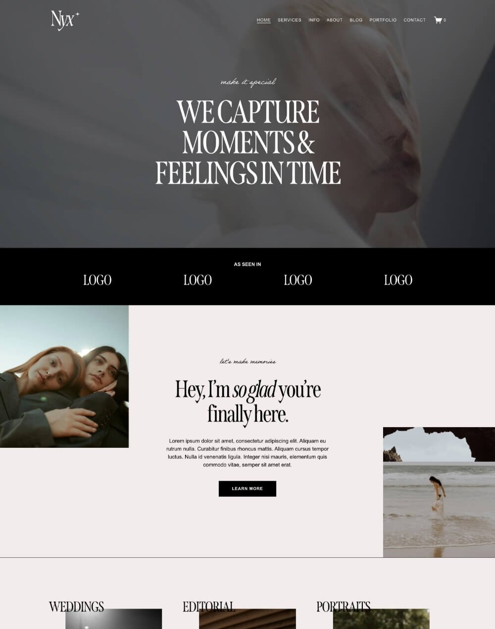
Despite the name, white space doesn’t actually need to be white! It simply means the empty space around your content.
If your website is feeling a little crowded, try:
Adding more space between sections
Giving headings and paragraphs a little more room
Removing decorative elements that aren’t really adding anything
Letting important content stand on its own
You don’t need to fill every gap for your website to feel finished. Sometimes, a little more space is exactly what makes a design feel more polished and intentional.
👉 A Complete Guide to Unique Image Layouts in Squarespace
👉 7 Best Website Layouts for Seamless Navigation and Eye-Catching Design
5. Using too Many or Hard-to-Read Fonts
Fonts can make or break how polished your website feels, and there are usually two main issues we see with DIY sites: Using overly trendy fonts, or using too many different fonts at once.
Fonts come and go in trends just like fashion. If you’re following trends, make sure the font still feels fresh. Otherwise, a more classic, timeless choice is usually the safer option.
The other big mistake is overdoing it. To keep your site feeling cohesive, stick to 2–3 fonts max:
One main heading font
One secondary or accent font
One simple body font
And if you’re using a script, handwritten or decorative font, keep it for headings or small details. Your body text should always be clear and easy to read, especially on mobile.
The goal is simple: Choose a small set of fonts that work well together, then use them consistently throughout your site.

6. Alignment
Good alignment is one of those small details that can make a huge difference to how polished your website feels.
On DIY sites, we often see text, images and buttons sitting slightly out of line, or spacing that changes from one section to the next. None of these things seem major on their own, but together they can make a page feel a little messy.
Try to keep things consistent:
Line up text, images and buttons where possible
(this is where the Fluid Engine grid really comes in handy! Press ‘G’ on your keyboard to view it)Keep your page margins and spacing even
Avoid random gaps between elements
Use the same alignment style throughout similar sections
For longer paragraphs, left-aligned text is usually the easiest to read, especially on mobile. Centered text can work nicely for short headings or small bits of copy, but big centered paragraphs can get tiring pretty quickly.
7. Hierarchy
Hierarchy is what helps people understand what to look at first, what to read next, and where to click.
Without it, everything on the page can start to feel equally important, which makes your website harder to scan.
Here are a few simple ways to create stronger hierarchy on your site:
Make your main headings noticeably larger than your body text
Use size, weight and color to highlight important information
Give key sections and buttons enough space around them
Keep less important text more subtle
Make your calls-to-action easy to spot
Think about the journey you want someone to take through the page. Your design should naturally guide their eye from the main message, to the supporting information, and then towards the next step.
You don’t need loads of different font sizes or flashy design tricks. A clear structure, a few strong focal points, and consistent styling can make a huge difference!
Hey there!
Welcome to my site
Here's a small paragraph of text, to show you an example of good hierarchy.
Hey there! Welcome to my site. Here's a small paragraph of text, to show you an example of bad hierarchy.
Want to Make DIYing Your Website a Little Easier?
If you want to build your own website without starting totally from scratch, a professionally designed website template can save you a lot of time (and help you avoid plenty of the mistakes we’ve just talked about!).
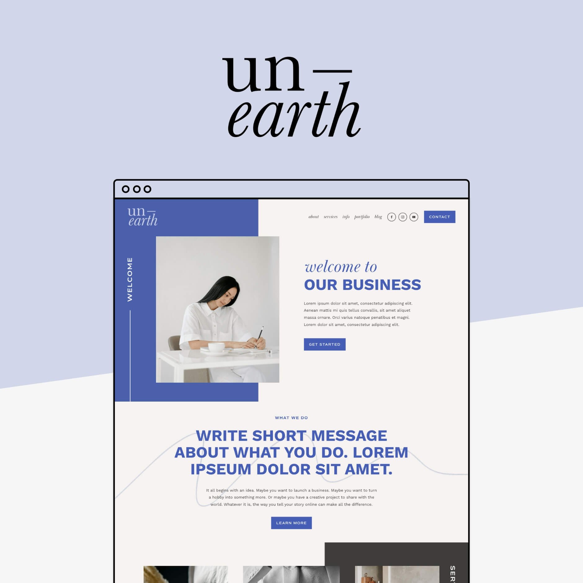
Our Squarespace templates give you a polished, strategic starting point, with the layouts, spacing, typography, and mobile design already designed for you.
You can still make it completely your own with your colors, fonts, images and content, but instead of staring at a blank page wondering where everything should go, you’ve already got a solid foundation to work from.
Perfect if you want the flexibility of DIY, with a lot less guesswork, and a professional result!
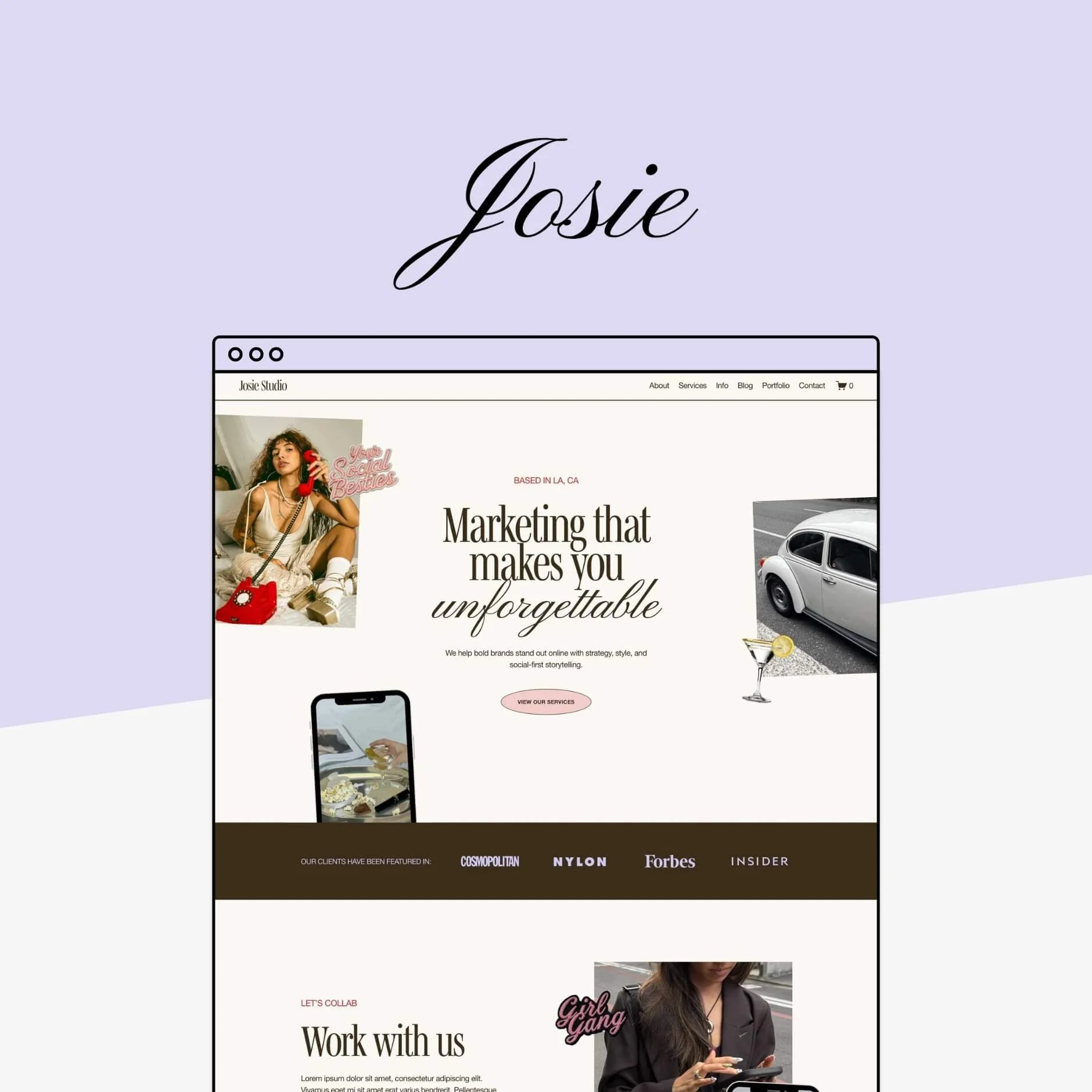
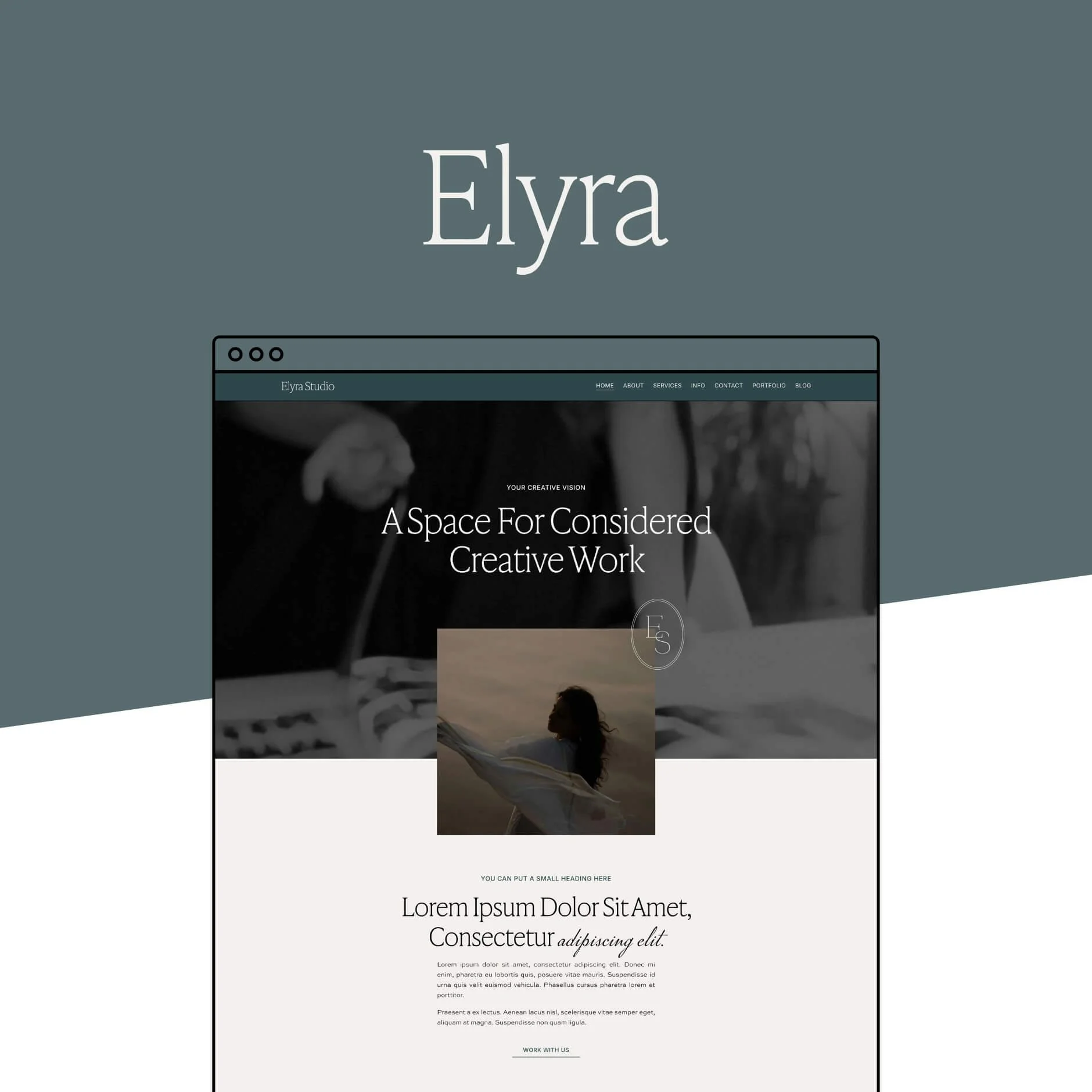
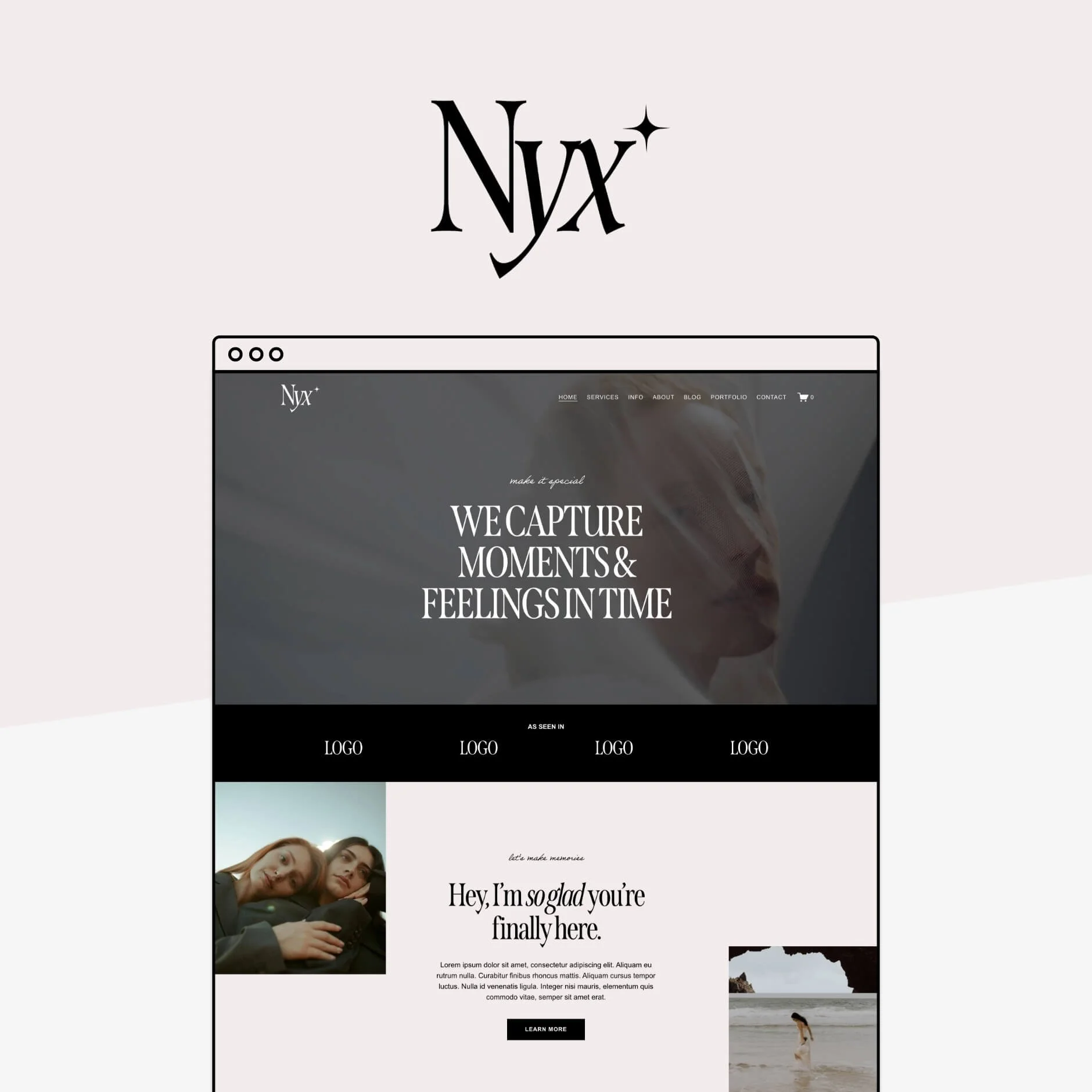


Now go check your web design and make sure you're not making any of these mistakes!
Want more website tips? Check out these posts:
How to Make Your Squarespace Website More Accessible
7 Website Mistakes That Could be Costing you Clients
Where to Promote Your Offers on Your Website (So They Actually Convert)
How to Showcase Your Work with Squarespace Portfolio Pages
Website Pages That Will Increase Your Revenue (and you Should add Today!)

Leon
7.1 Fluid Engine ✷ $297