

4 Mobile Design Hacks for Squarespace
Squarespace is freakin’ awesome (if you didn’t know, we're huge Squarespace fans over here) and it’s especially awesome because it makes optimizing your site for mobile oh-so-easy!
And now with the release of the Fluid Engine editor, you get way more freedom to adjust your layouts between desktop and mobile. The flip side? That freedom sometimes means things don’t look quite as polished on mobile until you give them a little extra attention!
That’s why we put together a few of our favorite quick hacks to make sure your mobile site looks just as good as your desktop—clean, functional, and ready to impress.
For those of you still using Squarespace 7.0 where the mobile version of your site can’t exactly be edited independently, we have some hacks for you too!
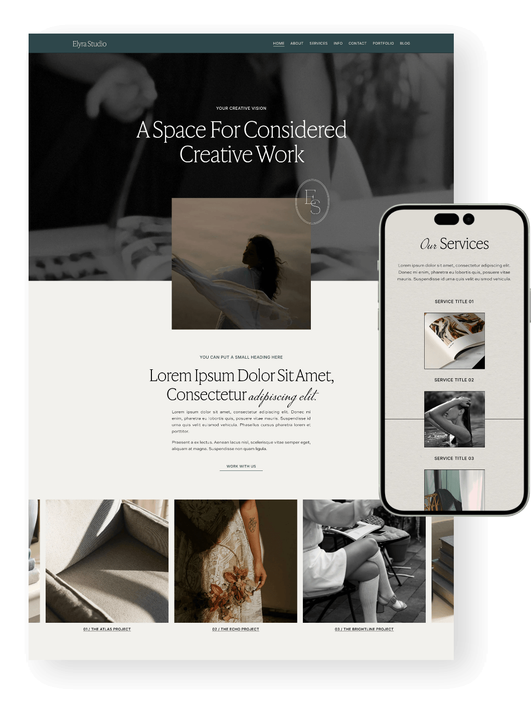
PS. Did you know that all of our Squarespace Templates are optimized for mobile from the get go? Not only will you get a beautiful design to start with, but you’ll also get hours of our most up to date tutorials all about learning Squarespace. Check them out below! 👇


Mobile Design Hack 1: Using Spacers
For Squarespace 7.0 Only:
Problem: Have you ever noticed when you’re looking at your mobile site and there’s just so much space in between elements? This might be because you've used spacers. Maybe you’ve used a few spacers stacked on top of each other, or even just one spacer. You've got it looking great on the desktop view, but when you look at it on mobile, it’s just waaay too much space.
Solved: For each one full-width spacer that you use, instead, use two spacers and put them (by clicking + dragging them) side by side. When you put two spacers side by side, Squarespace will cancel out both spacers on the mobile site. So by using this trick, you can have a large space on your desktop view, and you can completely cancel the space out on the mobile view.
Example:
If you use one spacer like this, the space will show up on desktop and mobile:

If you use two spacers side by side, it will completely cancel out the space on mobile and only display on desktop:

Love this trick!
Alternatively, you can use the flip-side of this trick by using lots of spacers to create tons of space on mobile. The only issue with this is that it’s not exactly opposite, because using lots of spacers will show on desktop and mobile. But it’s still good to know, and can be a really effective technique.
Mobile Design Hack 2: Using the Section Height Settings
For Squarespace 7.1 Only:
Problem: It tackles a similar same problem as above: too much spacing, or not enough spacing. Though in this case it’s spacing between the top and bottom of sections.
Solved: Use the section height settings to adjust the size of sections on mobile.
The section height settings generally add padding to the top of bottom of a section. This can look great on desktop, but sometimes it’s way too much padding on mobile. If this is the case, then reduce the section height settings which will reduce it on mobile and desktop. If you are still using Classic Editor, you can fake padding by putting a spacer in the top and bottom of the section because spacers do not show in 7.1 so wherever you put a spacer on desktop it will disappear on mobile. If you are using Fluid Engine, just position your blocks a bit further down on the grid to leave some extra space - easy!
👉 Squarespace 7.0, 7.1, Fluid Engine, Classic Editor - What are the Differences?
Example:
I like how this section on my website looks on desktop with the height currently set to LARGE:

But because it’s set to LARGE, the section on mobile has way too much padding and looks silly:

So, I will change the section height to SMALL.
For Classic Editor, I’ll add spacers top and bottom (in this case I did one one top and two on the bottom because it worked well with the design):

Then the mobile site will be set to small, and because the spacers disappear on mobile, the section looks much better with less padding:

For Fluid Engine, I’ll just move the first blocks down the grid and extend the bottom of the section.
Tip! You can reveal the grid by hitting ‘G’ on your keyboard
Mobile Design Hack 3: Using the Focal Point
Note: This Hack Works for Squarespace 7.0 and 7.1!
Problem 1: Your background section image has been cropped on the mobile view and isn’t displaying the most important part of the image.
Problem 2: You have a background section image with text over top, and on the mobile view the text is hard to read because the background has been positioned right underneath the text whereas on desktop the alignment is fine and the text is readable.
Solved: Use the Focal Point to set the position of where images will crop on mobile!
👉 Your complete guide to image focal points in Squarespace
Example:
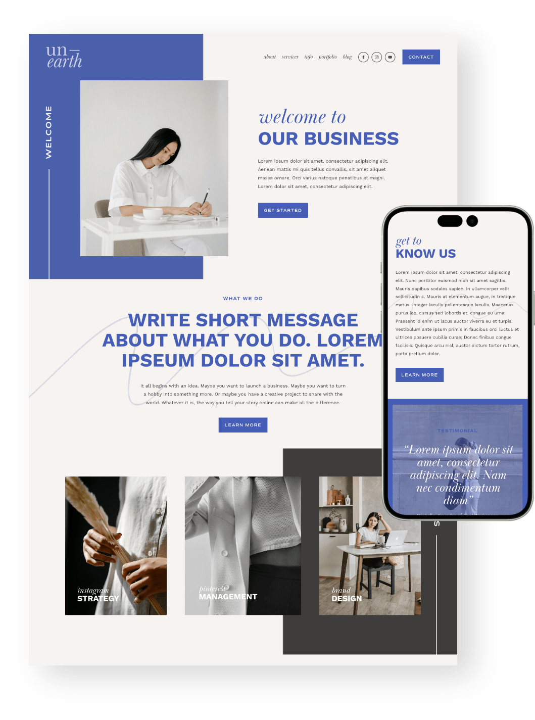
This is currently the banner image for the homepage on the Unearth template and I have put a box around the "focal point".
You’ll find the focal point by going to the Edit Section > Background

You can click and drag this focal point anywhere you want on the image, and this will indicate which part of the image is important, or which part you want to be “in focus”.
If you are trying to focus on a particular part of the image on mobile, then move the focal point there.
If you are trying to avoid background color/image behind text on mobile, then move the focal point to the part that will look good behind the text on mobile.
Example continued:
As you can see above, currently my focal point is in the top-left, so it will show up like this on mobile, highlighting the “welcome” text right where we want it:

Mobile Design Hack 4: Adjusting the Styles of Your Fonts with Some Code
Note: This Hack Works for Squarespace 7.0 and 7.1!
This is something that Squarespace tried to do automatically, but I find that sometimes the way Squarespace adapts the fonts for mobile is absolutely fine, but other times the headings are too big, too small, or they have lost specific formatting like letter spacing or the body text is too big or too small.
So I created this super easy code so you can adjust all of that!
Just head into your Squarespace site, hit '/' on your keyboard, type in CSS into the search bar to take you straight to your CSS panel and paste in this code:
@media screen and (max-width: 767px) {
body {font-size: 11pt}
h1 {font-size: 13pt}
h2 {font-size: 13pt}
h3 {font-size: 16pt}
}
With this code you can quite easily see that you can adjust the size of the body, h1, h2 and h3 fonts for mobile, you just need to change the font-size number. If you don't want to change one, just remove the whole line. You can also add other font characteristics in here too, like,
@media screen and (max-width: 767px) {
body { font-size: 11pt;
letter-spacing: 20px;
line-height: 20px; }
h1 {font-size: 13pt}
h2 {font-size: 13pt}
h3 {font-size: 16pt}

}
When you’re adding different characteristics, make sure to add the semicolons after each characteristic (as I have above) and don’t delete the curly brackets, or you may break the code!
Feel free to experiment with these styles, remember they will only show on mobile view!
Explore more of our tutorials about mobile optimization below 👇
How to Change Mobile Logo on Squarespace
Mobile Optimization: Creating Responsive Squarespace Sites
How to Adjust Your Mobile Menu in Squarespace
How to center-align text in mobile ONLY in Squarespace
Hacks to make mobile editing in Squarespace Fluid Engine faster
Liked this post? Pin it to Pinterest! 👇