

6 blog design tips for Squarespace
So you’ve started blogging on Squarespace, that’s awesome! It’s so simple, right?
But if you’re new to the platform, you might not be making the most out of the blog design features. I love blogging with Squarespace because you design your posts just like any other page, aka, you have complete creative freedom!
You can add blocks literally anywhere, which makes your blog posts super customizable. Today I’m going to share some tips on how to use different blocks and design features to make your blog posts look extra professional and keep readers coming back to your blog!

1- Design in the visual editor (Squarespace 7.0)
First thing’s first, make sure you’re designing in the visual editor, not the pop-up module, this will save you a huge headache trying to get things to look right!
This tip is ONLY for Squarespace 7.0, as in Squarespace 7.1 you only have the ability to design in the visual editor (woohoo!)
When you first add or click ‘edit’ on your blog post, it will open up this pop up module:

This pop-up box controls a lot of your blog settings, so it’s really important.
But when you’re actually adding text and images to your post, this isn’t the best place to do it.
I recommend entering all of your details (name, categories, thumbnail image etc) and the saving (not publishing) your post and exiting out of this pop-up box.
Now you’ll want to click on the post name (in the left sidebar—see visual below) and it will open a preview of the post on your page.
Note: this can be a bit glitchy sometimes, if it’s not doing anything when you click on the post, just refresh and click on it, now it should work!Now you can view your visual blog post preview to the right of the sidebar. If you hover over the page you will see the grey box that says Edit, click this!

I recommend you add all of your images and text in this visual editor, rather than in the pop-up box. It will make it SO much easier to see what you’re doing and to see what the final post will actually look like.
2. Position your images
You might already know how to add images to your post: click on the black (or blue) line that shows up when you hover (as seen below)

Then choose image from the list of block options:

What you might not know, is that you can position these images anywhere you want on the page.
There are two options for positioning: Side by Side or Text Wrapping
Side by Side: To position your image next to any other element, all you need to do is click and drag your image until you see a vertical black/blue line. Wherever this black line appears is where your image will be dropped.
This is what image and text side by side looks like:

Text Wrapping: Creating a text wrap around your image is a great idea for blog posts, as they are usually very text heavy. Just click and drag your image over your text box until a grey box appears. This grey box indicates where your image will be placed.
This is what a text wrapped image looks like:

With either the Side by Side or Text Wrapped images, you can then hover over the edge of the image and use the drag tool to make it bigger or smaller.

3. Crop and Focus your images
Click and drag this little dot up or down to crop your image

Hover over the image and click Edit (or double click). Click and drag the image focal point to adjust where your image crops to. (If your image isn’t cropped, you probably won’t be able to see any changes when you adjust this point.)

4. Adjust your Column Width
When you’re designing your blog post, consider narrowing your column of text. It’s been proven that when paragraphs of text are too wide, they are harder to read.
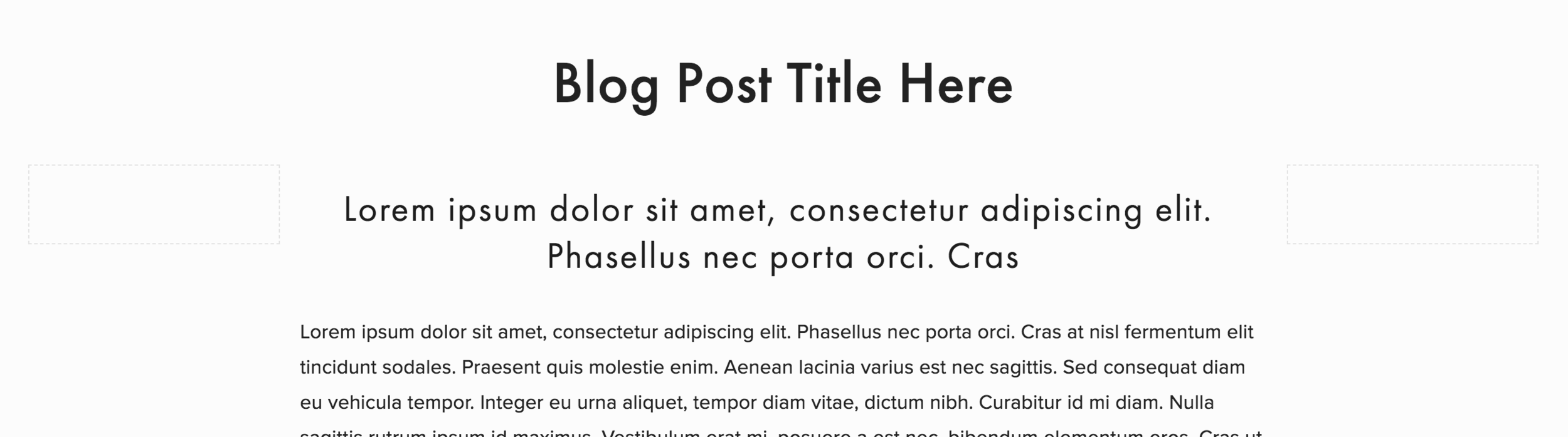
An easy way to do this is to add spacer blocks of either side of your text.
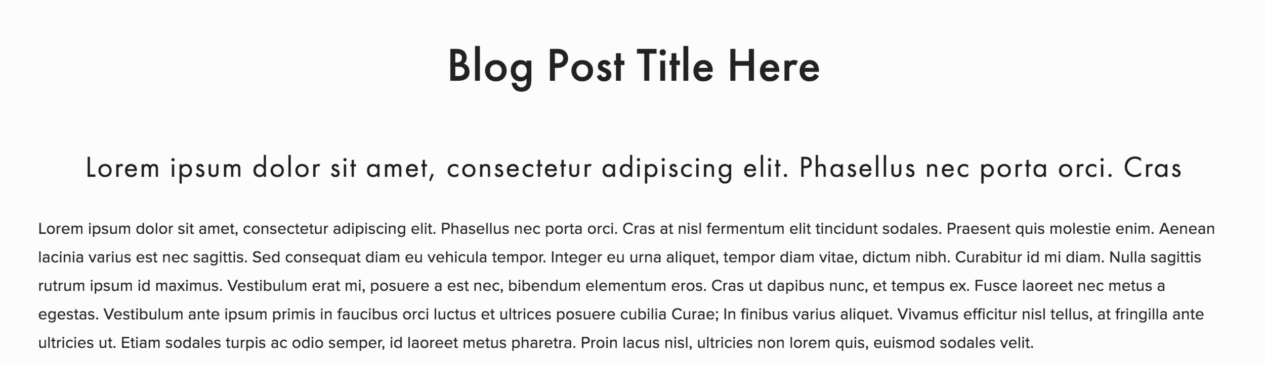
This is a blog post that has a really wide column of text:
This is a blog post that has a narrower column of text, by adding spacer blocks on either side:
5. Create hierarchy with your text
Squarespace makes using headings really easy. Just use the text editor to switch between different headings when you’re editing your text.

Make use of these headings when writing our your blog posts. Use different headings to break text up and draw importance to different things.
I also recommend using line breaks, bullet points and numbered points.
SEO Tip: When you’re using different headings and styles in your blog posts, make sure you use them in a way that makes sense, and breaks up the content to give better understanding and flow to your reader. Using this method (with your reader in mind), Google will be able to read your content more easily too, which will help with your SEO rank!
6. Keep your text left aligned
This is something a lot of new web designers seems to get wrong. When you’re writing paragraphs of text (so, blogs), make sure they are left aligned and NOT center aligned.
There are studies to prove that left aligning large bodies of text makes the text much easier to read (think newspapers and magazines), and if your text is easier to read, you’re going to keep readers on your site for longer!
Basically, centered text is harder to read and looks unprofessional.
Those are my top 6 tips for designing a gorgeous and professional blog post! Here are some more articles you might be interested in…
How to Install a Sidebar in the Brine Template
7 DIY Web Design Mistakes to Avoid
4 Techniques for Higher Converting Blog Posts
How to Create a Blog Signature in Squarespace
How to Optimize Your Blog Posts for SEO in Squarespace
If you liked this post, pin it to Pinterest!

