Website Pages That Will Increase Your Revenue (and you Should add Today!)
So, you’ve got your Squarespace website set up with all the basics and now it’s time to start adding content. At this point, you might be thinking “what do my potential clients need to know?” or “how am I going to keep the interest of new visitors?”
The ability to actually convert potential customers into clients is one of the biggest things that sets an advanced business website apart from an amateur one.
So, we get it, creating pages with effective copy comes with a lot of pressure! You want to be informative and create a streamlined sales experience and there are a lot of moving parts to think about.
But don’t worry! In this post, we’re sharing the different pages you definitely should consider adding to your site in order to keep your audience on your website for longer, have better control and flexibility over their experience, and increase your conversion rates (revenue). So by the end, you should be super confident in what to add and share with your audience.
Let’s get into it!
1. Sales Page
If you’ve never heard the term “sales page” before, it’s essentially just a single landing page on your website that is designed with the specific goal of selling a product or service.
Sales pages are amazing because they give you an opportunity to focus solely on one offer and cater the content in a way that resonates most with your target audience. They provide a seamless experience for your visitors, pointing them directly toward the purchase button, and are extremely helpful in boosting conversions.
A great sales page is not only visually appealing, but also takes the reader on a journey, pointing out each aspect of the offer in a way that is clear and connects to the heart of what’s most important to your audience.
Some elements of a sales page that are particularly effective might include:
Testimonials and case studies from previous clients, showcasing just how amazing your product or service truly is.
An FAQ section where you can preemptively answer all of your visitor’s questions.
Comprehensive pricing info including any payment plans or discounts you offer.
An “About Me” section where you can let the visitor get to know you. Putting a face to the offer builds connection and makes people feel more confident in purchasing.
Plenty of clear calls to action that make saying yes practically impossible.
If you have products to sell or a service to offer, you will not regret taking the time to put together a sales page! And to make things even easier for you, we offer Sales Page Template add-ons for each of our Premium Squarespace Templates.
You can view add-ons on each specific Template page and either bundle everything together (for an extra 30% off!) or purchase a la carte. Our Sales Page add-ons are designed to strategically present your offers in a visually stunning format and are a great addition to any website.
2. Instagram Links Page
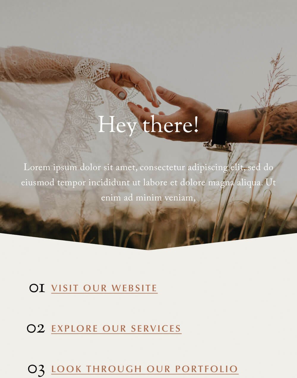
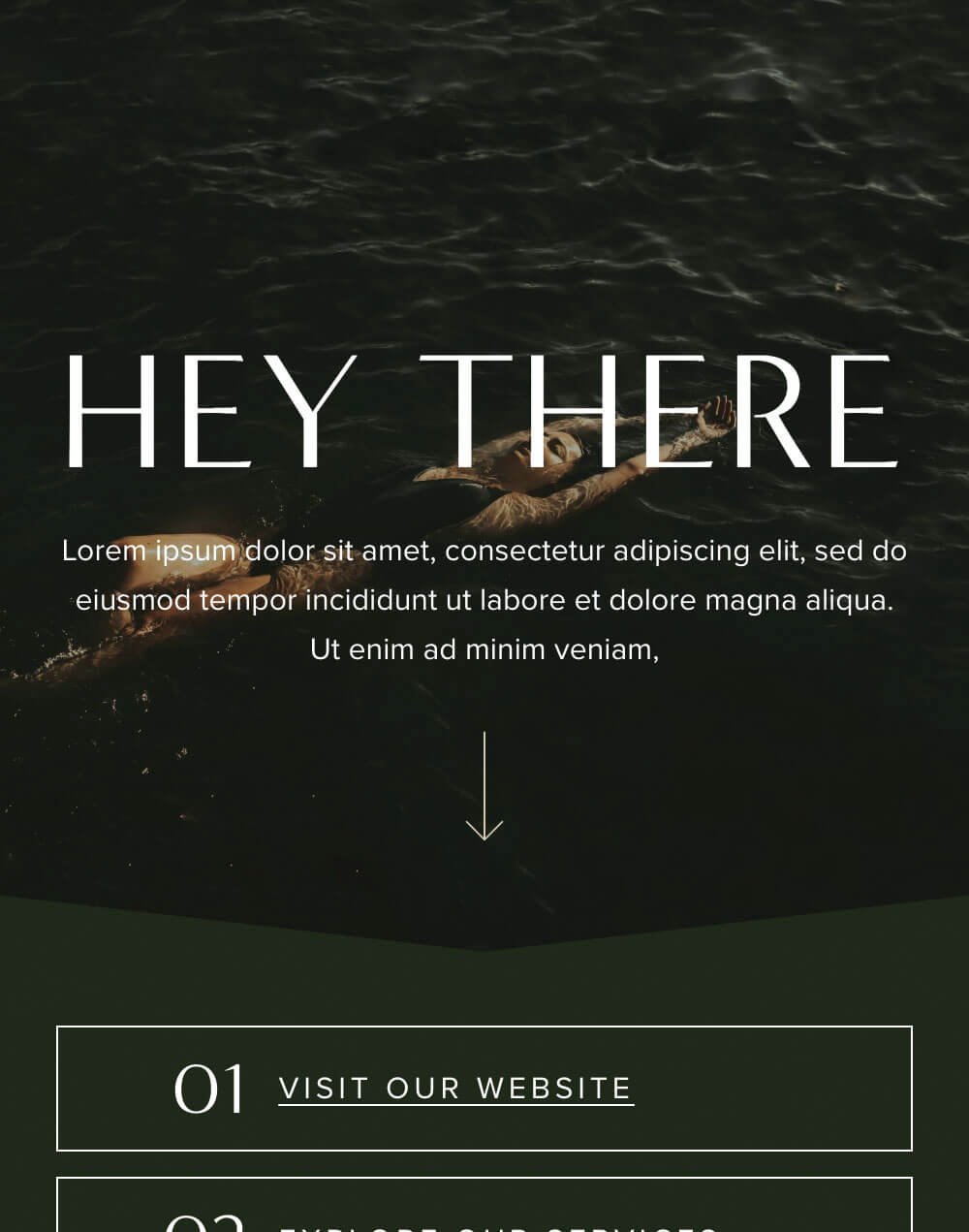
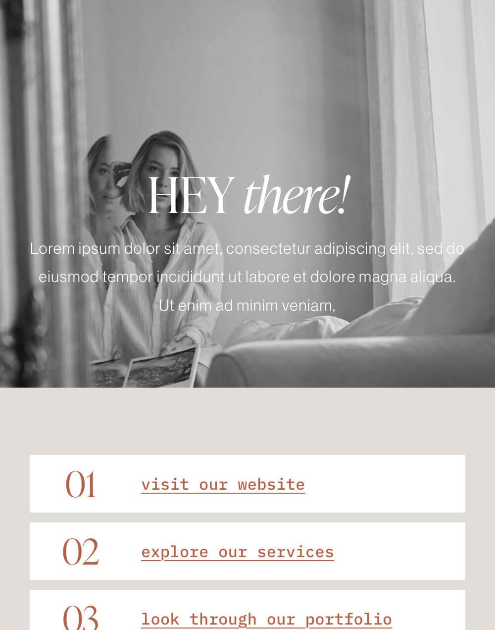
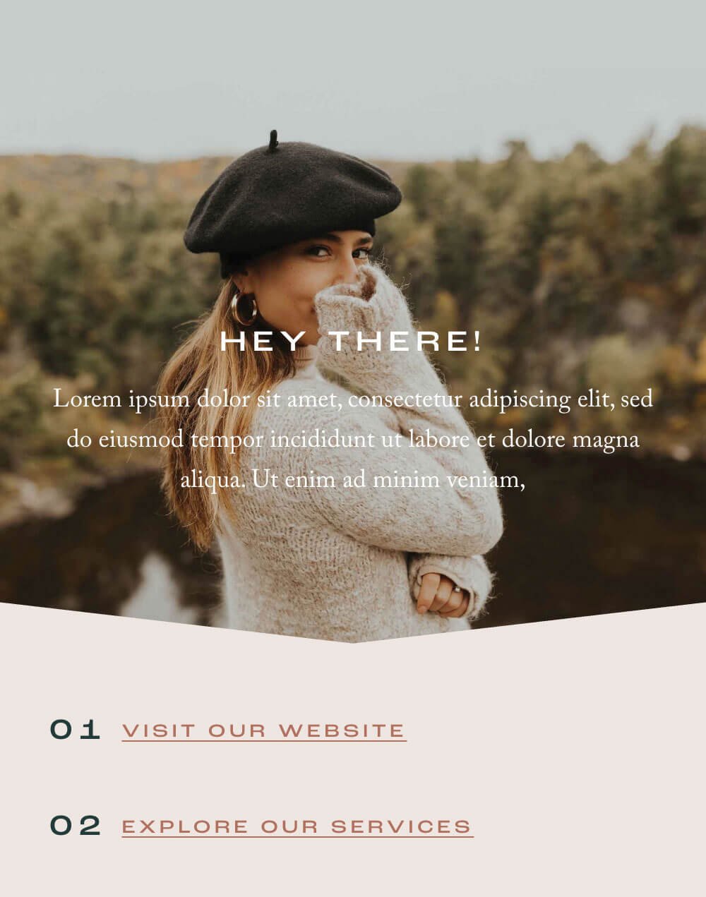
We all know how important the Instagram “link in bio” can be, but did you know that there’s a way to create a completely custom Instagram links page directly on your website?
Creating your own Instagram landing page is not only going to mean complete freedom of design and a gorgeous, on-brand links page, but it also means that you don’t have to rely on (or pay for) any external apps! It’s smart and simple.
Having a handy “link in bio” page that is actually on your own website will drastically increase the chances of your potential client staying on your website and exploring the services or products that you’re offering.
A custom Instagram links page gives you much more flexibility and control over not just the design of the page, but also the customer’s experience while on it. Squarespace’s Fluid Engine Editor allows you to really optimize your template to display links in a way that is intuitive and helpful. Plus, you get the chance to add additional sections like newsletter sign-ups, blog posts, portfolio galleries, and more to help entice your audience.
We also have uniquely designed Squarespace Instagram Links add-on Templates which you can view on each Website Template page. These IG Links add-on pages are simple, beautifully designed and allow you to have a custom links page up and running within minutes!
3. Freebie Page
A Freebie page is similar to a sales page, except it’s a much more paired down version that focuses on a free offer you’re providing to your audience in exchange for their email. So you’re growing your email list and giving value all at the same time!
Of course, you could always just use a simple Newsletter block to collect emails and hope that your website visitors are excited enough about the offer to sign-up, however utilizing something like a freebie page is so much more effective.
Freebie pages allow you to include more detailed information about your offer including
Testimonials from people who have taken advantage of the freebie in the past.
An overview of what people will learn or a breakdown of content (if you’re offering something like a training or workbook).
Up to date examples of your freebie so that people know they’re getting something real and valuable.
Other opportunities to get in contact with you or an FAQ section to answer the most popular questions you receive.
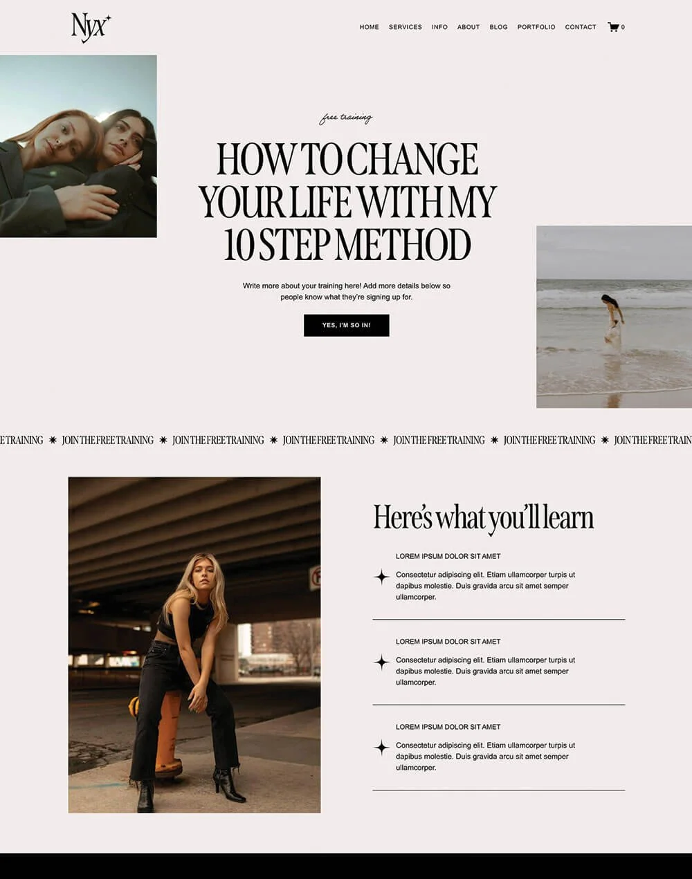
And if you’re looking for a done-for-you option, our Freebie Page Template add-ons make it super easy to launch a beautiful, high-converting opt-in page quickly. Plus, they also match each of our Premium Squarespace Templates, so your freebie page will feel like an intentional part of your brand from day one.
4. Custom “404 Not Found” Page
We’ve all been there… you’ve clicked on a link and were led to an “oops, this page doesn’t exist” message. What did you do next? Honestly, you probably exited the page and went with the next-best alternative.
This error message is called a 404 page, and immediately clicking away is actually a common flow that people tend to take when they land on a “page not found” notice. But, because you understand this now, you can prevent it with a custom 404 page that is actually beneficial for your business.
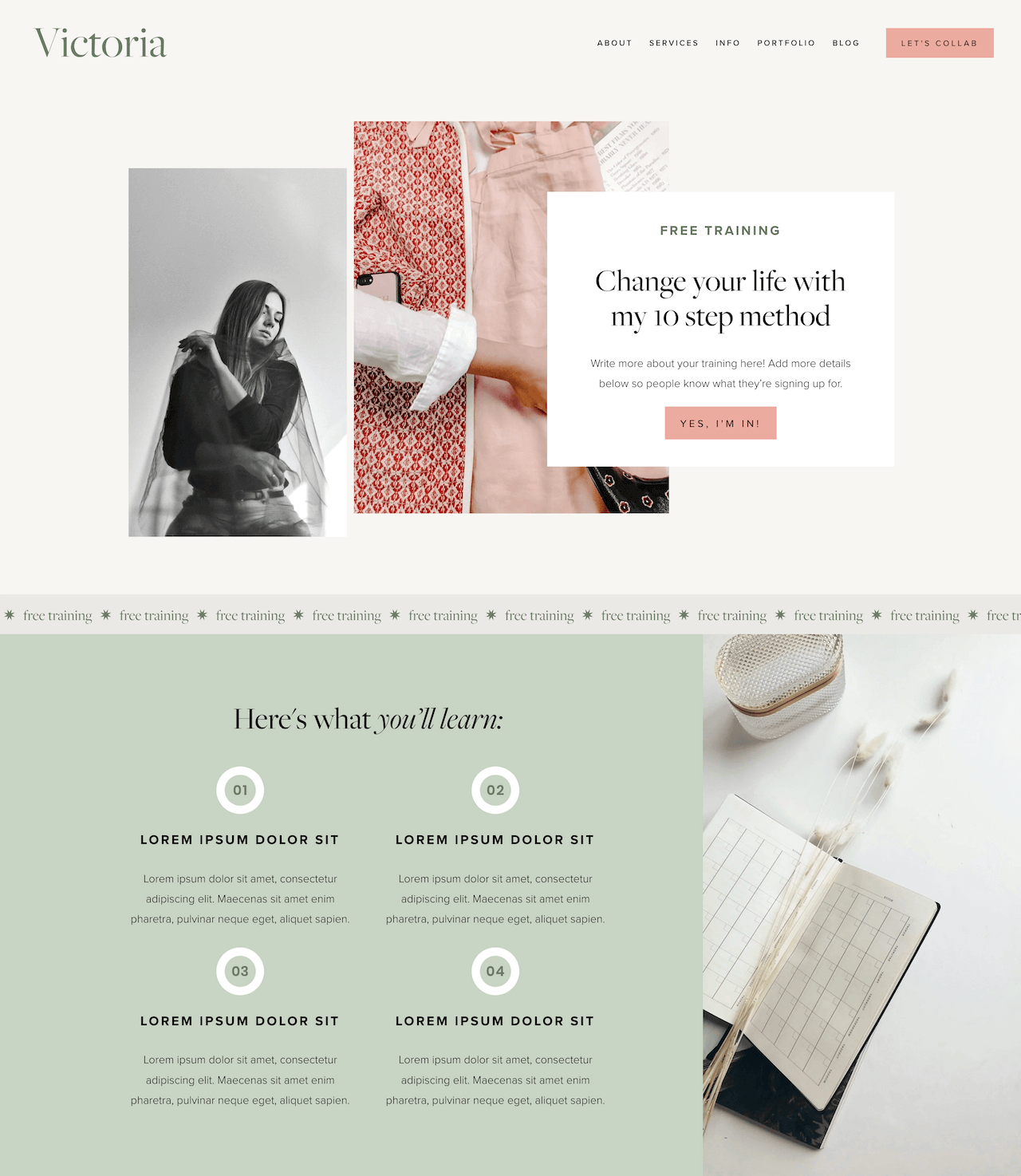
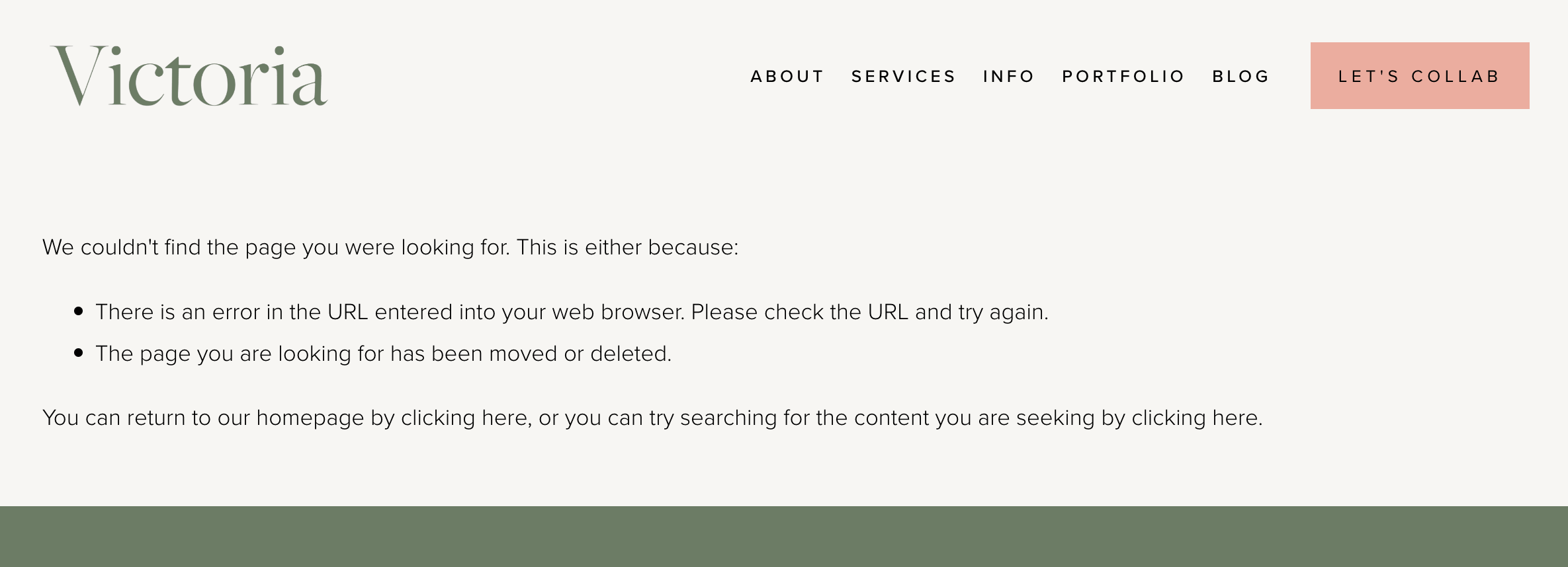
Now, Squarespace does have a default404 page that guides audience members back to the homepage, but it’s very simple and really not much help. It looks something like this:
Not cute, right?
So rather than relying on that, it’s much better for you to create a custom error message that matches your brand aesthetic and gives your audience members what they came for in the first place.
Your custom 404 page can have elements like:
An eye-catching heading
A search bar
A contact form
Links to your social channels
And anything else that you think might be helpful. This allows you to keep potential clients around for much longer and, therefore, increases their chances of conversion!
Example created using our Victoria Template
5. Podcast Page
Now, this page/content type might not work for everyone, but hosting a Podcast is currently all the rage! And if you do have your own Podcast, you should definitely be promoting it on your website and probably even hosting it there too.
Having a page on your website specifically dedicated to your Podcast is great for so many reasons, the main being that you’ll be keeping all of your content in one place that’s convenient for your audience to access and seamless in the user experience. Plus, it’s SO easy to get your Podcast up and running through Squarespace so, even if you don’t have a Podcast already, you can get started without a ton of fuss.
Your Podcast page can detail all of the information that potential listeners need to know like
What topics you cover
Where they can listen
If you’ve been featured in any cool publications
What episodes are your most popular
And so much more! Plus, doing something like this on your website gives you another chance to showcase brand cohesion and cross promote other products or services you have. It’s never a bad thing to have more eyes on your website, so why not direct your Podcast listeners there as well?!
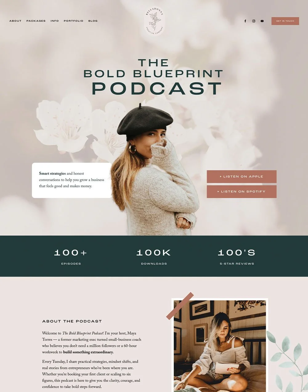
And again, we can help make this process so much easier for you with our Podcast add-on page Templates. Each Podcast page was designed specifically with the intention of highlighting your Podcast and the individual episodes you share through beautiful and functional layouts. You can purchase Podcast add-on pages as a bundle with your Template, or individually which gives you the flexibility to start your Podcast at any time.
6. Resources Page
If you’re an online business owner, then you probably use a lot of online business tools. And if that’s the case, then you should definitely consider setting up a Resources or Favorite Tools page.
Having a resources page on your website is a great way to tell others about all of the products that you use and love. Plus, most of the tools that you regularly use will likely have affiliate programs, meaning that you can sign up to promote them. And if you make sales through your special affiliate link, then you’ll get a percentage of that sale. So you can help out your audience while also making some extra income. Yes, please!
Take a look through each of the tools you currently use and see if they have an affiliate program like this. If they do, go ahead and sign up, create a resources page on your site, and take advantage of that passive income.
Now, this resources page probably shouldn’t be a main featured page on your website. Instead, you could simply link it in your footer area or somewhere else less front and center as it’s not the main purpose for people landing on your site or the main conversion you want visitors to take (aka booking your services or buying your products).
But adding this page to your site is a win-win. Your existing audience and new visitors alike will love getting to know the tools you're using, and you get to make some affiliate income if they decide to sign up to use one of the tools!
👉 Creative ways to promote affiliate links (& make more passive income!)
And there you have it! Those are the pages that should be serious contenders for your website in order to increase your business revenue. Your audience will love the content and you’ll be so happy to see your conversion rates sky rocketing.
Want more tips? Check out the posts below:
The Ultimate Website Pre-Launch Checklist (Everything to Do Before You Hit Publish)
Different Portfolio Styles to add to Your Squarespace Website
How to Get Your Squarespace Website on Google: A 5-Step Guide
10 Best Practices for Building Your own Website DIY Style
7 Best Website Layouts for Seamless Navigation and Eye-Catching Design
If you liked this post, Pin it to Pinterest! 👇🏻


