How to Customize Squarespace Forms (and Say Goodbye to Boring Contact Forms)
If you’re a small business owner, you know just how important it is for existing and potential clients and/or customers to connect with you. Staying in touch with your community and providing excellent customer service is so important for becoming one of the go-tos in your industry!
Thankfully, Squarespace makes it super easy to add custom forms to your website, that way people can easily contact you, fill out information, sign up for events, and more.
These forms give you a powerful way to gather specific responses from your site visitors using text areas, dropdown menus, surveys, and more. Plus, with Squarespace’s new style settings, you can customize your form design like never before, ensuring they match your brand perfectly.
This is a feature you’ll definitely want to master which is why, in this blog post, we’re going to walk you through all of the most important form customization steps.
Let’s dive in!
Adding a Form to Your Website
First things first, you’ll want to make sure you actually have a form somewhere on your website!
There really are so many different ways to use and customize a form depending on your specific needs, but some of the most common uses include:
Contact Forms
Consultation Questionnaires (ex: give us some info and we’ll be in touch if it’s a good fit)
RSVP's or Event Sign-ups
Surveys
To add a form to your Squarespace site (which by the way, you get 10% off your first year with BIGCATCREATIVE10), you'll first want to either create a new page or navigate to an existing page, then enter into editing mode by clicking Edit in the top left corner of your screen.
From here, there are two ways to add a new form.
First, you can add a form section by clicking on the blue “Add Section” button and then clicking on the “Forms” tab in the pop-up window.
Choose one of the pre-designed form sections, and it will automatically populate onto your page.
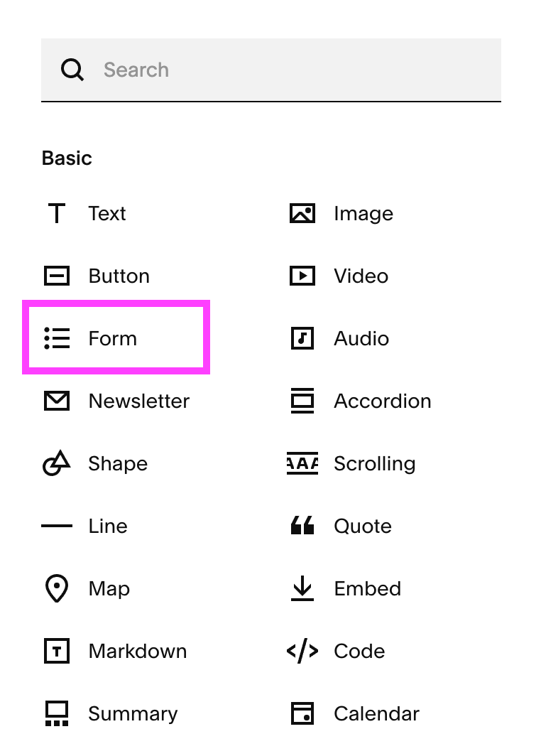
Second, you can add a form block to an existing section on the page by clicking on the “Add Block” button in the top left corner and then choosing the “Form” block option.
Customizing the Form Site Styles
Now it’s time to customize!
Once you’ve added your form, navigate to the Site Styles Panel by clicking on the paintbrush icon in the top right corner of your screen.
Then scroll down and click on the arrow next to the Forms tab.
And here you’ll find a bunch of different customization settings starting with the option to choose a preset Form Pack.
You can scroll through the long list of pre-designed form styles to find one already tweaked, customized, and ready to go! If you’re looking for something quick and easy, choosing a Form Pack is a great starting point.
Next is the Form Fields settings, which can each be customized individually whether you’ve chosen a Form Pack or not.
Field Shape: Choose between a square, rounded rectangle, or pill shape for the shape of your form fields, or choose custom corners to create your own unique shape.
Field Fill: Toggle this section on if you’d like for your fields to be filled with a solid color.
Border: Choose between a full border or a simple underline.
Border Thickness: Adjust the thickness of your chosen border.
Padding: Adjust the padding of the form field itself. You can choose from Small, Medium or Large, or click on the three dots to create your own custom padding.
Underneath the Form Fields settings, you’ll find some additional customization options to help take your form design to the next level. For more specific customization design ideas, check out our blog post with tips on how to elevate your Squarespace contact form.
Effects
In the Effects tab, you can choose a unique Hover & Focus effect for your form fields, which determines how the field will appear when the mouse moves over it.
You also have the option to choose a unique Submit Button Validation effect, which determines what appears within the Submit button after it’s clicked.
Selection Options
Under the Selection Options tab, you can customize settings for the Checkbox, Radio and Survey fields.
Checkbox: This field allows you to create a list of multiple options for visitors to choose from.
Radio: This field also allows you to create a list of multiple options for visitors to choose from except, with this field, visitors can only choose one option.
Survey: This field allows you to create a survey where visitors can rate items on a five-step scale.
The settings for each of these fields are very similar to the general Form Fields settings, so you’ll just want to go through and play around until you find something you like!
Fonts
Under the Fonts tab, you can uniquely change the font styles for different elements within the form. If you want ideas on how to choose fonts for your website, check out 👉 How to choose the right font for your Squarespace form and site.
Each element automatically takes on a global font style (paragraph, heading, or miscellaneous), but you have the option to either re-assign a different style or create a completely custom one.
Colors
You can adjust the colors of your form by clicking on the Colors tab.
The colors of your form field automatically take on the properties of whatever color theme you’re currently using for that section and you can scroll through the form-specific settings for that color theme to adjust the appearance of your form.
In order to use a different color theme, choose one from the dropdown menu at the top of the tab, or go back into your section and change the color theme under “Edit Section”.
You can also toggle off the “Use a color theme” option at the top of the panel if you’d like your form colors to be a simple white and grey.
👉 How to add a Custom Color Palette to your Squarespace Website
Form Spacing
Under the Form Spacing tab, you can adjust the spacing between different elements in your form. For example, you can create more or less space between fields or between a field and its label!
Important! Keep in mind that any changes you make to your form Site Styles will affect ALL forms throughout your entire website.
Form Block Customizations
In addition to customizing your form via the Site Styles Panel, there are some additional settings that can be adjusted in the form block itself.
To access those settings, head back into editing mode, click into your form block and then click on the Pencil icon to access the block settings.
From here, click into the Design tab and you’ll see all of the additional form customization settings.
Button Style: Choose between your Primary, Secondary, and Tertiary button for the form Submit button.
Button Alignment: Change the alignment of the form Submit button.
First Input Highlight: Customize the border of the very first input field in the form.
Lightbox: Toggle this option on and an “open form” button will appear in place of the form. When a visitor clicks on the button, the form will open up in a separate window.
Background: Toggle this option on to put a solid background behind your form. Once toggled on, you’ll be able to customize the color of the background.
Stroke: Choose to add either a solid or dashed border around your form. If you choose to add a stroke, you’ll then be able to customize the color, thickness, corner radius and padding.
Blend Mode: Choose a transparency setting for your form. This might be helpful if you’re overlaying the block in front of an image or other piece of visual content.
Blur: Toggle this option on to blur either the form itself or the backdrop.
And there you have it! Everything you need to know in order to uniquely customize the forms on your website.
Squarespace has now made it easier than ever to create contact forms, sign-up forms, questionnaires and more so that your site visitors can quickly connect with you and stay in the loop on all things going on with your business. You can get as creative as you’d like with the design and play around with the settings until you have exactly what you need, so go and get customizing! 🧑🎨
Oh, and don’t forget to check out our custom Squarespace templates! They’re professionally designed to not only look stunning but also include strategic features—like the form customizations we just explored—to help your website stand out. 👇
Loved that post? Check out some more posts all about Squarespace below!
How to Choose the Best DIY Website Builder for your Business
How Much Will Building Your Website on Squarespace Actually Cost
How to add a Blog Sidebar to Your Squarespace Site (7.1 and 7.0)
How to Automatically Post Your Squarespace Blogs to Social Media
If you liked this post, Pin it to Pinterest! 👇


