

Why Brine is the best 7.0 Squarespace template (& when you shouldn't use it)
Before we jump into this post about the Brine Squarespace template, I wan't to put up an important disclaimer. This post is specifically about Squarespace 7.0 and how the 7.0 templates work.
Squarespace now has 2 different versions of Squarespace, 7.0 and 7.1, and 7.1 behaves quite different than 7.0, so if you want to learn about 7.1 templates, then this post won't really help you.
If you don't have a site with Squarespace yet, I would actually recommend skipping Squarespace 7.0 all together, and heading straight to Squarespace 7.1, it's a bit easier to learn and it's the newer version. In that case, you can skip this post because in Squarespace 7.1, all of the templates have the SAME functions, so you can start with any template!
If you’re still not sure which version you’re using or which version you want to start with, check out this post all about the differences between the two Squarespace versions, and which you should be using.
If you still want to learn about Squarespace 7.0 Brine, read on!
One of the biggest mistakes beginners do when they first build a website with Squarespace 7.0 is to choose their template based on how it looks — trust me, I was there once too!
But why wouldn’t you? You create an account and then Squarespace immediately directs you to choose a template to start building your site, with no explanation about the templates or how they work, just some visual demos. So of course you’re going to choose by which one looks prettiest!
But this is a big mistake, one that can cost you a lot of time and stress in the long run.
Here’s why: The lineup of Squarespace Templates not only look different, but they actually all have different functionalities (remember, this into only applies to Squarespace 7.0, not 7.1!)
For example, one might have an sidebar feature, and another may not. Not all templates are made equal!
So before you go choosing a template based on it’s looks, we need to do some research into what you need on your website and which template can offer you that.
The last thing you want is to spend weeks building a new site and then realize that certain template doesn’t have a feature that you really need. That would be a huge waste of time!
Lucky for you, there’s a consensus between everyone who knows anything about Squarespace, that there is one template family to rule them all…
Brine, glorious Brine!
If you’re new to Squarespace, you might not have any idea what I’m talking about (hint, I’m not talking about the stuff that your canned chickpeas come soaked in). Brine is the best Squarespace 7.0 template, hands down, even Squarespace themselves say so.
So let’s talk about Brine a little bit, because it’s actually not just the template Brine that is awesome, it’s the whole Brine family!
What is the Brine Squarespace Family?
The Brine Family is a group of templates that all have the same functions. There are other families too, but today we’re talking about Brine.
The Brine Family templates include: Aria, Basil, Blend, Burke, Cacao, Clay, Ethan, Fairfield, Feed, Foster, Greenwich, Hatch, Heights, Hunter, Hyde, Impact, Jaunt, Juke, Keene, Kin, Maple, Margot, Marta, Mentor, Mercer, Miller, Mojave, Moksha, Motto, Nueva, Pedro, Polaris, Pursuit, Rally, Rover, Royce, Sofia, Sonny, Sonora, Stella, Thorne, Vow, Wav, West.
Lot’s of templates, right?
So basically, you can choose any of the above templates and they will ALL have the exact same features, functions and style settings.
Why is there so many templates if they’re all the same?
My theory is, because Squarespace is a DIY platform, they want to show you as many “examples” of how the Brine template can be used as possible.
And because Brine is so flexible, there are a lot of different options to choose from.
Not only are they showing you these examples, they’re giving them to you as templates to use, so you don’t have to fiddle around with the template too much or spend too much time working out all of the features yourself.
Because Brine has SO many options and features, it makes sense that they give you lots of different starting options so you can just choose a template by how it looks (which is OK in this case) and do as little DIY as possible.
So, what’s so special about Brine?
Simple, it just has WAY more design features/settings than any other template. Like, wayyyy more. Which means it’s much more flexible, which means you can create a completely custom site that you really love.
Among the (literally) hundreds of awesome design features Brine has, there are a few standouts that make working with Brine unbeatable and one of a kind:
1. Stacked Index pages
You know those full-width, long scrolling pages that are super modern and sleek to scroll through? Brine is seriously your best friend for creating these (see the example below!)
2. Add any blocks on top of your Banners / Index page sections
You’ve got your full-width banner image in place, or your index page section. Imagine being able to use ANY block on top of this banner image. You could put text, images, videos of whatever kind of block on top of the banner image. This seems so simple, but is unavailable in most other Squarespace templates!
Check out this example of the lovely Paige Bruntons homepage. She’s utilized an long stacked Index page and also the ability to add text blocks over her index sections (see my notes in green):

3. Parallax scrolling
This one’s fun! When you scroll past a banner image and it moves independently from your scroll. Here’s an example from this article on Parallax by Squarespace. See how the background image and the text move separately as you scroll past?

4. Super customizable navigation menus
Brine gives you options for your main menu, a secondary menu and a footer menu. Not only that, they can be customized to be in different positions, different colors, sizes, effects, different logo placement (almost any menu layout is possible).
Here’s an example of JUST SOME of the style options you have for your navigation menus:


5. Extra mobile editing options
Squarespace handles most of the mobile design for you automatically, which is a usually blessing, but sometime’s a curse. With Brine, a lot of it is still taken care of automatically, but there are lots of style settings (fonts, colors, spacings etc) you can customize too, which helps you have a bit more control over what your mobile site looks like.
Those are my favorite things about Brine, and why I choose it every time I use Squarespace 7.0. But trust me, that only just scratches the surface! Compared to all of the other templates, Brine is 99% of the time the best.
But what about the other 1% of the time? What features does Brine not have that might make it unsuitable?
When should I not use Brine?
Brine doesn’t have a built-in sidebar
Eeek. I know. This is the one thing I come across with basically every client. And the downside is, the Squarespace templates that do have a built in sidebar are just not up to Brine standard.
But don’t fear! I have found a way around this that I recommend to everyone now. It’s this amazing sidebar plugin. I’ve tried and tested it multiple times and really, it works perfectly. I currently use it on my blog! It’s a small extra cost for being able to add a sidebar to Brine.
It’s missing some other blogging features
Along with missing a sidebar, there are some other features that you might want for your blog like: an automatic related post feature, an endless scroll or author profiles. These three things are only available on Farro family and Skye family templates, which are generally pretty limited templates anyway.
There are ways around this in Brine, you can add Related Posts through this plugin, or an easy workaround using a summary block. You can also add add author profiles/blog signatures through this easy workaround. I’m yet to look into creating an infinite scroll for Brine, but this is something that I think isn’t really that important, anyway.
No sticky navigation on desktop
Sticky or Fixed navigation is a pretty popular and modern trend right now, but unfortunately it’s not something that’s programmed into the Brine template.
Again, if this is something you really want, there will be a way to code it in. The reason I can’t supply you with a basic code here to copy and paste is because it will be a little bit different depending on how your site is set up, it can effect announcement bars and secondary navigation. My recommendation would be to head on over to Upwork and hire someone there to code it in for you, it might cost you $15.
I’m sure there are other features that Brine doesn’t have, but these are the ones I come across most commonly.
You’ve probably noticed, there’s a workaround for almost all of these “missing” features. (Technically, the options are endless with Squarespace if you know how to code, but not all of us do, so I like to share the easiest ways to duplicate features using no code!).
The moral of the story here is weigh up the features you think you need with the benefits of using Brine.
It’s unlikely that you will find a Squarespace Template that literally has every single feature you’re looking for, unfortunately that’s what happens when you use such a simple DIY platform. But if you’re going to come close, Brine is likely it!
If you want to learn more about Brine, this article from Squarespace is awesome!
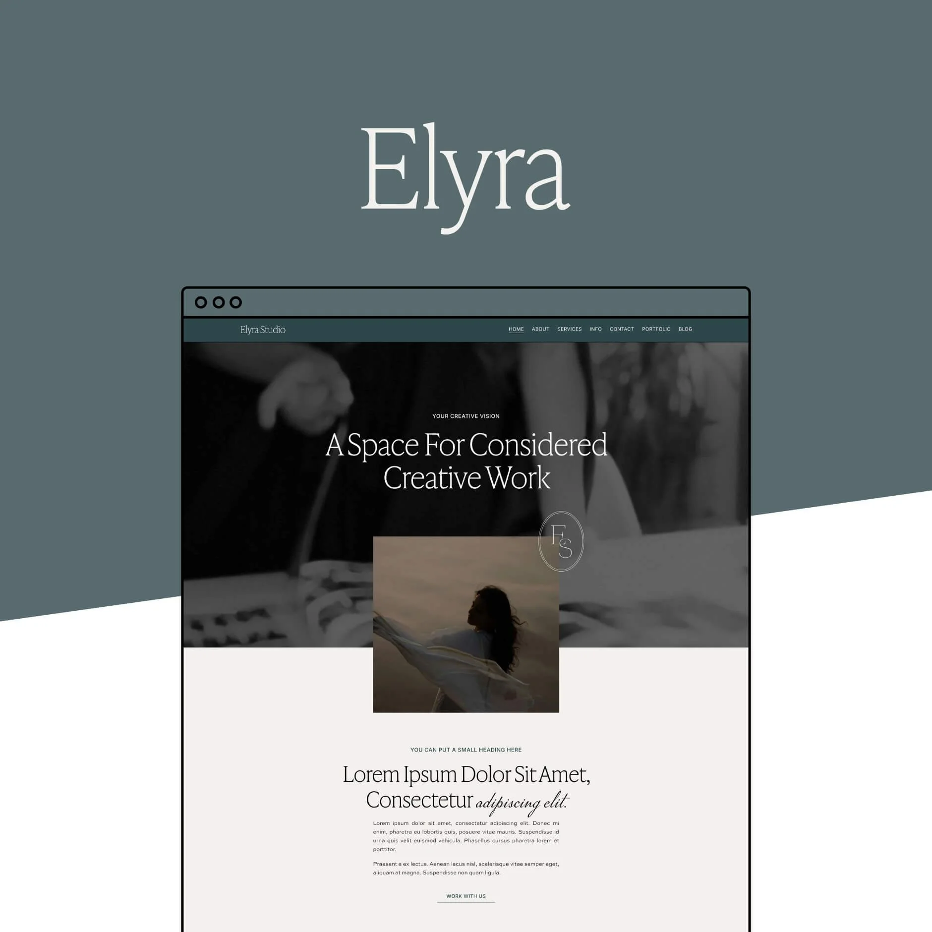
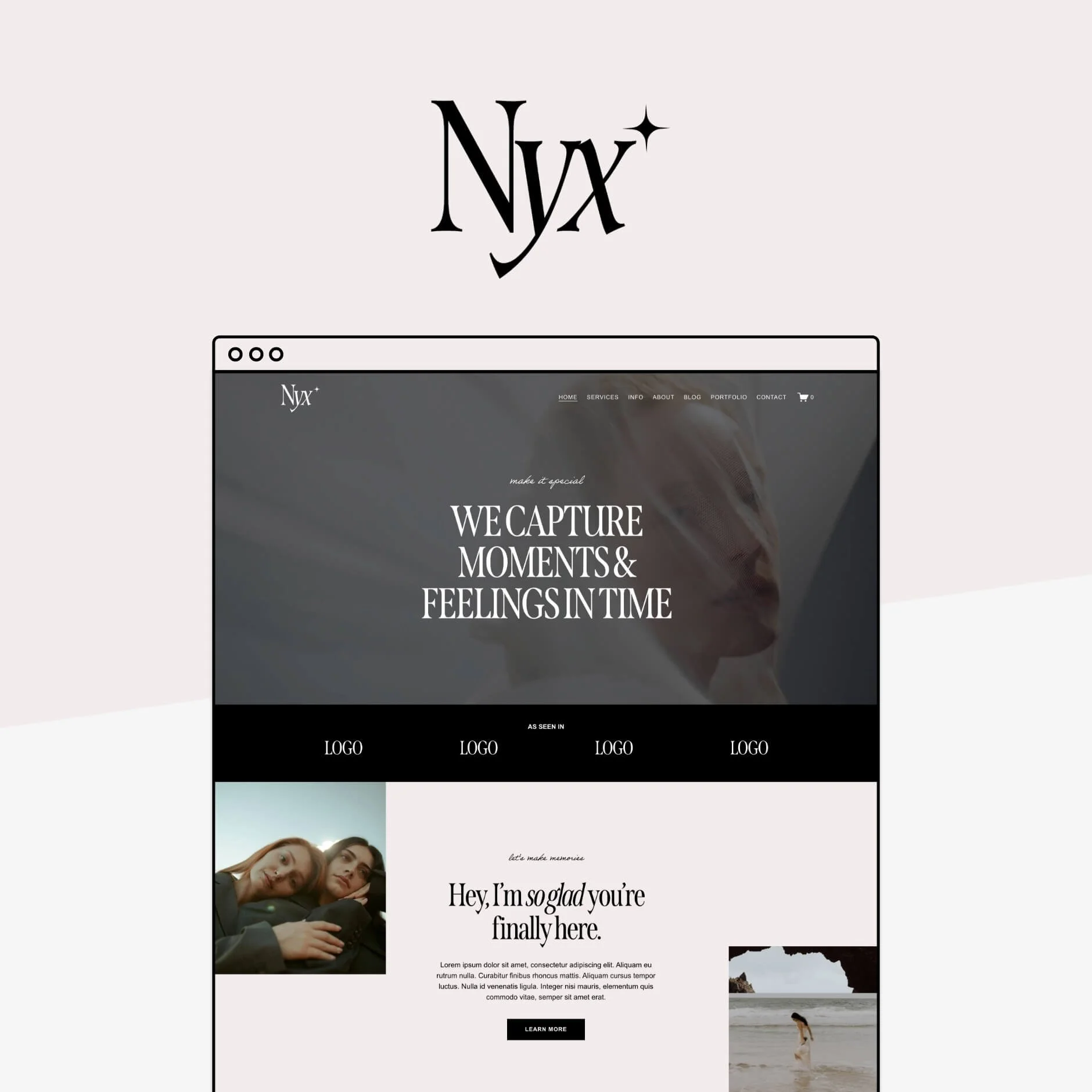
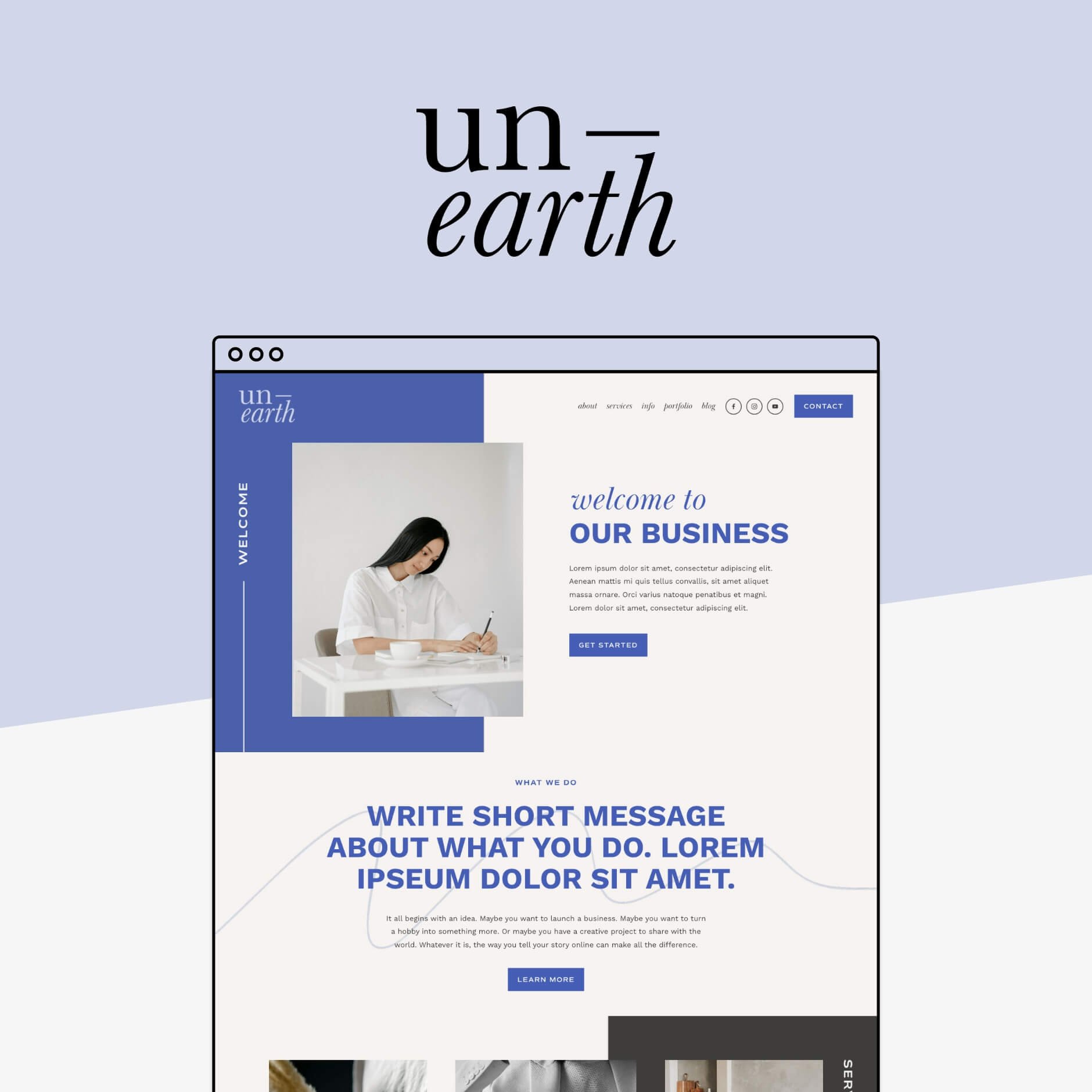
If you’re looking for some awesome Brine examples, check out our range of Squarespace templates! All of the templates that are designed for Squarespace 7.0 are built using the Brine family template as a base.


Liked this post? Pin it to Pinterest!
