A Complete Guide to Unique Image Layouts in Squarespace
There’s no doubt in our minds that Squarespace is the ultimate platform for DIY website designers. The easy-to-use interface, flexible content blocks, and nearly endless customization opportunities make it a DIYer’s dream.
But how can you utilize all of these awesome features to your advantage and take your design to a whole new level?! Well, you’re in luck because in this post we are going to walk you through our absolute favorite ways to display images in Squarespace 7.1.
These ideas might take you a bit out of your “Image Block” comfort zone, but in the end, you’ll be left with beautiful and exciting designs that showcase your images in a cool way, while maintaining maximum site function.
Let’s dive in!
Why are Images Important?
It’s no secret that most site visitors scan with their eyes before committing to jump in further with your content. In other words, you need to grab their attention visually to keep them around.
Photography is a huge part of this. However, plain old square images aren’t exactly the most appealing. With all of the creativity out there in the world, static, and (dare we say) boring displays and layouts can end up standing out for the wrong reasons.
Thankfully, platforms like Squarespace make it so insanely easy for DIYers to create innovative and exciting designs without a ton of extra work and that’s exactly what we’ll be highlighting below!
1. Overlapping Images
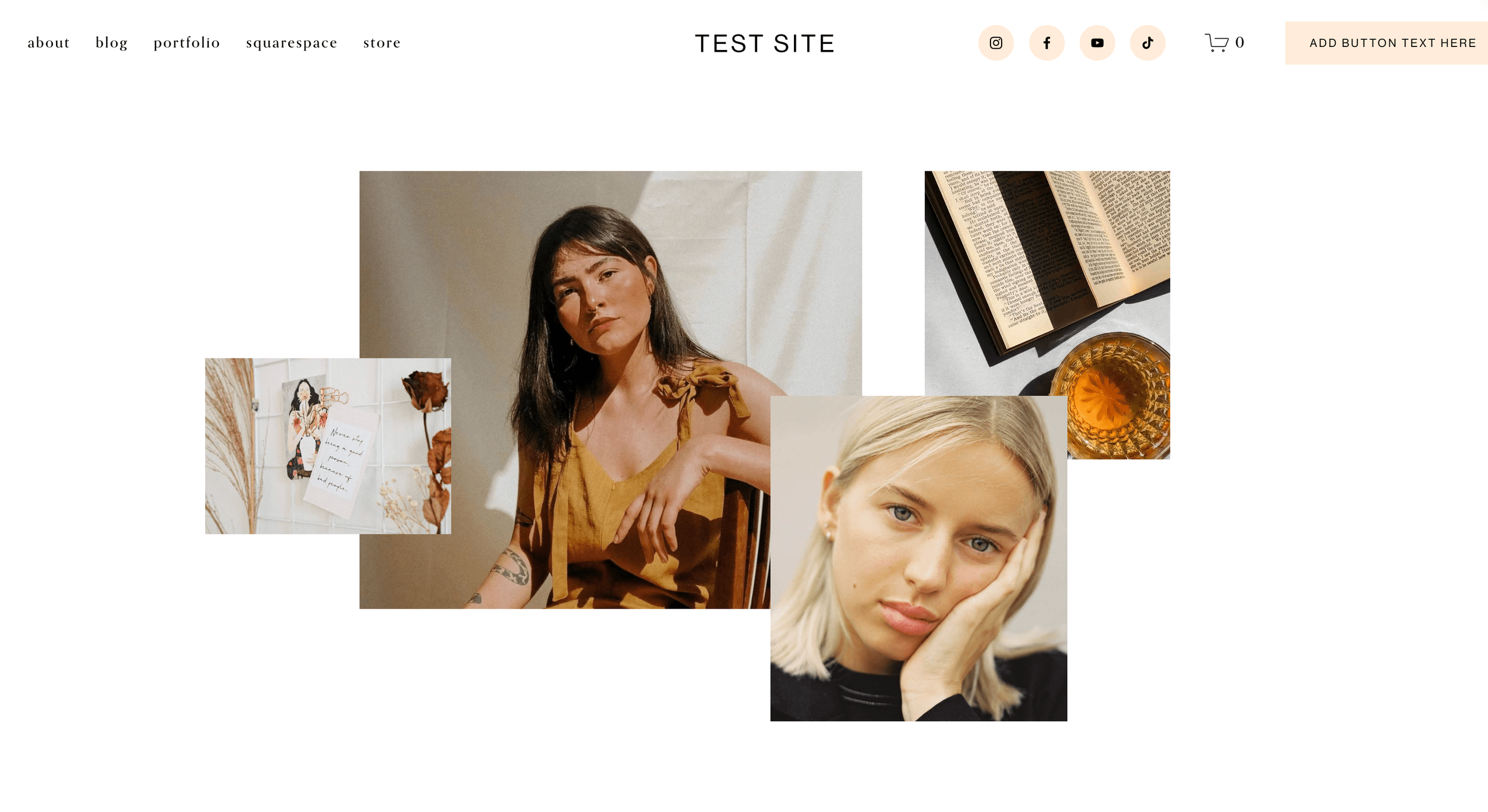
One of our favorite things about Squarespace 7.1’s Fluid Engine editor is the flexibility it offers when moving around and positioning individual blocks. This feature allows you to easily create unique layouts and designs that would otherwise only be achievable using custom code (something no DIYer has time for) - for example, overlapping content!
Overlapping your Image Blocks is a really fun way to create dynamics on the page and give your website a super custom and professional edge.
You can overlap as few or as many photos as you’d like, tweaking the design to fit your needs. The more images you include, the more collage-y it will look, but this style can also be just as effective with 2 or 3 images.
To achieve this design, you’ll first want to enter Editing Mode by clicking "Edit" in the top left corner of your screen.
You can then add your images to any section you’ve created by clicking Add Block in the top left corner and choosing the Image Block.
Once you’ve added your images, simply click and drag the Image Block to move it anywhere you’d like within the section! As you start overlapping, you can click on any Image Block and use the “move forward” and “move backward” icons to bring images to the front or to send them behind others.
👉 How to create overlapping sections in Squarespace Fluid Engine
2. Text Overlays
Another cool way to display images, especially if you’re a product or service-based business, is by using text overlays, which basically just means adding text on top of your image!
This layout is perfect for showcasing photos from a specific product collection or service package. It can also make a bold statement as an intro banner. Adding text enhances the visual impact and turns a simple photo into something more engaging. Plus, you can include buttons or links for extra calls to action, making this design both stylish and functional.
Achieving this style is really simple! However, there might be a couple of extra steps you’ll want to take to make sure that everything is readable and pleasing to the eye.
First things first, you’ll want to add both your image and your text to a section via Image and Text Blocks. Once both are added, you can click and drag the Text Block to move it directly on top of the image (or wherever else you’d like it).
Next, double click on the Image Block to open up its Settings and click on the Design tab.
From here, you can choose to add an Image Effect and/or Overlay.
Image Effects add an artsy feel to your photo with things like film grain, waves, parallax and more, while the Image Overlay allows you to add a block of color on top of your image that you can then make more or less transparent. This can be super helpful in making your text easier to read depending on how busy your photo is.
Example of the Film Grain Image Effect
Example of an Image Overlay
Alternatively, if you’ve added a section background photo, you can adjust the Image Effects and Overlay by clicking on the Edit Section button in the top right corner of the section and then clicking on the Background tab.
From here, you can add an effect to your background image and adjust the overlay's opacity to create a polished, professional look. And just like that—voilà! You’ve got a stunning text overlay with image effects to elevate your design
3. “Card” Layouts
This display combines images with multiple other elements to create a "card" style design perfect for highlighting services, courses, newsletter sign-ups, and so much more.
Versatility is at the heart of this style, giving you the freedom to build exactly what you need. By combining features like shapes, text, and buttons, you can create a custom composition that keeps your image as the focal point. With countless potential variations, your website will always feel truly one-of-a-kind.
To achieve this design, start by adding a shape to your section by clicking on the Add Block button in the top left corner and choosing the Shape Block.
Double-click the shape to open up its Settings where you can change the shape itself, as well as adjust the color and border.
Once you're happy with your shape, you can start adding to your card by positioning your Image Block wherever you’d like it and then, layering Text Blocks, Button Blocks, or any other content block you desire.
Think of these “cards” as mini graphics within your website! Use different font styles and colors to compliment the image you’re showcasing and make the display dynamic and enticing.
4. Image Shapes
Another one of our favorite features of the newer Squarespace 7.1 Fluid Engine editor is the introduction of built-in image shapes. This allows you to change the shape of your uploaded image with just the click of a mouse. Yes, please!
You can choose from circular shapes to angular shapes to even more abstract shapes. Squarespace has, so generously, provided us with a ton of options to choose from, so you’re sure to find something that fits your vibe.
Displaying your images as shapes is a fun way to maintain visual interest as visitors are scrolling through your website. It feels very custom and can breathe new life into an otherwise plain photo.
To convert your images into shapes, add an image to your section by clicking on the Add Block button in the top left corner and choosing the Image Block.
Double-click on the image to access its Settings and then click into the Design tab.
From here, click on the Shape tab and then click on where it says “Shape”.
You can then browse through the different shapes to find one that you like.
And remember to have fun with it! Try combining your image shapes with other layout styles, overlap them, mix and match, and get creative.
👉 How to Create Rounded Corners and Unique Shapes for Your Images in Squarespace (No Coding!)
5. Pinned Image Blocks
Next up is another newer Squarespace feature - Pinned Images.
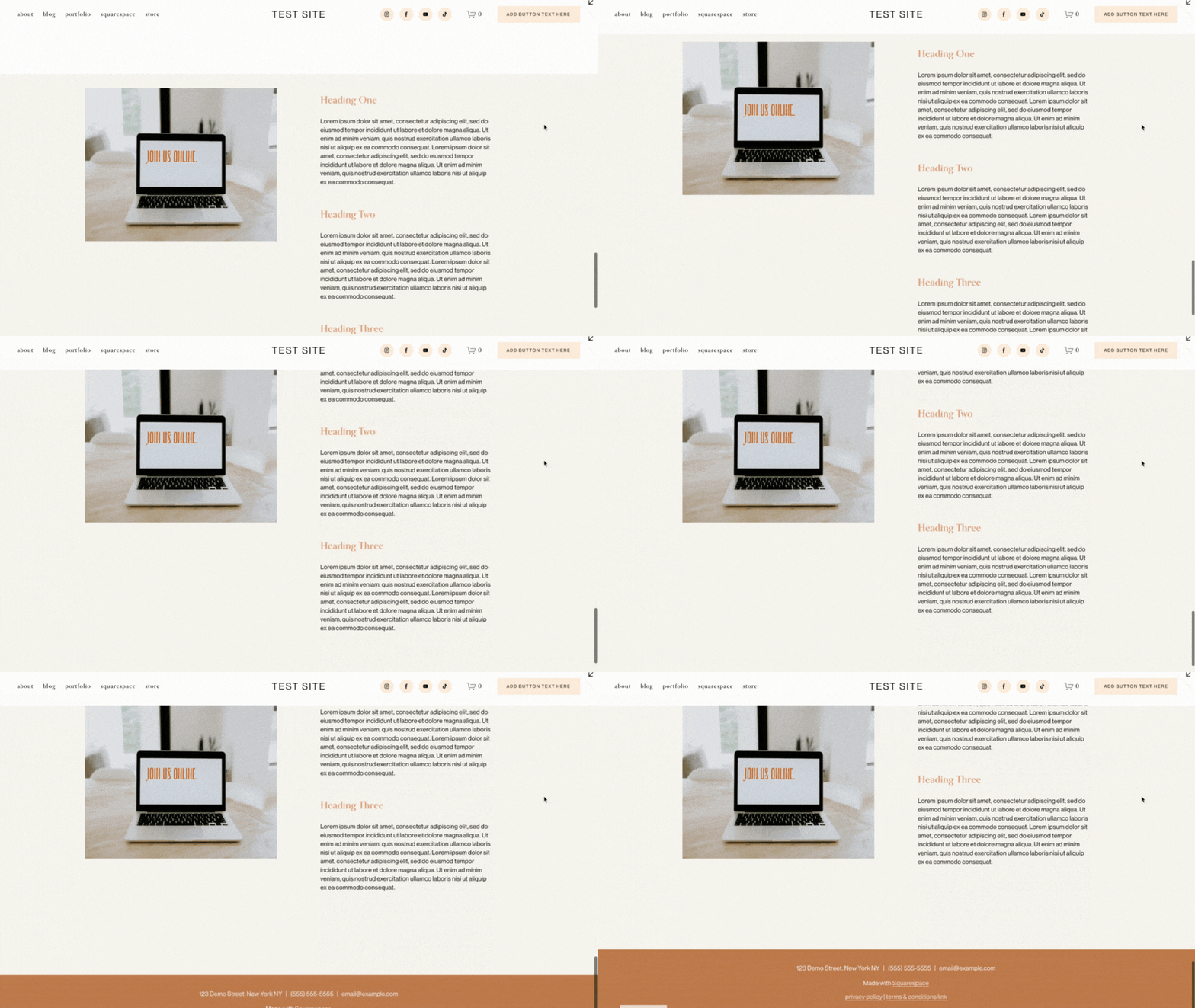
Technically, you can pin any block type (while using the Fluid Engine editor), but our favorite way to use this tool is to pin Image Blocks so that they remain fixed in place among any other content within the same section.
Pinning images helps to make layouts more dynamic, keep the focus on what’s most important and guide visitors through a narrative or product journey.
When you pin your images, you ensure that they remain relevant on the page and that no visitor misses out on an opportunity to be visually dazzled!
We have a full walkthrough tutorial all about pinning blocks that you should definitely check out if you want to master this style 👉 How to use Squarespace's new Pinned Blocks
6. Gallery Sections
Last, but definitely not least, we have to give a special mention to Gallery Sections because they’re one of those Squarespace features that you can never go wrong using.
Gallery Sections are perfect for portfolios or places on your site where you really want to show off your visuals because they are dedicated solely to displaying photos. You can choose from a bunch of different pre-designed layouts (like a masonry grid or slideshow) and even create full-width displays to really wow your visitors.
All you need to do is insert your photos, tweak the display settings a bit, and you’re ready to rock!
To add a Gallery Section to a page, first enter into Editing Mode by clicking “Edit” in the top left corner of your screen and then add a new Section anywhere on the page by clicking on the blue “Add Section” button.
In the Add a Section pop-up window, scroll down and choose the Images tab. The first 7 layout options under this tab are going to be Gallery Sections - signified by the little circled “i” icon which lets you know that those sections allow you to conveniently switch between layouts without needing to manually rearrange things.
Once you’ve chosen your Gallery Section, you can add your unique images by clicking on the Edit Gallery button in the top right corner of the section. In the pop-up window, you can delete and add images, add image descriptions and links, rearrange the order of your images, and also edit your images if needed.
You can also switch between the different Gallery Section layouts and edit the Gallery’s Settings by clicking on the Edit Section button in the top right corner of the section.
And there you have it! Our favorite ways to display images in Squarespace 7.1. These display styles not only look great, but are extremely functional which means you won’t be sacrificing sales for aesthetics.
Hopefully you find something in this list that sparks your interest and, with the help of Squarespace (our DIY web design hero), feel confident now to step outside of your image comfort zone.
If you're ready to take it a step further, be sure to check out our latest Squarespace 7.1 templates! They come pre-built with creative, personality-filled features and unique design elements that make standing out a breeze. Customize to your heart's content and watch your website come to life! 💻 🤩👇
Loved that post? Check out more customization tips below!
How to find and pick the perfect photos for your brand
Top 10 FREE stock image websites
The 4 best modern font combinations for Squarespace
How I create custom, branded icons in under 1 min
Liked this post? Pin it to Pinterest! 👇


