How to create a transparent header navigation in Squarespace (7.1 and Brine)
Your website header is one of the first things that your visitors will see and it plays a BIG role in how your visitors navigate around your site. The header typically includes your site name or logo and links to different pages on your website, but can also include social icons, buttons, a search bar, or a shopping cart.
Squarespace has plenty of built-in customizations for your website header that makes customizing your website so easy, one of them is the style of your header.
Most websites you visit will probably have a standard solid color as the background, but if you have a full-width image or video as your first section, a great way to take your website up a notch is to create a transparent header.
Transparent Website Header
There are a few different ways we can create a transparent header in Squarespace, and the way to do so will depend on which version of Squarespace you are using. If you're not sure which version of Squarespace you're using (Squarespace 7.0 or 7.1) check out these instructions.
Okay, let’s get into it, shall we?!
How to make your header navigation transparent in Squarespace 7.1
Transparent nav on a section background image or video:
First, go into your header settings by going into Edit mode on any page.
Hover over the header and click on Edit Site Header.
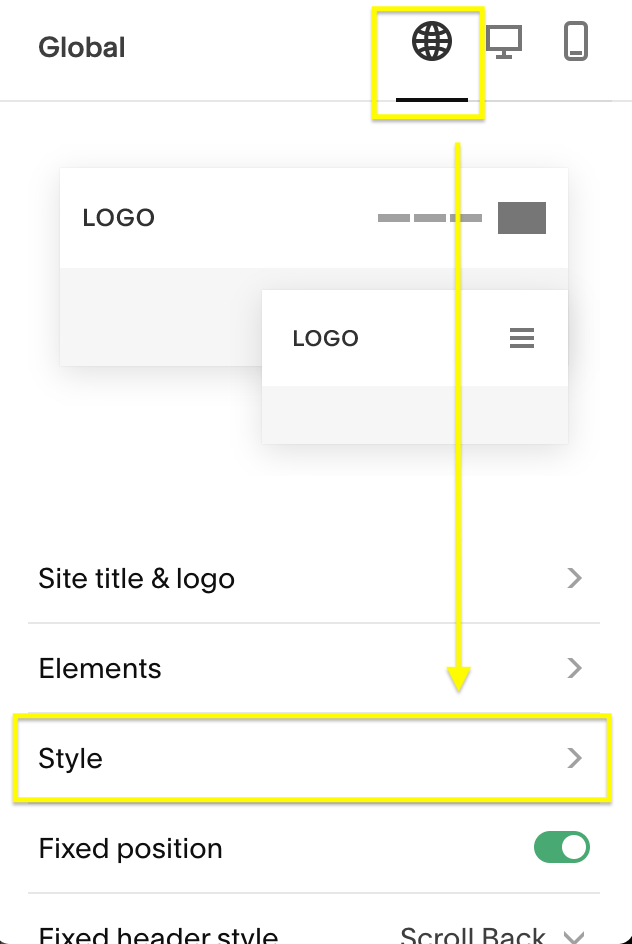
In the Site Styles pop-up menu, you'll see three tabs at the top: Global, Desktop, and Mobile. Select Global and scroll down until you find the Style option.
Under Style, select Dynamic from the drop-down menu.
That's it. You now have a transparent header!
Transparent nav on a gallery section slideshow:
If the top section of your website is a full-screen slideshow you can add the following piece of code to move the gallery up and underneath your navigation.
Make sure to follow the steps above to set your Header Style to Dynamic.
Then head to Design > Custom CSS and paste in the following code:
.page-section.gallery-section {
padding-top: 0px !important;
}
Instantly you should see your slideshow gallery move up to the top of the page and your menu should be sitting nicely on top! Feel free to adjust the code however you need to.
How to make your header navigation transparent in Squarespace 7.0
Not sure which 7.0 template you're using? Make sure to find out here before you dive into the instructions.
In the Brine template family:
In the Squarespace menu, head over to Design and then click on Site Styles.
Scroll down until you see the section “Header: Layout".
Change the position to “Bottom” for any of the following options you have in your header: Branding Position, Primary Nav Position, Secondary Nav Position, Social Position, Search Position, and/or Cart Position.
Once everything is set to a "bottom" position, the top nav color background will disappear.
Notes:
This will make the header transparent on top of a background image, a gallery, or a background video.
If you have a gallery at the top of an index page and you want to have your navigation sit on top of it, you will need to go back into Site Styles and scroll to "Index: Gallery" and click "Overlay Header on First Index Gallery"
In other Squarespace 7.0 templates:
Every Squarespace 7.0 template family has different functions, so the instructions on how to achieve a transparent header navigation area will vary per template. Many of the more popular templates (eg. Bedford) already have a transparent header by default!
If you're not sure how to achieve this in your 7.0 template, make sure to first look through the Site Styles as if this featured is built into your template this is where you will activate it.
If you can't find anything in the Site Styles, it might be that your template needs this feature to be coded in with some custom CSS to achieve the transparent look. If this is something you really want but can't figure out how to do yourself, reach out to our Extra Support service and we can help!
Regardless of which version of Squarespace you're using, Squarespace makes it really easy to create a transparent header. As you saw it only takes a few clicks of your mouse and you get a seamless introduction to your website that's sure to draw your visitors in.
For more ways to customize your website header, check out some of our other tutorials:
10 fun customisations for your Header Navigation menu in Squarespace
How to create a sticky header navigation in Squarespace
How to add a button to your header navigation in Squarespace
If you liked this post, Pin it to Pinterest! 👇🏻


