The main differences between Squarespace’s new Fluid Engine and the Classic Editor
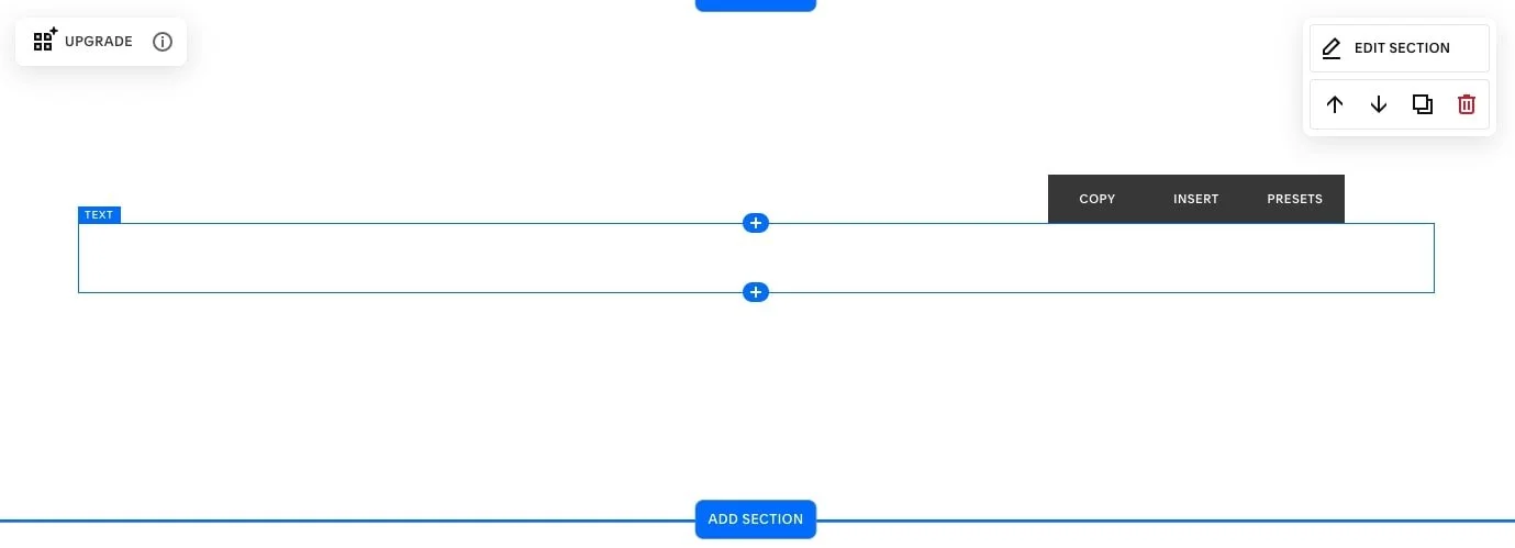
Squarespace just released a new content editing experience for Squarespace 7.1 called Fluid Engine. Fluid Engine will be the new on-page content editor for page sections that use blocks, eventually replacing the Classic Editor.
Classic Editor:
Fluid engine:
This new feature gives Squarespace 7.1 users more options and overall flexibility with block placements, allowing you to create layouts that were never possible with Squarespace's Classic Editor. This includes overlapping blocks, which took some heavy lifting with code before!
We do want to note that this does not take away or change any of the global design settings like Site Styles, nor does it take away any of the primary website settings. This is solely a new way to edit your page sections that use Squarespace's signature block layouts!
At first, it may sound daunting that there is this big change within Squarespace, but we're here to tell you it’s more exciting than difficult! It’s actually going to give you a lot more creative freedom when it comes to designing your website and laying out your content.
To ease into learning Fluid Engine we wanted to highlight a few of the key differences between Squarespace’s new Fluid Engine editor and the Classic Editor to show you what you can expect the new possibilities in the platform.
The main differences between Squarespace's new Fluid Engine and the Classic Editor
1. Grid-based Layout
The first main difference is the one we feel is the most important because it essentially defines the shift from Classic Editor to Fluid Engine. Fluid Engine allows you to work within a more flexible grid-based layout and no longer uses spacer blocks.
You’re probably used to adding spacer blocks in the Classic Editor to create space between the content blocks and/or positioning your content within each section. That now becomes a lot easier in Fluid Engine's grid-based layout. The grid-based layout will allow you to move blocks around more freely to build unique and creative layouts - this includes overlapping!
Currently, only regular page sections, footers, and portfolio sub-pages use Fluid Engine. The rest will continue to use the Classic Editor. Over the next few months we imagine the Fluid Engine will extend to Blog Posts, Product Pages and the other last few areas it's not yet in. Fluid Engine will never apply to List or Gallery sections as they are edited via section settings rather than on-page editing.
TIP: When working in a Fluid Engine section, click 'G' on your keyboard to make the grid appear. Press 'G' again to hide the grid.
2. Fit or Fill Blocks
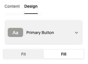
In Fluid Engine, image and button blocks now have settings that control how they work within the grid. The new settings are called Fit or Fill.
If an image or button block is set to Fit, the block will stay the same size as intended. The image will be as you upload it and it will not be cropped at all, and the button will use padding that is set in your Site Styles.
If an image or button block is set to Fill, the image or button will fill the entire space of the block container, where ever you have adjusted this in the grid, there will be no padding in the block container.
Button Design Settings
Button set to FILL
Button set to FIT
Image Block Design Settings
Image Block set to FILL
Image Block set to FIT
3. More Block settings
While the same set of blocks are available between the Classic Editor and Fluid Engine (except the Spacer Block!), with the new FE launch Squarespace released a bunch of new and different block settings.
Every block has it's own set of settings and some have much more settings than others. Above we talked about the new Image and Button settings, but there are an array of new settings that are showing up for other blocks in this new editor.
Blocks now have their own block alignment, so you can align the content within a block container (top, bottom, center, left or right - depending on block!)
Because we can now overlap blocks, you'll see that in every block's settings you can choose to bring-forward or move-backward, which helps you stack your blocks in the correct order.
Text block color backgrounds! You can now apply a color behind your text block with the click of a button (TIP: This color is edited within the Site Styles)
We've also seen new scalable text with the text block tool bar, which is awesome for large page headings.
We imagine there's tons of new settings that will be released over the next few months, so make sure to always check your block settings!
4. Section Settings have changed
With the new Fluid Engine sections come new Fluid Engine section settings. Let's dive a bit deeper into what the new Fluid Engine style settings are:
Row Count: Editing the row count will allow you to control the number of rows you have in your section's grid to make the section bigger or smaller!
Gap: Customizing the gap setting will change the space between units in your grid. If you want a bit more white space in between your content you can play with the gap setting to adjust for this. Or if you're going for a more condensed look and feel you can remove the gap!
Viewport or Fill Screen: Enabling the viewport setting will give you more control over the height and alignment of your section content.
These settings are very similar to the Classic Editor settings, and are optional. Because you have control of height and alignment with the grid, this settings feel a bit redundant, so if you're not 100% sure how to use them, don't worry about them and just use Row Height and Blocks to control height and alignment!
Height: You can adjust this feature to change the height of your section. This is done by adding padding to your section outside of the grid.
Alignment: You can change where you want the extra height padding to appear. For example, if you want to align your content to the top of the section, the padding would go underneath the content. Aligning the content in the center would push the padding above and below the content and aligning the content to the bottom of the grid section, would add the padding to the top of the content.
5. Independent Mobile Layout
Ok, this just might be our favorite difference between Fluid Engine and Classic Editor. Ready for it? In Fluid Engine designing for mobile is now completely separate from desktop! This is a huge asset because you now have complete control over your site’s mobile design, just like you would on desktop.
According to GlobalStats, around 60% of internet users are using their mobile devices, so it’s more important now than ever that the mobile version of your website looks and works as well as the desktop version.
Squarespace’s Classic Editor automatically optimizes the desktop website for mobile, and while this is convenient and set Squarespace apart from its competitors, it also forces content blocks to be displayed in ways that don’t always look the best cohesive on mobile.
This upgrade with Fluid Engine will reduce the need for custom code to get your mobile site just right.
To edit your mobile site, click the mobile icon in the top-right and edit on page just as you would on the desktop editor!
What's missing from Fluid Engine?
Right now, there are a few things we loved about the Classic Editor that haven't been carried over to the new Fluid Engine. This biggest things we miss are:
1. Image Block Layouts
Collage, Stack, Overlap, Card etc. If you used these in Classic Editor before, you're going to miss them in the Fluid Engine. While we can create all of these designs by using a variation of blocks and the grid based overlapping, it would just be easier and a lot faster if we could have our beloved Image Block Layouts back!
2. Image Block Animations
In Squarespace 7.1 we can add site-wide animations in our Site Styles, which is awesome. But unfortunately Fluid Engine has (maybe accidentally?) taken away individual Image Block animations. Sometimes site-wide animation is a bit much, just too many things moving on your page, and it's nice to have the ability to animate individual blocks. This is something that hasn't been carried over to Fluid Engine.
3. Text Wrapping
The ability to wrap your bodies of text around images has also unfortunately disappeared! But we’ve got news from Squarespace that they are working to bring this back.
There's a few other small things missing, and some things that they need to tweak and fix, but overall Fluid Engine is a pretty solid web design editor!
For the parts that are missing, or you are having trouble with, it's important to submit a support request to Squarespace so that they can track the requests and know exactly what their customers want added back and want fixed.
Like with most things, switching to a new interface will take some time to learn and adapt, but we hope that understanding the main differences between Squarespace's Fluid Engine and Classic Editor will help you more easily navigate and learn the new features!
Using fluid engine on an existing site
If you want to get a head start with Fluid Engine, we recommend starting a new trial site and playing around with it! When you’re ready, you can convert any existing sections from your 7.1 site to Fluid Engine by clicking the “Convert” or “Upgrade” button that will be on your section. You can learn more about how Fluid Engine will affect your existing site and page sections here.
Make sure to keep an eye on this blog and our youtube channel, as we continue to create new tutorials around Fluid Engine! You can also sign up for those tips directly to your email inbox.
squarespace Fluid Engine templates
ALL of our Squarespace 7.1 Templates have been adapted for the new Fluid Engine! In the template process we walk you through the new Fluid Engine and everything you’ll need to know to customize a template and more within the new 7.1 Fluid Engine editor. If you love the idea of DIY but don’t want to start from scratch with FE, check out our pre-made templates. All you need to do is customize + launch!
If you liked this post, Pin it to Pinterest! 👇🏻


