

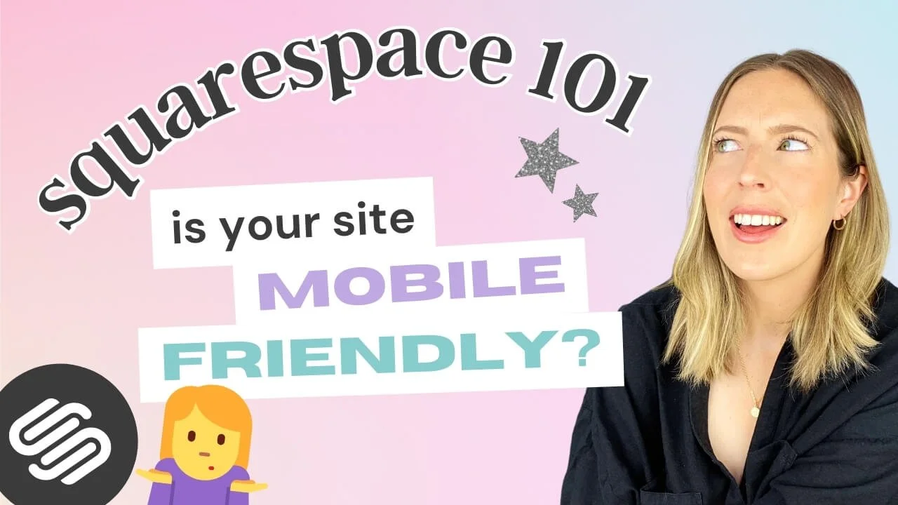
Mobile Optimization: Creating Responsive Squarespace Sites
In today's digital world, it's hard to go a day without using your phone. Let's face it, just about everyone has a smartphone on them at all times, and whether they use it for their latest fit check, to scroll TikTok or Instagram, or quickly look something up, this handy little tool has become an indispensable aspect of our everyday lives.
Mobile browsing, shopping, and general interacting is very quickly becoming just as common (if not more!) than doing so on your laptop. And as a crafty business person, that means that you need to make sure your website works just as well, and looks just as good, on mobile as it does on desktop.
A mobile-optimized site means your site visitors will have a seamless user experience. This makes your business more accessible, it can also boost engagement, improve your SEO, and lower bounce rates (because how often have you looked something up on your phone and the site looked so bad that you quit 🤮 ).
To help you achieve that flawless mobile experience, this week, we're talking all things mobile optimization, why Squarespace is great for that, and the steps that you can take to make your Squarespace mobile site shine!
Let's dive in!
Why Mobile Optimization is Key
Because so many people are browsing uniquely on their phones these days, you want to make sure that your website is clear and well-designed when scaled down to such a small screen.
This means no squinting, no endless scrolling, and definitely no giving up and closing the browser because your site is difficult to read, poorly structured or glitchy.
Mobile optimization is simply the process of adjusting your website so that it looks good and works well on a smaller device like a phone. Here are some key elements that make a website mobile-friendly 👇
Key Elements of a Mobile-Optimized Site
Responsive Design
Having a responsive design means that your website automatically adjusts to fit the screensize perfectly, no matter what device someone is using to view your site.
If you're using (or planning to use) Squarespace, then your website is responsive by default and Squarespace will automatically scale down your website to look (relatively) good on any screensize without you having to do a thing! This includes:
Flexible layouts: Squarespace automatically stacks columns on top of each other instead of sitting side by side when viewed on a smaller screen, ensuring that your site's content can be displayed clearly and be readable.


Independent mobile editor: Squarespace 7.1 sites using the Fluid Engine editor can customize their mobile site almost entirely independently, over-riding Squarespace's automatic adaptation for a more unique and streamlined mobile site (more on that below!).
Adaptive images: All images on your Squarespace site will be scaled so that they fit well on different screens, ensuring that they don't get too big, taking up all the space, or too small that they can't clearly be seen.
Readable text: Similarly, all text adjusts so that it’s easy to read without having to zoom in.
Touch-friendly: All buttons and links can be tapped with a finger on any touchscreen.
Fast Loading Times
Having a site that loads quickly is crucial to keep visitors on your site and engaged. In today's fast-paced world, people expect things to happen quickly, especially when they are browsing on their phones.
If a website takes too long to load, most people will just give up and go somewhere else, costing you precious traffic!
But it's not just about keeping your site visitors happy. Search engines like Google also pay attention to how fast a website loads on mobile devices. They want to make sure users have the very best experience, so if your site is slow, it might not show up as high in search results, making it harder for new people to find your site.
While Squarespace does automatically optimize your site for mobile, there are a few extra things that you can do to ensure fast loading times:
Optimize your images: Large images contribute significantly to poor loading speeds on mobile, given that they require more internet data and stable connection to load, which may not always be available when you're on the go. Make sure all the images that you upload to your site are compressed to aim for a page size below 5MB, and renamed to improve your SEO.
Minimize code: Similarly to large images, custom code can slow your website right down. Try to use Squarespace's built-in features where possible and keep your code tidy.
Enable AMP for blog pages: Squarespace has a handy Accelerated Mobile Pages (AMP) feature that can be enabled to improve your blog's loading speed. While it does strip your blog posts' looks down to the basics, faster loading times mean that visitors will be more likely to actually read through it, as well as rank better in Google.
Easy Navigation
A website's navigation should be intuitive and straightforward on any device, but scaling down your header navigation menu links can make them unreadable, busy, or in the way.
Squarespace automatically turns your navigation menu into a dropdown with a "hamburger" icon that is easily accessible in the top corner of all the pages on your site to save space and make it easy to use on a smaller screen.


The hamburger icon and pop up mobile menu are both also customizable in Squarespace to help you create the very best mobile-friendly version for your customers.
👉 How to Customize your Header Navigation in Squarespace 7.1 Fluid Engine
👉 How to Adjust Your Mobile Menu in Squarespace
How to Optimize Your Squarespace Site for Mobile
Choose a Mobile-Responsive Template
If you haven't got a website just yet, or are planning on a major revamp, then why not start with a website template that has already done all the work for you?
All of our premium Squarespace templates have been strategically designed to look just as good on mobile as they do on desktop, prioritizing responsiveness, fast loading speeds, and easy to read layouts.
We've put in the work to entirely redesign the mobile version of each of our Squarespace 7.1 templates, meaning that each template comes with a completely custom mobile design that you can fully control and adapt to any changes you make. Plus, we teach you how to do it all yourself in our extensive Squarespace tutorials included in the template resources 👏
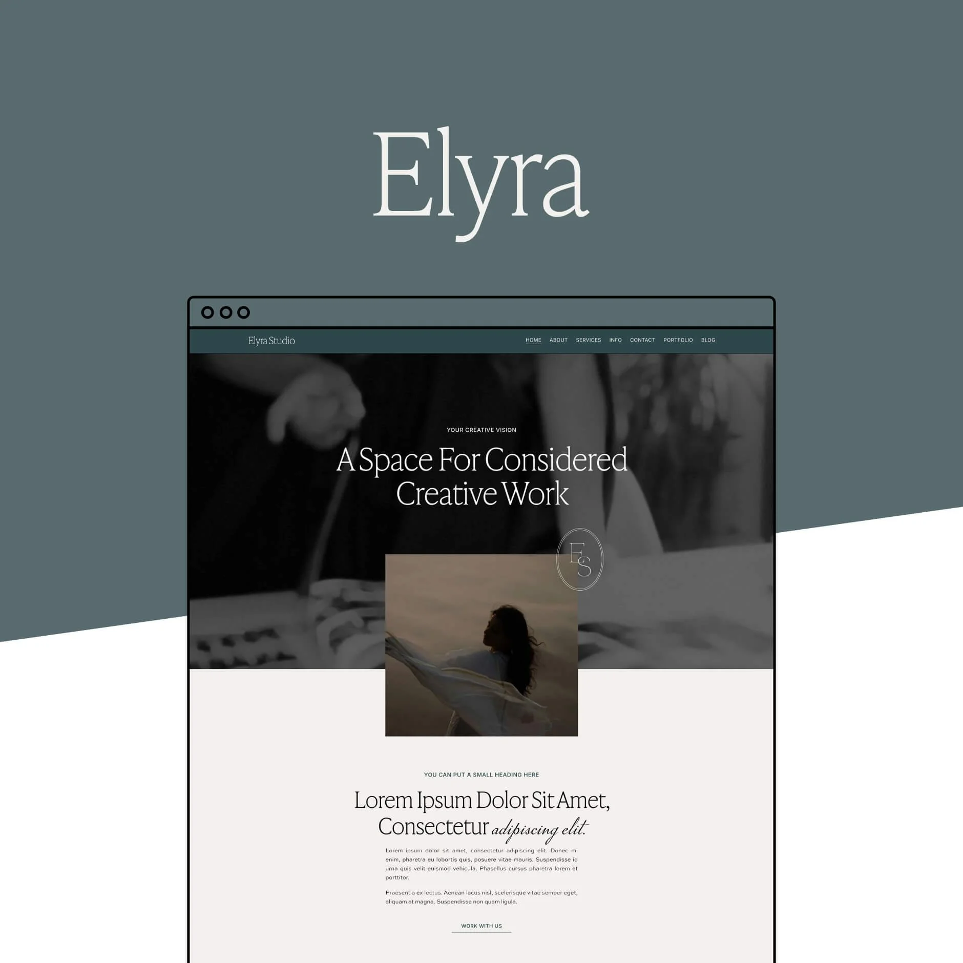
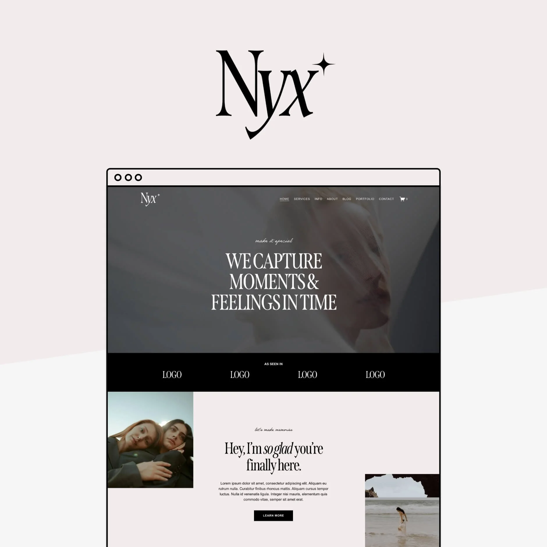
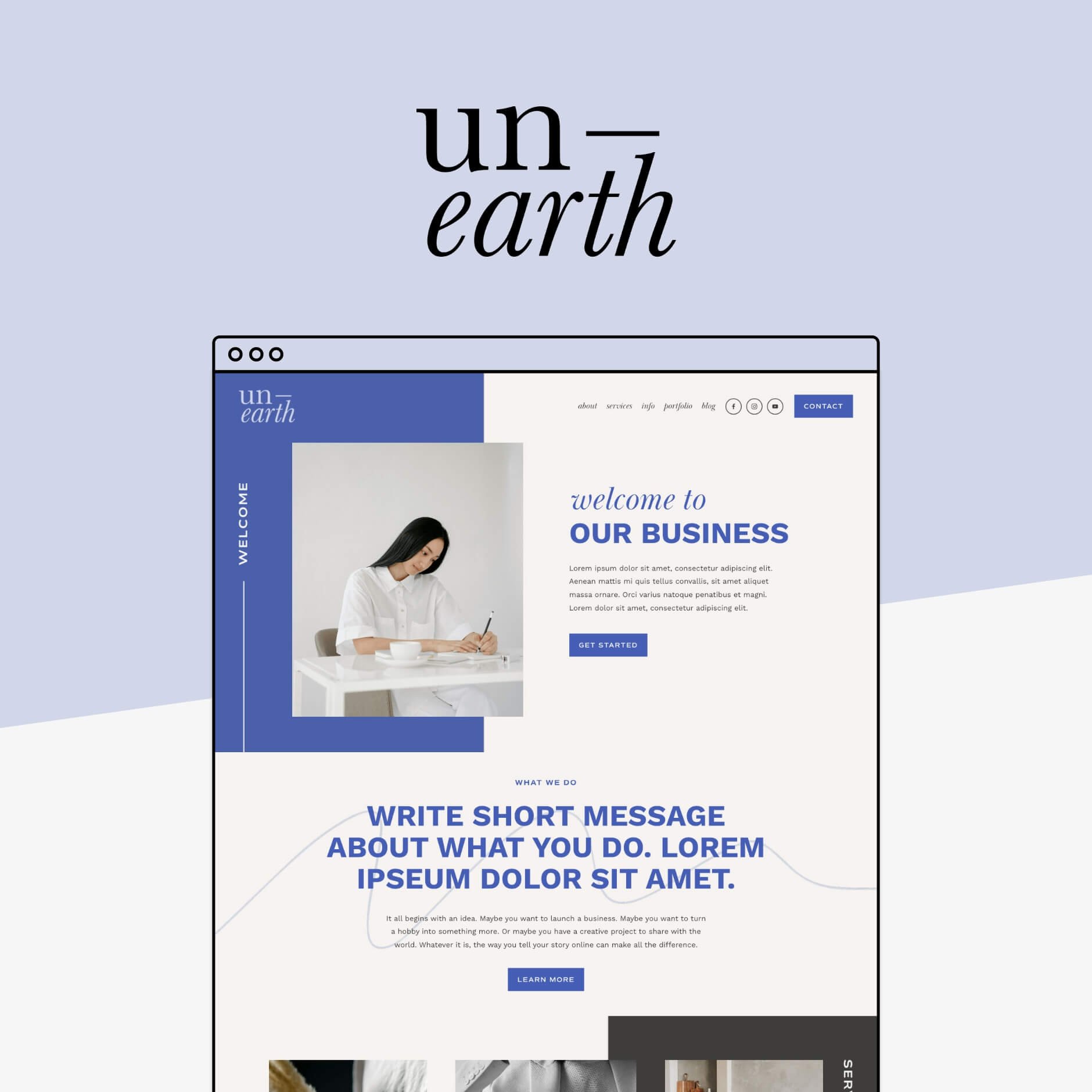
To check out exactly how the mobile version of your favorite template looks like, view the template demo site by clicking the View Demo button at the top of each template page, either directly on your mobile, or on your desktop by scaling down your browser window to be roughly the dimensions of a mobile screen.
Make sure to look for templates that maintain a clean and organized layout on smaller screens that would work well with your content.
Not sure which template is right for you? Check out our full guide on picking the perfect template for your business.
Customize Your Mobile Layout
If you have a Squarespace website that you DIYed yourself, or are planning to do so, knowing how you can customize the mobile version of your site is a key part of the process.
In Squarespace 7.1 (Fluid Engine)
One of the things that we love most about Squarespace 7.1's new Fluid Engine editor, is that you can actually customize your mobile site almost entirely independently from the desktop version, meaning that you can reposition blocks and create a totally unique mobile design to take mobile optimization to the next level!
To view and edit the mobile version of your Squarespace site, click on the mobile icon in the top right corner of your site. Your site preview will automatically adapt to mobile view.


Click EDIT in the top left corner and edit each section just as you would on desktop as the general function is the same!
👉 How to edit in Squarespace 7.1 with Fluid Engine - Best practices & tips
What is Independent?
Block position: You'll be able to rearrange and resize any block in any section on mobile to create a totally new layout if you like.
Row count: You'll be able to adjust each section to be shorter or longer depending on how you position the blocks to make sure there is no unnecessary space.
What is not Independent?
Block content: Block content like photos in image blocks or the color and alignment of text in a particular text block, are global and will affect both desktop and mobile. You also can't delete blocks (though you can sneakily hide them behind others or with some CSS if need be!).
Colors, fonts, and site styles: Your site styles are global and will remain the same across desktop and mobile. There are some distinct settings for certain mobile only elements (like your mobile logo for example) but not many.
For mobile editing best practice tips, check out the posts below:
👉 How to customize your mobile design in Squarespace 7.1 Fluid Engine
👉 Hacks to make mobile editing in Squarespace Fluid Engine faster
In Squarespace 7.0 or Classic Editor
While it is not possible to design your mobile site separately in the older Squarespace 7.0 or Classic Editor, Squarespace will automatically optimize the mobile version of your site for you.
Though it can look a little bit clunky and is limited in terms of customization, there are a few things that you can do when creating the desktop version to ensure the mobile view is at its best!
Spacer blocks: To remove extra spacing in mobile view, add two spacer blocks side by side on desktop instead of one long one as they will cancel each other out!
Focal points: If you don't like how an image is cropped when resized for mobile, adjust the focal point in desktop to where you would like the image focus to be. This will be reflected in mobile view and is particularly relevant for background banner images.
👉 Read more about Squarespace mobile design hacks here
Test Your Site on Multiple Devices
Once you're happy with your website design, testing how your site actually looks on various devices and browsers is essential to make sure you're providing a consistent experience for all users!
Simply open up your website on your phone, your mom's phone, your aunt's ipad, and your dad's computer to see how it's all looking and if you can make any changes to better it.
You can also use tools like Google's Mobile-Friendly Test (aka Lighthouse) to check your mobile site's responsiveness and identify any issues. These tools provide helpful recommendations that you can take onboard and fix, like images that should be optimized, unused CSS that can be discarded, or text that is difficult to read.
Optimizing your Squarespace website for mobile is a critical step in providing an the very best user experience that you can and boosting your site's performance. By focusing on responsive design, fast loading times, easy navigation, and utilizing Squarespace's customization tools, you can create a mobile-friendly site that looks and works great!
Want more Squarespace tips? Check out these posts 👇
How to change your mobile logo in Squarespace (Squarespace 7.0, 7.1 + Fluid Engine)
How to center-align text in mobile ONLY in Squarespace
How to customize your Squarespace footer and what to include in the design
How to move from Squarespace 7.0 to Squarespace 7.1
Squarespace SEO: Boosting your Site's Visibility with our go-to SEO Checklist
If you liked this post, Pin it to Pinterest! 👇🏻
