

Hacks to Make Mobile Editing in Squarespace Fluid Engine Faster
Squarespace launched their Fluid Engine editor mid 2022 and with it, we got more creative control and flexibility. One of the most exciting changes that they made was that they gave us the ability to customize mobile layouts independently of desktop designs. With approximately 58% of all website traffic coming from mobile devices, this function is now more important than ever!
However, the downside to this is that we have to make sure we are adapting our desktop AND mobile site separately. While this is necessary for good, responsive website design, it can still end up taking a bit of extra time!
So that’s where this article comes in handy! As people who design websites with Squarespace all the time, we’ve come up with some handy hacks to make mobile editing in Squarespace Fluid Engine faster. So hang tight and keep on reading!

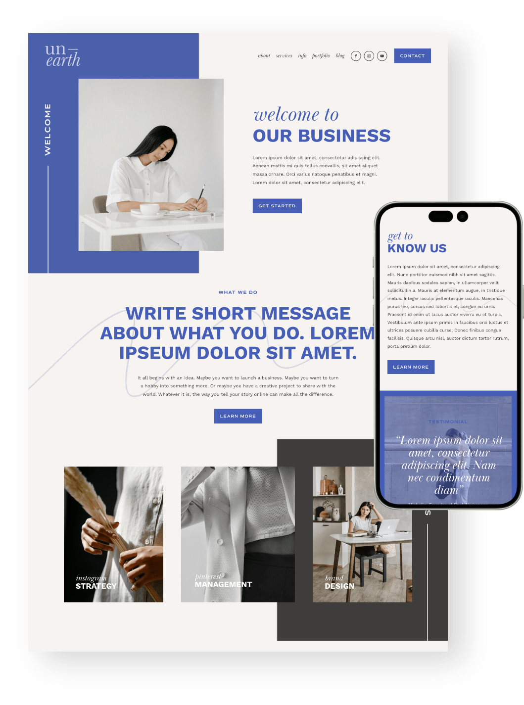
PS. Did you know that all of our Squarespace Templates are optimized for mobile from the get go? Not only will you get a beautiful design to start with, but you’ll also get hours of our most up to date tutorials all about learning Squarespace. Check them out below! 👇


Use Arrow Keys to Move Your Blocks
(Instead of clicking and dragging with your mouse!)
If you’ve tinkered with Squarespace’s Fluid Engine, you’ll know that dragging a block from one position to the next can be a bit glitchy. Rather than using your mouse to click + drag blocks around, use your arrow keys instead.
Because Squarespace’s editor snaps blocks into the grid, using the arrow key will give you a more streamlined and accurate experience. Plus, when blocks begin to overlap, you won’t have to worry about grabbing the right one!
Use the Up-Down “Order” Mobile Arrows
We mentioned in this article that Squarespace now populates the mobile layout according to the order in which you added the block to your desktop design (not according to where it is on your desktop design).
This means that sometimes (well, most times!) your blocks are going to need to be rearranged.
Speed up the process by using the up-down “order” mobile arrows to quickly change the flow of your mobile website. Pressing the “up” button moves a block so that it goes above the block on top of it and pressing the “down” button moves the block under the block beneath it.

Note: They are working on a new system to adjust this to adapt the blocks to where you have added them on your desktop page, rather than the order in which you added them. So you might notice soon that when you're building, the blocks on mobile look pretty good! But it will never be perfect, and you'll always have to adjust.
Use More Sections on Your Page
Instead of putting all your content in one really long section, use multiple sections to create your page.
If you want to keep the look of one section, rather than multiple sections, set the section themes to the same color and decrease the section padding to 0. This will give the exact same effect.
When you want to move things around, simply use the up-down buttons to shift sections around. This will make things easier (and faster) especially in mobile.
If you have one long section, shifting items on mobile can be slow and glitchy. Think of having more sections as working in "small chunks".
Use the "Row Count" in Settings Instead of Dragging the Blue Arrow to Reduce Section Rows
An exciting thing about Squarespace Fluid Engine is that you get to determine the size of your section without needing to add Spacer Blocks.
But you'll notice when working with Fluid Engine that a lot of the time extra Rows get added to the bottom of your section, and you need to remove them. This happens a lot on mobile!
If you do find yourself with a ton of extra rows that you need to remove on your mobile site, we recommend getting into a habit of using the Row Count in the Section Settings panel instead of trying to drag the blue arrow up and down. The dragging function on mobile editing tends to glitch, but the row count in settings doesn't.
Open up your section settings, click inside the Row Count, then use your up and down arrow keys to add or remove rows. From our experience, this is the most seamless way to do this, without glitches!

Squarespace has been working hard on making a lot of improvements to Fluid Engine and the mobile editor. Though we can all agree that it still needs a lot of work, we have seen a lot of small changes over the last few months that have made a big impact! I hope these tips help you design faster.
For more on editing with Squarespace’s Fluid Engine, check out these articles:
How to customize your mobile design in Squarespace 7.1 with the new Fluid Engine Editor
What is the new Fluid Engine Editor in Squarespace, and should I use it?
Using Squarespace 7.0 or 7.1 Classic Editor? Check out this post:
Want a Squarespace Template that's already mobile and conversion optimized?
I hope you enjoyed this post and learned a bit about email marketing and where to start. Good luck!
If you liked this post, Pin it to Pinterest! 👇🏻
