

6 top tips for designing & optimizing your website homepage
They say you have about 7 seconds to make a strong impression when you first meet someone. Now, that information has been around a long time, I remember hearing it when I was just a kid. In this digital age of instant gratification, super-speed everything and total impatience (speaking for myself here), I’m going to go ahead and assume that it takes a lot less than 7 seconds to form an first impression when you land on someones website.
The first place people are going to land is likely going to be your homepage, so, how do you form a first impression that actually keeps them there much longer than 7 seconds? And from that, an impression that makes them attracted to your business and likely to buy from you?
I know that I form impressions very quickly and make snap decisions when it comes to whether I stay on a website for long or not. I usually give a website a few seconds of my time (max!), and if something’s off, I leave without thinking twice.
The two main umbrellas of problems I found are:
I can’t figure out exactly what you do / what you’re offering
A variety of bad design elements
So I decided to make a concise list of the mistakes I consistently see, and what you need to do instead to get people to stay on your website for longer, and hopefully turn into customers!
It’s really not that hard to put a bit of strategy behind your homepage. And it’s likely that you have all of the elements and resources to do it, so hopefully this guidance can help!
Let’s get started!
What is your message?
When you’re building your homepage, you want to be able to instantly capture your visitors with:
What you do, who you do it for, and why you do it.
This message should be front and center, easy for anyone to see. When potential customers land on your website, they need to know exactly what you’re all about straight away, and they shouldn’t have to go searching for it.
Keep it concise and clear, use simple language and make sure that someone who has no idea what you do, would know exactly what you do after reading it.
Now, I’m not saying you need to sound like a robot, feel free to put your own fun spin on it, but make sure it’s easily understood. Sometime’s there’s so much “spin” on a branding message that it’s just really confusing.
Make sure to include the three elements: 1. What you do. 2. Who you do it for, 3. Why you do it.
Example: I create Squarespace Templates for small business owners so they can DIY their dream websites easily and quickly.
Visitors want to know what you do ASAP, if they can’t figure it out, they will leave. So don’t be vague, the first copy on your website should be this message.
Make it clear what you want your visitors to do
Before you can do this, you need to know what you actually want them to do.
Do you want them to book your services? Buy a product? Sign up to an email list? Read a certain Blog Post? What is your end goal for your visitor? This is different for every business.
Try working backwards, for example: if your end goal is that you want someone to book your services, they will need to contact you first. Before they contact you they will need to read a bit about what services you offer.
So, your homepage priority would be to direct visitors to your ‘services’ page where they can read more about the services you offer. And from the services page, you would have a very clear “contact” button or even a contact form on that page to book you!
If you goal is to get them onto your email list, then one of the first things you’re going to put on your homepage is a big and obvious opt-in!
The goal is to guide your visitor to do exactly what you want them to do! And it all starts on your homepage.
This section should sit nice and close to the top of your page, if not the very top, and somewhere next to your brand message. So your visitors can instantly know what you do, who you do it for, and why you do it. Then, if that is what they’re looking for, the next thing they will see is an opportunity to learn more about it. And the rest is history.

Cut down on Homepage copy clutter
A homepage with too much text will instantly put people off.
Remember before when I talked about no patience and instant gratification? Well, people don’t have the time to read paragraphs on paragraphs of text.
If this was a blog post, or even an about page, this might be a different story. But this is your homepage, where you want to capture your visitors interest within seconds.
You want to only give them the most important information in the shortest, easy to digest way possible.
Your homepage is an overview of what you can offer, and if you make a good impression, your visitor will click through to another page to learn more about this offer. This is when you can give them some more detail, once you’ve already hooked them in!
Take those long paragraphs of text you have written off your homepage and put them on their appropriate learn more pages.
Declutter your Main Navigation
Now we’re getting into the design nitty-gritty of the homepage.
Keep your main navigation clear of any links that aren’t really important. My website probably has about 20 pages, but you’ll never see more than 5-6 links in my navigation.
Again, think about what you want your visitor to do. What is your end goal?
For example: I have“resources” page on my site so I can show people all of the awesome tools that I use in my business. Yeah, it’s a great page and it’s helpful for people, but is it helping me with my end-goal of selling products? Not at all. That one is definitely going in my footer. On the flip side, my “Shop” link definitely stays in my main navigation, because that’s what I really want people to do.
Weigh up what’s most important, because not all 10 of your pages are top-navigation level important, I can guarantee that! And what you do by having them all up there is confuse you visitor, they’re not sure what action to take and they might not even make it to your “Shop” (or whatever your equivalent is).
Also, add a Search Bar to your navigation! Seriously, these things are invaluable, especially if you have a Blog or website with a lot of pages. I would recommend having it in the top header if possible (at least have one in your footer!).
Add Social Media links, if they’re relevant
This is a bit of a controversial topic, I’ve heard peoples arguments for and against having your social links on your website.
The people who are against it argue that you don’t really want people to navigate away from your website, you want to keep them on there as long as possible.
While that is a good point, I think these days we can connect on an even deeper level with businesses who use Social Media, and I know for a fact that if I stumble across a website and business I like, I always want to make sure I’m following them on at least Instagram (because Instagram is my jam!)
So, I recommend making it as easy as possible for people to find you on social media.
Again, this goes back to the idea of guiding your visitors into what you want them to do. Maybe they didn’t go over to your services page yet, but following you on social is an awesome first step!
But, here’s the catch: If you don’t have an active social media presence, do not add it!
For my business, I actively use Instagram and Facebook. Instagram much more than Facebook, so, you will likely see me telling people to follow me on Instagram much more often than I talk about Facebook. And you definitely won’t see me asking people to follow me on LinkedIn or Twitter.
Even though an Instagram feed is pretty on a website, if you’re not actively using Instagram to promote your business, then don’t promote your Instagram on your website! The same goes for any social link.
At that point, it’s just a link that takes someone away from your website and is doing nothing beneficial for your business.
Just good design
There’s nothing more instantly off-putting to me than a homepage that has been poorly designed.
So far we’ve been talking about strategy and where to place things, but now I’m talking about the actual design of the site. The colors, fonts, images, spacing…
Maybe I’m bias and particularly picky, being a designer myself, but the fact of the matter is: good design sells. That’s why I have a job.
Good design gives your business legitimacy. If you land on a website and the first thing you think is “woah, this is obviously DIY’d”, you’re going to automatically think that this business is small-beans compared to something that looks professional and sleek. Right? It doesn’t matter which business is actually better here, because for all we know if could be the badly designed one, it’s just about appearing better.
And “better” is different for everyone, there’s no cookie cutter perfect website design I’m suggesting you use. Your design needs to reflect your business style and attract your ideal customer, which will be different for every business.
But there are design standards that need to be met, like: clear and high quality images, nice fonts and font hierarchy, optimized for different size screens etc.
And I’m definitely not saying go spend thousands of dollars on a professional site design, please, don’t do that! I’m a huge advocate for a good DIY, that’s literally what my whole business is based on! But there’s a world of difference between good DIY design and bad DIY design.
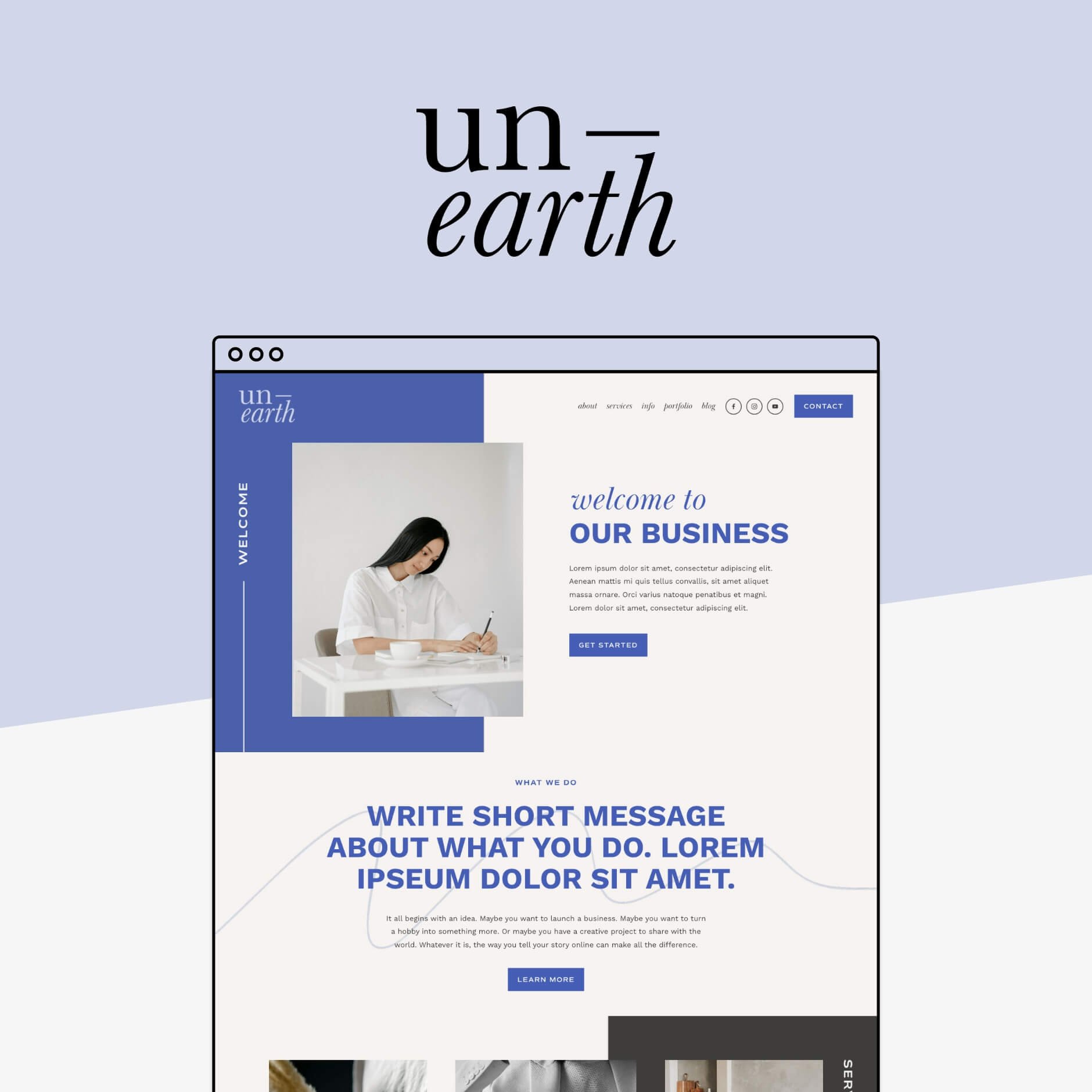
There’s lot of options these days for people who have literally no idea what they’re doing when it comes to design! (No judgement here, there’s a lot of things in life where I have no idea what I’m doing). Like our Squarespace templates, for example! Or any other type of website template. These are a great middle point between DIY and Designer.
Or if you do have the budget to spend, investing in a custom site design is going to get you a great result, too. Just make sure you’re not dipping too deep into those savings to do it…
If you do need some web design help, check out our easy to use Squarespace Templates


So, that’s my list of top 6 ways I think you can improve your homepage!
Remember, it’s a dance between strategy and design. Both are important and they need to work together if you’re going to see real results from your website.
Now, go through your homepage and make sure that you have everything in this list!
Want more web design tips? Check out the blog posts below!
6 blog design tips for Squarespace
How to change the background color of a single page in Squarespace (Brine template)
5 simple ways to add a Portfolio to your Squarespace website
How to upload custom fonts to Squarespace
How to add a header video to your Squarespace 7.0 or 7.1 site
Pin this to Pinterest!
