

How to Adjust Your Mobile Menu in Squarespace (7.1 and 7.0 Brine)
Today, about 50% of internet traffic comes from mobile phones, and that continues to climb every year (Source: Statista).
That means it's just as important to make sure the mobile version of your website is optimized just as well as the desktop version.
Luckily Squarespace makes optimizing your mobile site a lot easier with its built-in responsive design, which resizes your content and images to fit different devices and screen widths. And with the recent launch of Fluid Engine, Squarespace's new content editor, you can edit your mobile site completely separate from the desktop version!
One of the most important parts of your website, regardless of screen size, is the navigation menu. It's often the first thing your website visitors will see or the first thing they will look for on your site. The navigation menu guides their experience on your site so you'll want to make sure it's clear, concise, and matches the rest of your website.
With that in mind, we don't want to forget to customize the mobile version of the navigation menu!
Let's walk through how to customize the mobile menu in Squarespace using built-in settings - no code needed!
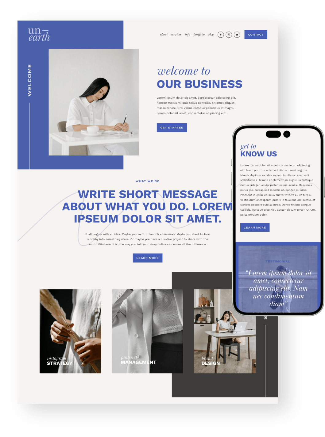
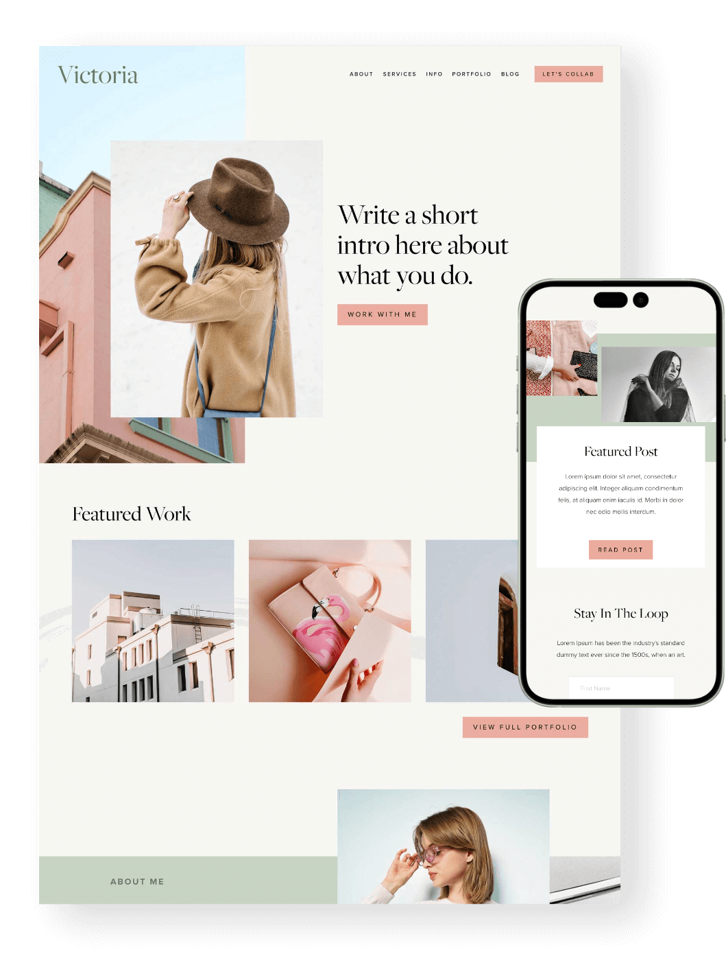
PS. Did you know that all of our Squarespace Templates are optimized for mobile from the get go? Not only will you get a beautiful design to start with, but you’ll also get hours of our most up to date tutorials all about learning Squarespace. Check them out below! 👇


Customize Your Mobile Menu in Squarespace 7.1

How to Access the Mobile Menu Settings
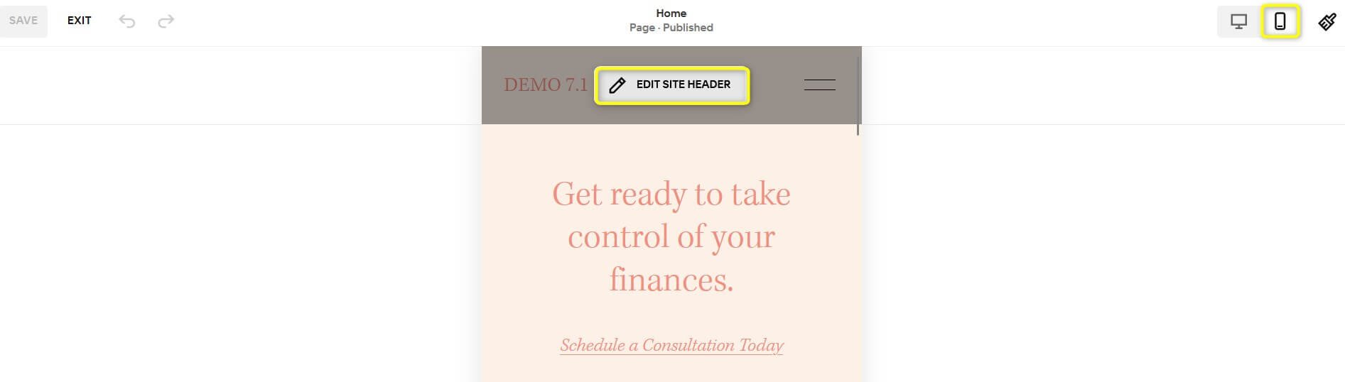
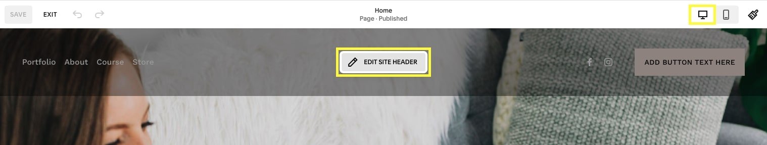
First things first, let's get to the mobile menu editor by clicking the mobile icon on the far right, then clicking Edit in the top left corner of your site to enter Edit mode.
In Edit mode, hover over your website header until you see the Edit Site Header button appear and click on it.
Once you click on Edit Site Header you will see two options Edit Design and View Menu.
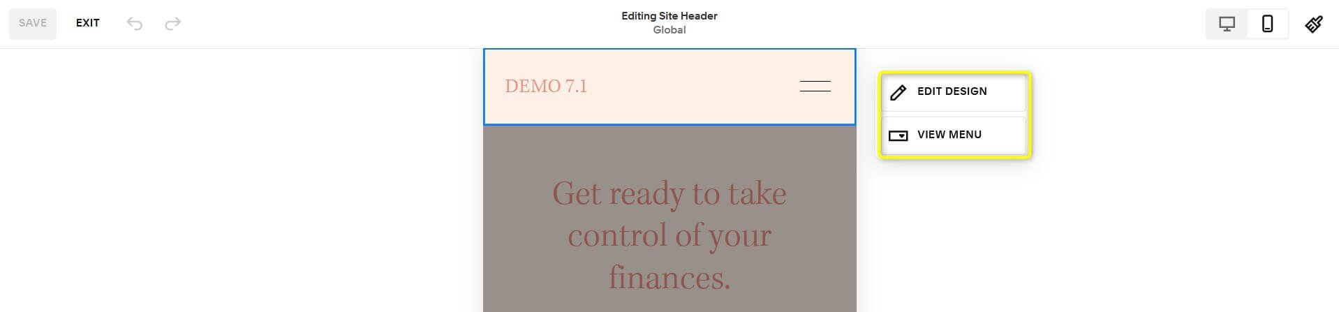
Start by clicking Edit Design.
Edit your Mobile Header Design
Change Your Header Layout
In this menu you can edit the Layout of the mobile menu. To do this, click on the dropdown menu displayed under layout.
Here you can choose from 5 different mobile menu layouts:


Note! There are other settings below Layout (Drop shadow, Border, Fixed Position, etc.) but these affect mobile and desktop, they are not strictly for mobile. We've gone into more detail about those further down the post, but for now we'll continue though the mobile specific settings!
Edit your Mobile Menu Layout, Colors and Fonts
When you are done editing the mobile menu layout and effects, click anywhere on the screen that isn't the settings menu to return to the view where you'll see the Edit Design and View Menu options again.
Now Click on View Menu. The view menu button allows you to see what the mobile menu will look like.


Mobile Menu Layout
Then click Edit Design.
This menu allows you to change the alignment of your mobile menu text and adjust the link spacing.

Mobile Menu Colors
Under the Color tab, you can choose from your sitewide Color Themes.


To edit these themes: Head into your Site Styles (paint brush icon in the top right corner of your site) > Colors.
Click the Edit (pencil) Icon on the Color Theme you want to use/have already selected.
Look for the MENU OVERLAY settings and adjust the colors here!


Mobile Menu Fonts
The mobile menu font uses whatever you have set as your Paragraph font in your Site Styles.
You can customize your Paragraph font by going to Site Styles (paintbrush icon in the top right corner of your site) > Fonts > Paragraphs
Note! Any changes you make here will apply sitewide to wherever you have used your paragraph font on your website.
While the size of the mobile menu font cannot be customized using Squarespace's built-in features, it can be customized further using custom CSS.
Simply copy + paste the following piece of code into your Custom CSS panel found under Website > Pages (scroll to the bottom) > Website Tools > Custom CSS and adjust the font size value to whatever you like!
.header-menu-nav-item a {
    font-size: 10px;
}

Mobile Menu Elements
There are a variety of elements that you can add to your mobile menu including a button, social media icons, an add to cart button, an account login button, and a language switch button.
Note! These are not independent from desktop view, meaning that if you want to add any of these elements to your mobile menu, they will also display in your desktop header navigation.
If you would like to add any of these elements to your mobile menu, these will need to be enabled via Desktop view.
How to add elements
Switch to Desktop view and click on Edit Site Header.
Click +Add Elements on the left hand side, then toggle on the elements that you would like to display in your mobile menu (and desktop navigation header).


How to customize elements
Once you've toggle on all the elements that you want in desktop view, you'll be able to either customize them in desktop view OR mobile view by double clicking on each individual element icon to bring up a pop up menu with settings to customize it.
In mobile view, as most of the elements will display only in the overlay menu, you will need to access this first by clicking the View Menu button.

Now, you'll be able to double click on each element to access its specific settings just like in desktop view.

Note! The element design settings are not independent from desktop view. Meaning that if you change the look of any of the elements in mobile view, these will also change for desktop.
For example, the social icons design:


When you are happy with your menu design, click anywhere on the page and you'll return to this view. Click Close Menu.

How to customize your mobile menu button
The menu button has some further customization options located in Site Styles.
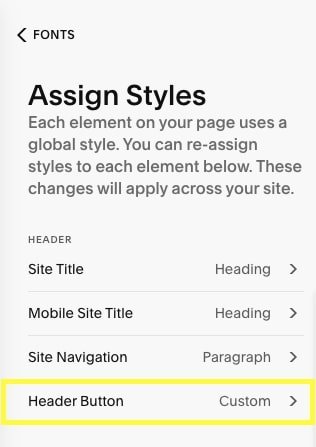
To customize your button's font, head to Site Styles > Fonts > Assign Styles > Header Button.
Note! The header button font will apply to both the desktop AND mobile header menu.


To customize the overall button style, head to Site Styles > Buttons > Primary button.
Note! Any changes that you make to your Primary button styles will apply sitewide to wherever else you have used a primary button on your site.

Changing the Mobile Menu Icon
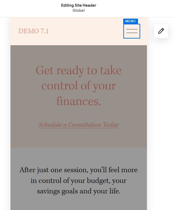
To make edits to the way the mobile menu icon looks, hover your mouse over the menu icon and a blue box will appear around it with the word menu. Click once to get the pencil icon.
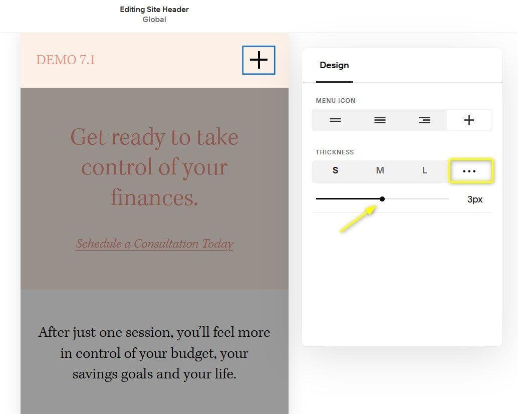
Once you click the pencil icon you will be able to choose a mobile menu icon design and customize how thick the lines are.
If you'd like to enter a custom thickness value for your mobile menu icon, click the three dots "..." and type in your desired thickness.

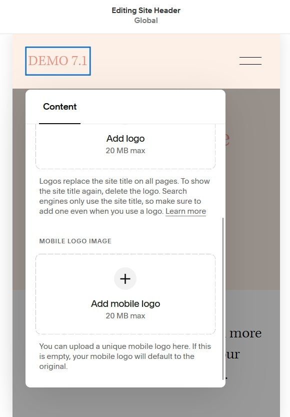
Add in a Site Title and Mobile Logo
To edit the site title, logo image, and mobile logo image you can click on your site title (in this case the text "Demo 7.1"). Be aware that any changes you make to your site title and logo image here will affect your entire website on both mobile and desktop.
Site-Wide Title and Logo
Your site title and Logo is site-wide and not unique to mobile. This will display across your whole site, desktop or mobile.
Upload your site-wide logo under the logo image using the + button
Type in the title you would like for your website to see it displayed.
If you upload a Logo, your site title will not display (but it's still important to add a site title for SEO purposes, regardless of if you use a Logo image or not!).
Once you upload a Logo, new settings for adjusting the size will show, including adjust the mobile settings independently.
Upload a Mobile-Only Logo
If you want to add a different version of your logo that will only appear on mobile, you can upload that logo into the mobile logo image area.

Change the Font of Your Site Title on Mobile
If you don't have a specific logo, you can simply choose a nice font for your site title to use as your 'logo'.
Your site title's font can be customized independently for mobile view and you can do so by going to Site Styles > Fonts > Assign Styles > Mobile Site Title.

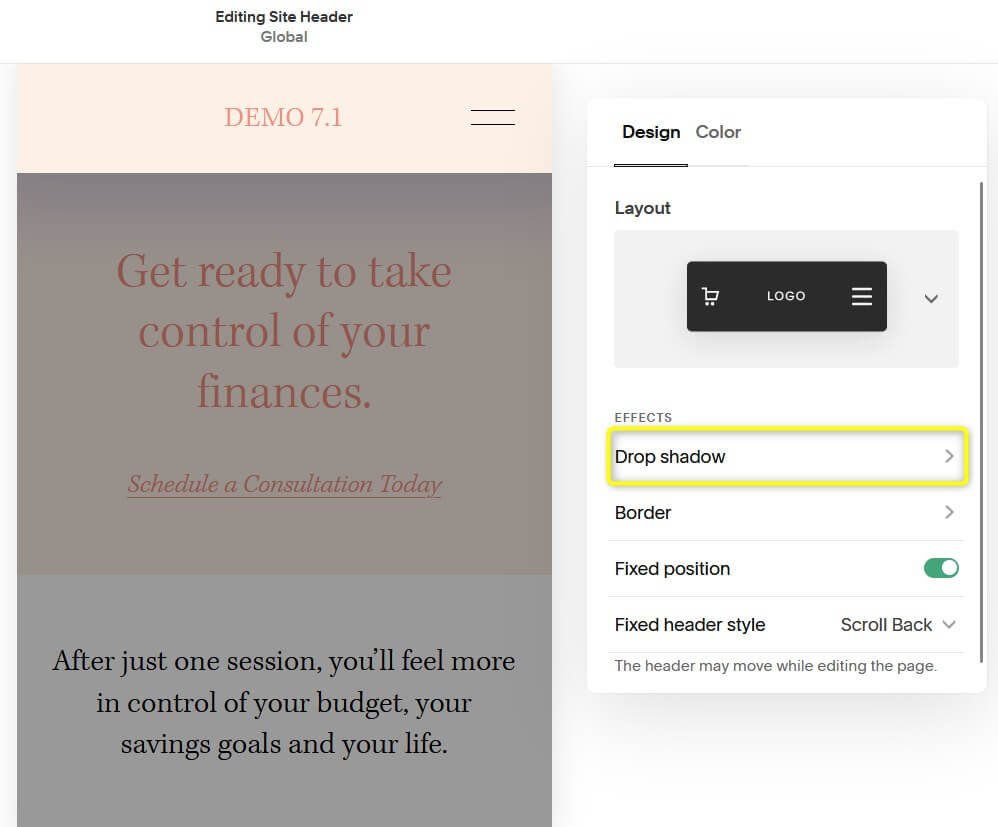
Other Mobile Menu Design Settings That Affect Both Mobile + Desktop
The design settings below are NOT independent from desktop view! This means that any changes you make to your header design in mobile view will also change the design of your desktop header navigation. For example, if you add a drop shadow, border, or fixed position in mobile view, you'll notice that that this will also be enabled when you switch to desktop view. This also applies to the settings in the Color tab 👇
Click on Edit Site Header
Click Edit Design

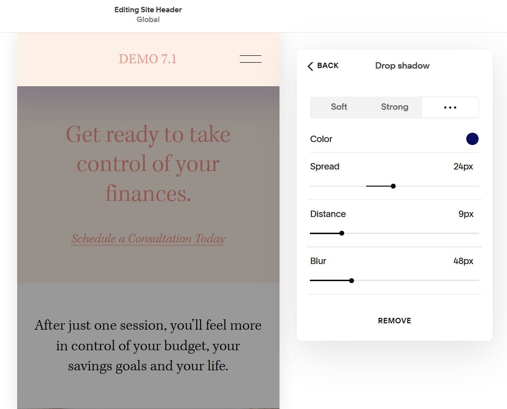
Drop Shadow
The next effect you can control in this menu is the mobile header drop shadow.
Once you click on drop shadow you can pick the color of your shadow. Then you can chose from 2 shadow presets, soft or strong, or create your own custom shadow. You can do this by clicking the "..." or by simply adjusting the value of the available inputs which are spread, distance and blur.
After playing with the shadow, if you decide you don't like it, click Remove at the bottom of the menu.
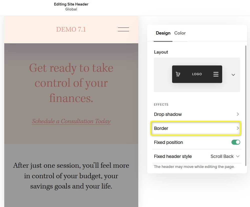
Border
When you're done playing with the shadow, hit the back button on this menu, and we'll move onto the next effect you can modify which is a Border.
In the Border settings, you can edit the color, line thickness and position of the border. For the thickness you can use the presets or add in your own value. The border position controls where you want the border to appear. You can chose to have a border on all sides, top and bottom, just top or just bottom!
If you decide you don't like any of the border options you try, click Remove at the bottom of the menu to remove it.

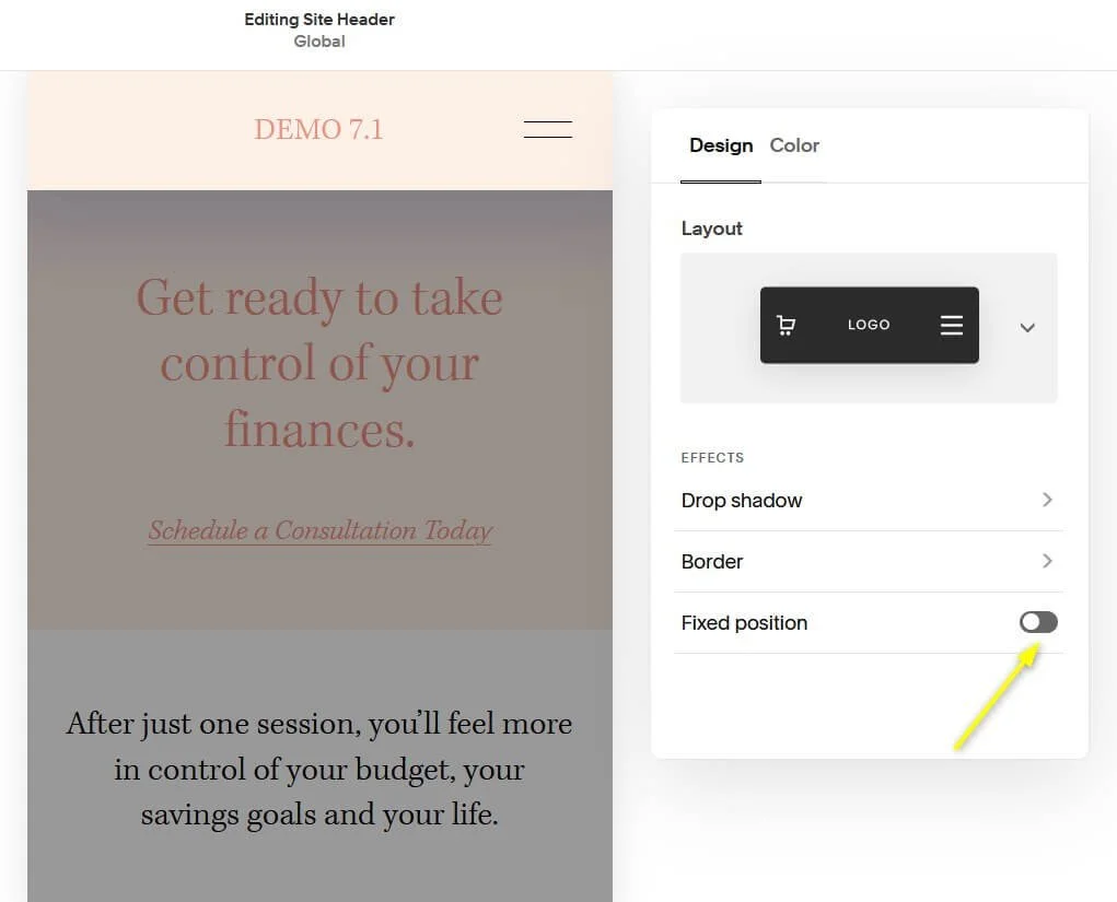
Fixed Header Position
Now you can decide if you want the header to be fixed or not.
When the toggle for fixed position is toggled off (grey is showing on the toggle) this means the heading is not fixed and it will scroll up with the rest of your page as the user scrolls through your page.
If the toggle for fixed position is toggled on (green is showing on the toggle) this means the heading is fixed and you'll see a drop down menu for Fixed Header Style.
Within the Fixed Header Style drop down you'll see two options, Basic and Scroll Back.
The fixed header style "Basic" option means that the header will stay at the top of the page no matter how much the user scrolls down the webpage.
The fixed header style "Scroll Back" option means that the header will disappear when the user is scrolling down through your website, but it will reappear as the user starts scrolling back up your website.

Colors
Now that you've modified the menu layout and added effect, click over to the color tab.
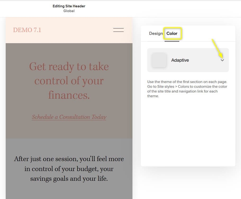
In the color tab you'll be able to choose from 3 different styles:
Adaptive
Gradient
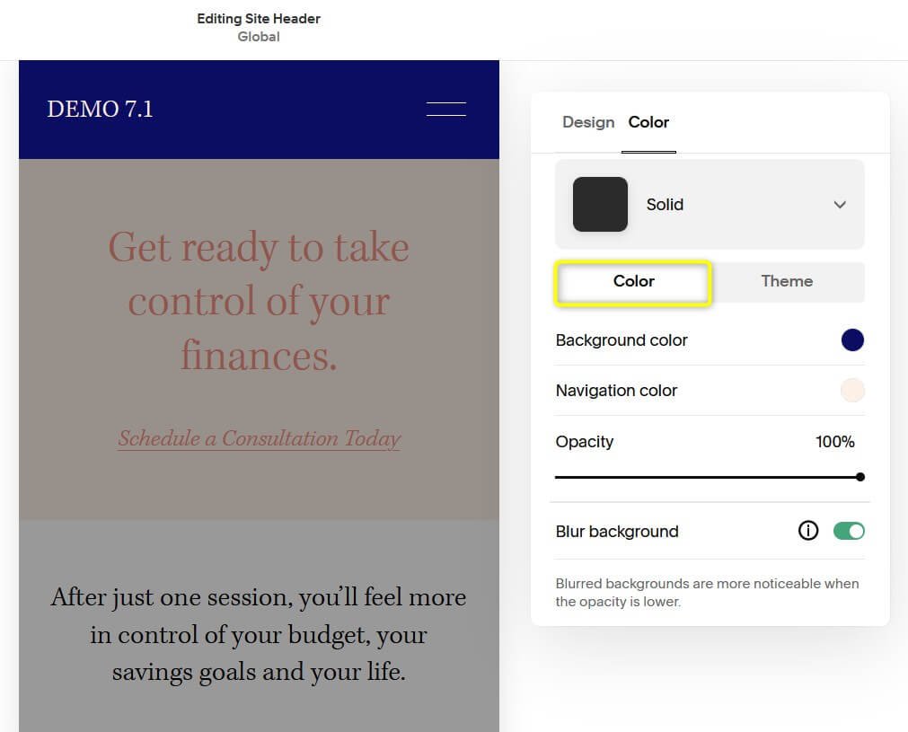
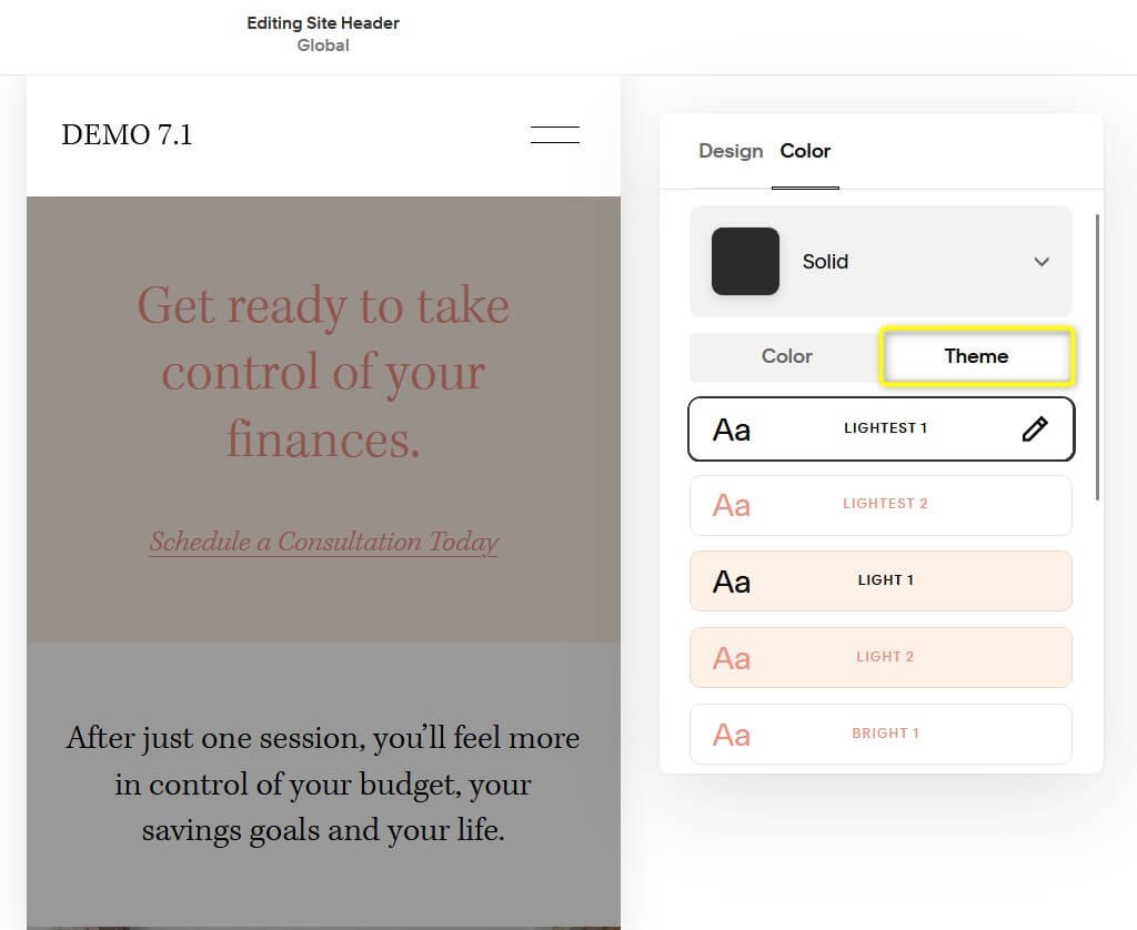
Solid
You can apply these styles by click on the drop down arrow next to the default setting, which is adaptive.
An adaptive header style means that the header will adapt to whatever color theme you have applied to the top section of each page of your website. Also if you have a background image in your top section it will be behind the header.
If you apply the gradient color style the header will fade from a color of your choosing to the color of the section below it.
Under this style you can manipulate the background color, the navigation color (the color of your menu text), the opacity (how far the color comes down from the top), and the background blur.
In the images below you can see the difference between 92% opacity and 30% opacity.


The last style is solid. Under this style you can manipulate the background color, the navigation color (the color of your menu text), the opacity (see through the color is), and the background blur. If you want to just stick with your preset color themes, click over to the theme tab and select the preset you desire.
Customize Your Mobile Menu in Squarespace 7.0 (Brine Template)
The below tutorial is for sites within the Brine template family because they have the most flexibility when it comes to adjusting the settings of your mobile menu.
How to Access the Mobile Menu Style Settings
First, let's go to the mobile version of our site. To do so, click on the horizontal line above your site window.

This will bring forward three device-view options: Mobile, Tablet, and Desktop. Select the Mobile (phone) icon to access the mobile menu style settings.

Now, on the main Squarespace menu on the left side of the screen, navigate to Design > Site Styles.
In the search bar, type "Menu" and you should see the built-in mobile menu options appear.

Menu Icon
First up is the mobile menu icon. To customize this, scroll down to Mobile: Menu Icon in the site style settings.
You can adjust its position, style, and color. By default, the style of the menu icon is a three-line hamburger menu, but you can choose from a variety of options including a plus sign, dots, and squares.
When this icon is clicked on your mobile site, it opens up a menu with your site navigation.

Background Color
Under Mobile Menu: General you can adjust the main mobile menu color settings.
This includes changing the background color of the mobile menu, the close icon, and other backgrounds that are visible when the mobile menu is activated.
You can also adjust what side the mobile menu appears on. I have this set to appear on the left, but you can toggle that option to "right" and it will flip to the other side of the screen.

Menu Font and Color
You can change the font style and text color under the Mobile Menu: Primary and Mobile Menu: Secondary sections.
To style the primary menu, scroll down to Mobile Menu: Primary.
In addition to changing the font and text color, you can also convert your navigation links to buttons and adjust the styling of the buttons.

To style the secondary menu, scroll down to Mobile Menu: Secondary.
If you would like the secondary menu to be styled the same as the primary menu, you can select Inherit Primary Nav Styles under Mobile Menu: Secondary.

If you want to differentiate the secondary nav links, you can uncheck the box next to Inherit Primary Nav Styles to activate the individual text settings.
Here you can choose a different font or text color for the secondary nav links just like you did with the primary nav.

Feel free to experiment with the style of your mobile menu; remember they will only show on mobile view!
If you want a website that’s already all set up for mobile, check out our Squarespace Templates! Strategically designed for both desktop + mobile, these templates are the best way to get a head start with building your website!
Explore more of our tutorials about mobile optimization below 👇
How to Change Mobile Logo on Squarespace
Mobile Optimization: Creating Responsive Squarespace Sites
How to center-align text in mobile ONLY in Squarespace
Hacks to make mobile editing in Squarespace Fluid Engine faster
If you liked this post, Pin it to Pinterest! 👇🏻