7 Best Website Layouts for Seamless Navigation and Eye-Catching Design
Have you ever clicked on a website only to feel totally overwhelmed after just a few seconds? Or maybe you feel as though you’re looking at the same website designs over and over?
Don’t worry - you’re not alone. A site’s layout can make or break a user’s experience, and often we find that websites either forget about design all together leading to confusion and disorganization, or they follow the same (sometimes outdated) trends as everyone else causing them to lose originality.
That’s where a well thought-out layout that combines seamless navigation and eye-catching design comes into play! Mastering this is essential in order to enhance the aesthetics and usability of your website, and to help it stand out among the pack.
In this post, we’ll explain just why layout design matters so much and, of course, provide some examples and tips for creating a website that looks amazing and is easy to use.
Let’s get into it!
Why Layout Matters for Design and Functionality
Let’s face it—when someone lands on your website, you only have a few seconds to impress before they head elsewhere (yikes!). With people constantly browsing, shopping, and learning online, it’s all too easy for them to click away if your site doesn’t wow them.
Cue the magic of a killer website layout! ✨
A strong layout isn’t just about looking pretty; it’s about making visitors feel like they’ve found exactly what they need. You want them to stick around, right? (Hello, potential customers! 👋) And that means your site needs to not only shine visually but also work like a dream.
A layout that nails both design and functionality (aka UX-design) will:
Improve user satisfaction by making users happy and confident
Enhance website efficiency by keeping your site running smoothly
Ensure anyone can find what they’re looking for with ease
At the end of the day, the best websites combine stunning visuals with a seamless user experience, making every visitor’s journey easy, fun, and oh-so-satisfying!
P.S. We have a free online website training where you’ll learn even more about creating outstanding website designs - sign up for that here. 👇
7 Visually Appealing and Effective Website Layouts to Use
Let’s look at some examples of really effective website layouts that are not only functional but also unique and visually appealing. These are designs that will stand out and make their mark - let’s talk about why!
1. The Perfectly Imperfect
Asymmetry is a great way to add a ton of interest to your website without a crazy amount of work. And thanks to DIY website builders like Squarespace, getting creative with the positioning of your content is easier than ever - you don’t even need to use any custom coding!
👉 How to Edit in Squarespace 7.1 with Fluid Engine
Take our Premium Squarespace Template, Shelley, for example:
Shelley Template
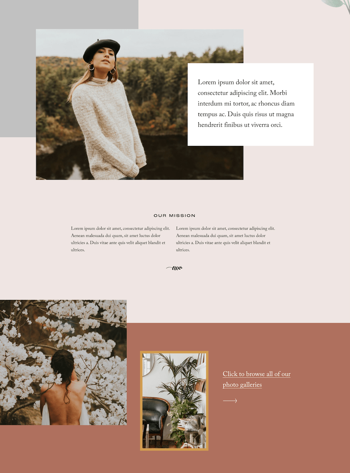
The seemingly random “sprinkle” of photos immediately draws you in because it’s different, something that breaks away from most traditional layouts. And at the same time, this homepage is easy to follow. The main menu is still clearly displayed and all headlines and calls to action are very apparent.
When implementing a layout like this, you can also utilize color and typography to balance things out. The section shown above could easily blend into one jumble of content, however the use of different colored backgrounds and clearly defined font styles anchors you to the page and makes it feel like there’s balance amidst the unevenness.
This layout style is going to keep your site visitors super engaged with its dynamic and modern feel, while still ensuring easy navigation.
2. The Editorial
This layout style can be likened to that of a magazine design and is perfect for websites that have a lot of content or individual pages.
Keeping this layout organized comes down to grouping your content, and pairing relevant text with descriptive images and headlines. This allows you to be as creative as you want without losing readability or overwhelming your visitors.
You’ll also want to utilize stickers (link to graphics and icons blog post once its live), animations, unique buttons, and other interactive features to draw the eye to certain pieces of content. This creates an experience for visitors that allows them to feel more invested, regardless of how much content there is to consume.
There’s a rhythm and a flow to this type of layout that might not be obvious to the untrained eye but is super impactful on the visitor’s journey through your website. Design tools like hierarchy and white space (don't worry we'll get into the specifics of these in a bit) will help to bring the aesthetic home while maintaining balance and function - the best of both worlds!
3. The Blogger
This website layout might seem standard, but if you’re someone who writes a blog for a living or if you’re an online educator, nailing down this design with your own personal flair can be a game-changer!
If we were to put this layout into UX-design terms, it might be called the “single-column layout” because all of your content is laid out in one vertical line down the page. This is really great for simplicity and ideal for mobile view translation, something that’s imperative if you want all visitors to have easy access to your material.
Our Premium Squarespace Template, Iris, displays this design layout in a classic yet slightly updated way:
From the moment you land on the page, you know where you are and what you can expect. There are easy-to-read descriptions and highlighted areas pointing you toward content you might be most interested in.
Each section reads from left to right and no visual distractions are pulling your focus, leaning into that single-column idea.
And as you continue to scroll down the page, the simplicity and clarity remain. The Iris template takes it one step further (adding a modern touch) by placing the blog posts in an alternating pattern, however, you never lose focus or find yourself confused. You could scroll on and on down the page and be visually happy as well as satisfied with the ease of use.
This layout ultimately places what’s most important at the forefront and prioritizes a smooth reader experience. Plus, it’s just nice and easy to look at!
👉 How to start a blog with Squarespace
4. The Unexpected
This layout style is super unique because it, essentially, takes bits and pieces from different styles and combines them to create one stunning and easy-to-navigate web page. There’s an organized chaos to this design that leaves room for you to determine what your ideal audience will respond to best.
The common theme with this style is clean yet dynamic. Each section of each page keeps the user intrigued because it’s not quite the same as the one before, however nothing overpowers or steals the spotlight.
This layout design utilizes shapes, white space, asymmetry, boldness, and more to achieve its ultimate goal - to keep them wanting more. With a layout like this, your site visitors might find themselves clicking through your website just to “see what’s next”, and because the sections are easy to navigate through, they’ll be able to do so with no issues.
5. The Compartmentalizer
What do you do if you’re a service provider who has a ton of different offerings? Simply typing everything out onto the page can get messy and perhaps a little boring. This is especially not great if someone doesn’t already know what service is right for them or if they're visiting your site for the first time!
👉 The best Squarespace website templates for service businesses
This particular layout design utilizes segmented blocks or sections to display information on a page in a really cool and modern way, making it perfect for showcasing services, packages, or even frequently asked questions.
You can achieve this style by creating individual sections on a page or by simply adding a different colored background to the text within the same section, something that Squarespace makes it really easy to do.
With this layout, your content remains readable and individualized. There’s no way for a user to get confused about what they’re viewing, allowing them to freely browse and educate themselves (and hopefully book/purchase!).
6. The Simplistic Grid
This simple yet impactful layout style is perfect for portfolio pages or e-commerce shops where imagery is the main focus.
We get it - If you have a lot of beautiful photos to share, it can be really tempting to just throw a bunch of full-sized image blocks straight on the page! The issue with this is that it’s unoriginal, clunky, and potentially not compatible with various screen sizes. And if your business relies on imagery to draw people in and/or make sales, all of those things could potentially drive people away from your site before they’ve even had a chance to enjoy what you have to show.
Take the portfolio page on Sophie, one of our Premium Squarespace Templates:
The grid layout here allows you to organize content in a way that’s super visually appealing and easy to navigate. There's consistent and even spacing among the actual grid so nothing runs together or feels disconnected, allowing you to accurately represent your business as a whole while allowing visitors to smoothly click from one piece of content to the next.
👉 The Best Portfolio Squarespace Templates to Showcase Your Work
7. The Bold Statement
One really popular trend right now is incorporating strong and bold focal elements to your website like background images or headlines to inform visitors what’s most important or what they can expect from your business without them having to go far to figure it out.
Our Premium Squarespace Template, Noire, utilizes this layout style perfectly:
Combining striking (nearly full-screen-sized) images with large section headings, lets site visitors know what this business is all about! There’s no mistaking what information they’ll find within each section of a page, making browsing a breeze, and the style is going to stand out from other similar brands.
For example, if a company’s values are important to a potential client, the section pictured above is going to show them exactly where they can learn more about that.
Ultimately, this layout design is practical and just downright cool.
Additional Tips for Creating a User-Friendly and Stylish Site
So now that you know why choosing the right layout design is so important and have some ideas for creating website pages that are both stunning and user-friendly, let’s go over a few beginner design tips that will help take your DIY website building journey to the next level.
White Space
White Space, also sometimes referred to as negative space or open space, is the space that’s left between elements on a page.
Lot’s of different things can fall under the category of white space including:
Line and letter spacing
The space between and around content blocks like images, text and buttons
The margin or border of your website
Utilizing white space in your layout design helps to shape the overall flow and keeps things from getting too cluttered or claustrophobic. It might feel weird at first to actively try to incorporate blank space into your design, but the more you work with it, the more you’ll realize its effectiveness.
You can create some really eye-catching designs with white space and it only helps to make things more functional and, you guessed it, easier to use!
Here are some examples of websites that expertly incorporate white space…
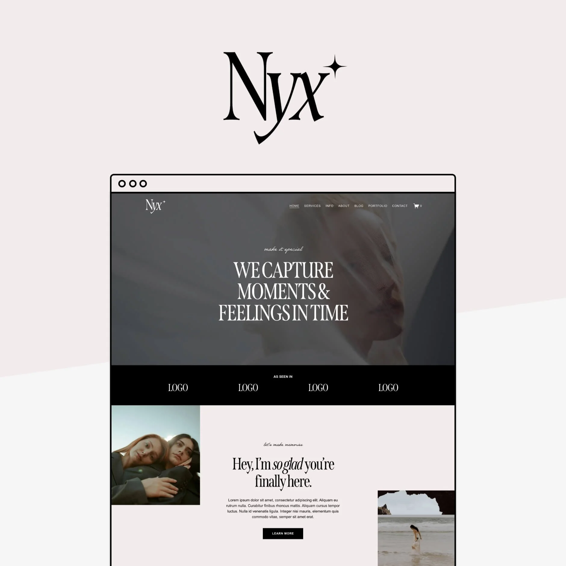
The space left open around the text in this example allows all of the content to breathe and have its own moment. Your eye goes to each individual piece of content and it’s not overwhelming to look at.
This example shows how you can pull focus to a particular element on the page simply by adding open space between it and the next piece of content. And the more white space there is around an item, the more the focus will be pulled to it.
Typography
Nearly every single element of your website utilizes typography which is why it’s so important to consider when designing your page layouts!
Your font choices affect readability, user engagement, brand cohesiveness and more. So yeah, we’d say it’s kind of a big deal.
👉 Choosing the Right Fonts for your Squarespace Site
👉 The 4 best modern font combinations for Squarespace
In the meantime, let’s look at some standout typography examples…
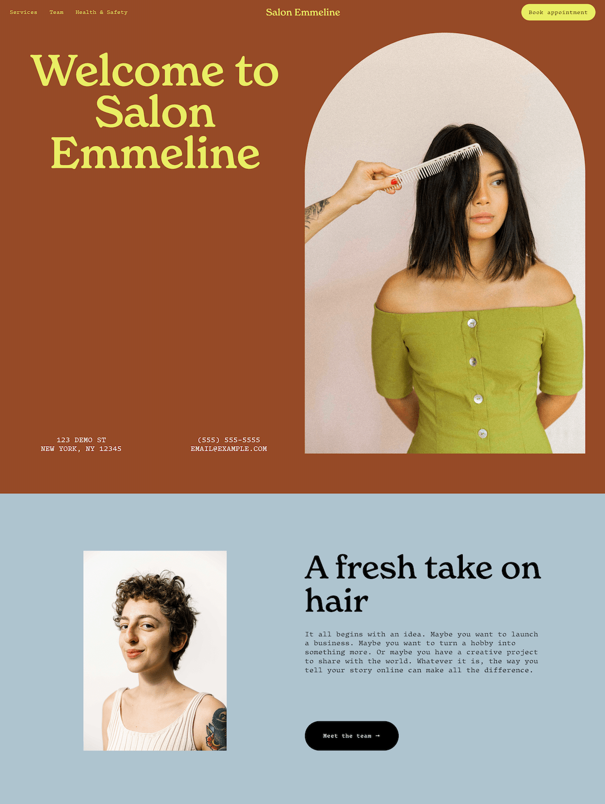
This is a great example of pairing an impactful primary heading with an easy-to-read paragraph font. The pairing is nice to look at and will be palatable to most every visitor yet it’s also fun and interesting.
This example showcases how you can display a particular mood through your typography. The primary heading font used on this site is fluid and a little funky, making us feel welcome and happy to learn more about the product. It stands out from other websites you might visit but is still crystal clear to read.
Hierarchy
Unfortunately, you can’t guarantee that all visitors will read your website like a book or magazine. You have to account for those who might just scan the page broadly looking for items of note. This is where hierarchy comes into play.
Having a clear hierarchy among the content of your website layout is so important in order to ensure readability, create a dynamic design that visitors will want to look at, and alert users of what’s most important.
You can create a hierarchy within your layout using many different tools including:
Size
Color
Alignment
Grouping
Let’s look at some examples of these hierarchy tools in action…
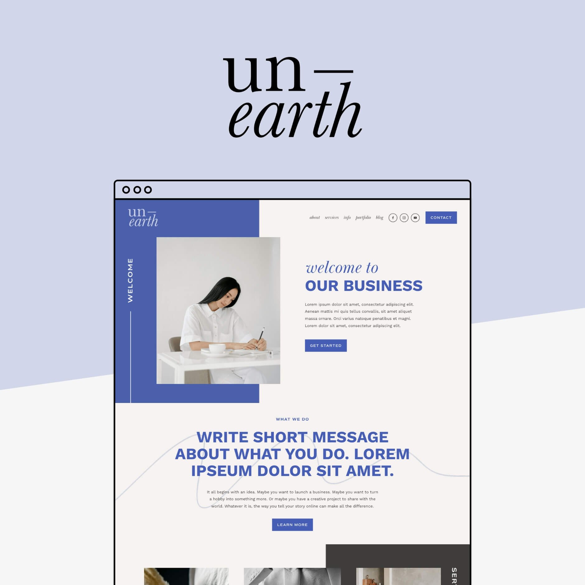
This example utilizes both size and color to create hierarchy on the page. The larger heading font pulls your focus and the purple background notifies you that the content highlighted is worth reading. This is a great way to get visitors to respond to a call to action or read an important disclaimer.
This example encapsulates almost all of the various hierarchy techniques. There’s a clear heading, larger than all of the other text, and each package option is grouped together so that it’s easy to digest the information. In addition, it also uses color to notify which package option is the most popular - a hierarchy tool that’s super effective in getting people to click and purchase!
Mobile Design
The mobile view of your website is just as important as the desktop view, especially since there are’s so many people who only view content on their phones nowadays.
When designing your website's layout, you’ll need to consider how things will translate on mobile view and/or if you’ll, easily, be able to make the tweaks necessary to achieve the look you want while maintaining a user-friendly experience.
Check out our blog post on creating mobile responsive Squarespace sites for some best practices for this.
Menu Navigation
One of the most frustrating things is landing on a website only to find it impossible to locate the main menu!
Some sites get so caught up in looking “cool” or “different” that they forget about the basic functions. When designing your site, a top priority should be making sure that you have an easy to find main navigation.
Check out these blog posts for more ideas on how to create the perfect menu:
👉 How to Customize your Header Navigation in Squarespace 7.1 Fluid Engine
👉 10 Fun Customizations for your Header Navigation Menu in Squarespace
Loading Speed
This one can be super easy to miss, but you’ll want to consider what type of images and videos you’re uploading to your site and make sure that they’re all optimized for faster loading times.
The truth is that nobody is going to stick around if it takes 10 seconds for the content on your website to load and, at that point, it doesn’t even matter what your layout looks like!
You can avoid this by compressing your photos using a site like TinyPNG and consider hosting your videos through Youtube or Vimeo vs uploading directly through Squarespace.
👉 How to Optimize Images for Squarespace
👉 How to Embed Course Videos in Squarespace from YouTube (free!)
Calls to Action
No matter what layout design you’re working with, you cannot forget to include clear and enticing calls to action.
These are buttons and links throughout your website that people can click on in order to take a certain action - purchase, sign-up, shop, contact, etc. Without these, visitors will have to go searching for a way to perform these actions. You can make their lives so much easier by displaying them any chance you get!
All in all, having a well-thought-out website layout that combines both style and functionality is so important to the success of your business.
And with the above tips in your back pocket, it is SO possible for you to achieve the most stunning and professional website. Even if you’re not a pro designer!
We hope reading this post gave you a bit of inspiration to confidently get started and make something magical, but if you’re still a little unsure about doing things yourself, check out our Template Shop to view our Premium Squarespace Templates, all of which include strategically designed layouts that are both visually stunning and easy to use. 💻 🤩👇
Loved that post? Check out more website layout and design tips below!
How to customize your Squarespace footer and what to include in the design
How to showcase your websites with full page screenshots
The 4 best modern font combinations for Squarespace
How to add a Custom Color Palette to your Squarespace Website
If you liked this post, Pin it to Pinterest! 👇🏻


