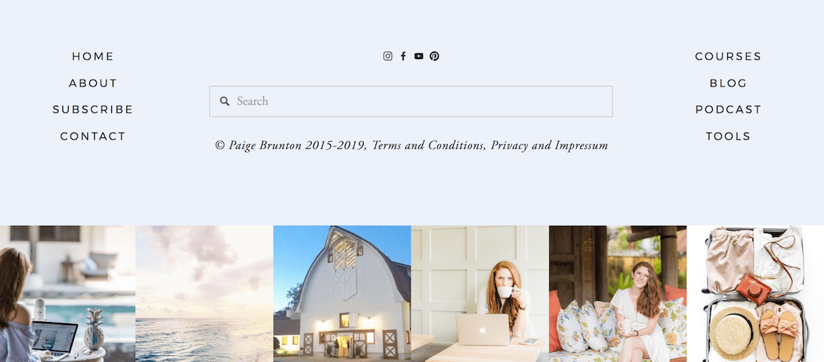
How to strategically use your website footer: What you can (& should) include
Website footers are treated like, well, the actual foot of our website. We spend so much time thinking about beautifying and optimizing the rest of our websites, the footer usually takes a back seat. It might be lucky to get a few links and a copyright thrown into it, and then it’s usually just ignored.
But have you ever considered that your website footer is one of the ONLY consistent things throughout your whole website? It literally shows up on EVERY page of your site. Your home page, a blog post, your contact form, your footer will always be there. You can’t say the same for much else of your website.
So firstly, let’s give this little guy some credit for showing up for us literally everywhere. Here’s to you, footer! And now let’s return that favor by using the footer for all it’s worth (that’s how healthy friendship works, right?)
But really, let’s get strategic! If this is the only place that displays everywhere on your site, this is PRIME real estate and we need to be making the most of it!
Not only are there lots of things we can add to our footer, there are lots of things we should add to our footer.
So let’s get into it!
What should you include in your footer?
1. Your main & secondary navigation
Whatever links are most important on your site need to go in your footer navigation. And the links that aren’t as important (but still need to be on your site somewhere) go in you footer, too.
These could be links like: Contact information, Shipping + Return Policies, Freebies etc.
Visitors expect to scroll down to a footer to find more information. The Navigation menu at the top of your website needs to be minimal and not too cluttered, so the footer is the perfect place to put all of those extra secondary links.
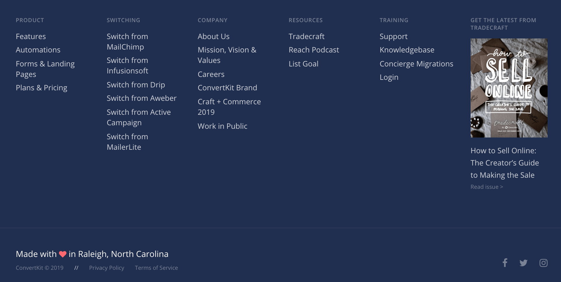
If you have lots of links, try to keep them organized by putting them in relevant columns.
2. Copyrights & credits
Although technically people aren’t allowed to copy anything off of your site anyway, adding a copyright © at the bottom helps enforce this.
I recommend adding a copyright to your name or business, eg: © Big Cat Creative
You may also have other copyrights/credits that you need to give eg for your web designer (“site designed by:”) or your photographer (“photography by:”) etc. The footer is a great place to put this.
Not only do people expect to find copyrights and credits in your footer, it’s a safe place to put them as they show up on every page.
3. Contact information + address
If you are a brick and mortar store, or it’s vital that people know your physical location, it’s very important that your physical address is listed in the footer for two reasons:
Because your website footer displays on every page, Google will see this information repeatedly, therefore see it as important information. If you have a physical location, Google will see this physical address as important and it will help to index the address to show up in Google results and improve your overall SEO.
Generally if people are looking for an address, the footer is where they’ll look for it.
Alternatively, if you are more of an online business and listing your address isn’t as important, I suggest adding your contact details (eg email address) or at least a button to a contact page that contains contact details.
4. Legal pages
It is law in many countries and states that every website has to have at least a Privacy Policy. Your footer is a common place to put this.
If you have any other legal pages, I would add these here too.
Try to organize these so that they make sense and still look good, try grouping them together but keep them away from your main menu categories.
5. Social Media Links
In this social media age, you’d be silly to not include Social Media links in your footer, honestly! People will go to your footer looking to connect with you on Social Media, I know I do that all the time!
So if you have Social Media, make sure to include the links in your footer.
Other stuff you can include in your footer
1. Social feeds
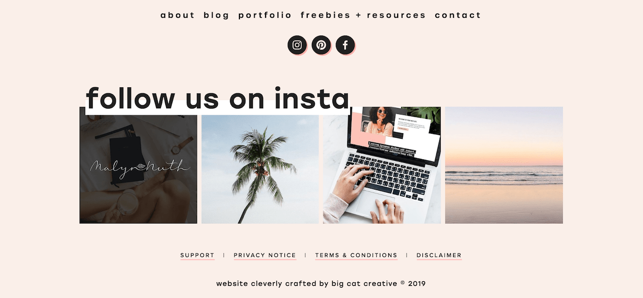
Slightly different than social links, these are feeds of content streaming directly from your Social accounts. One very common feed to stream is Instagram. Your Instagram feed is an awesome feature to put in your footer, if you’re trying to grow your Instagram. Only put a Social feed in if it’s really relevant to your business!
2. Newsletter opt-in
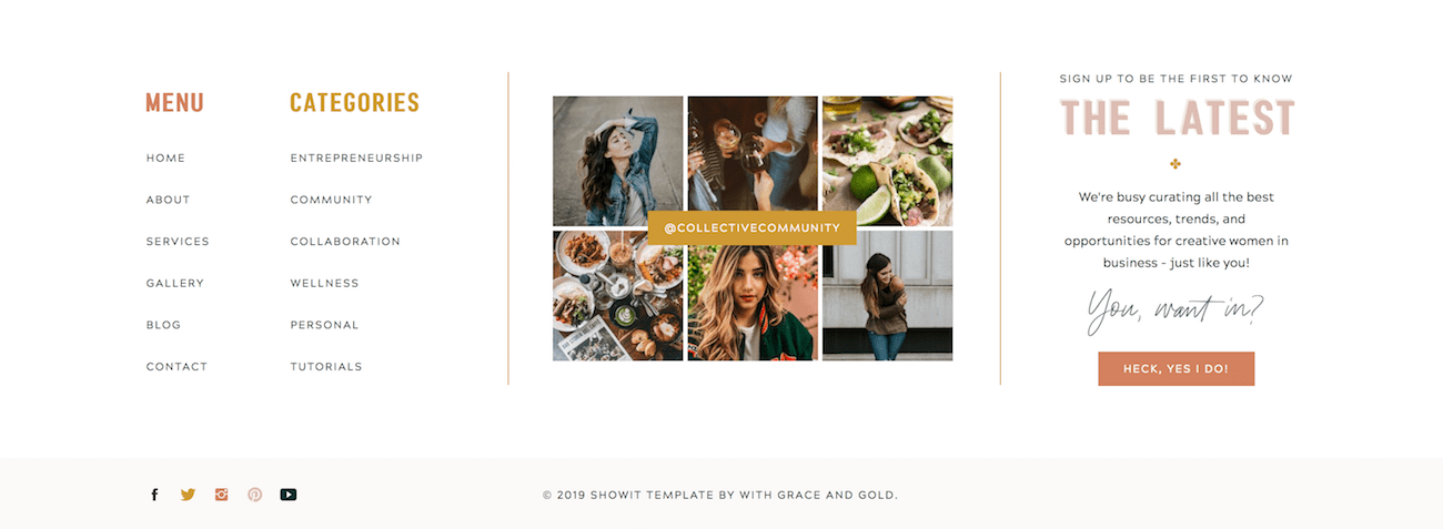
This is a great option for your footer. Since getting email subscribers is one of the most important things in business, make sure you give your visitors as many options as possible to opt-in. Remember, if it’s in the footer, it’s on every page!
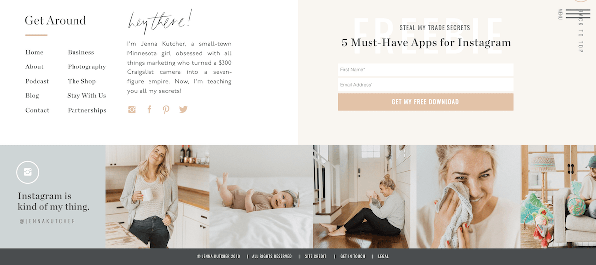
3. Business bio
A short bio about you or your business is something fun you can put in your footer. This is great to remind people about who you are and what you do. Keep it short and concise, though, no one goes to a footer to read large paragraphs of text.
4. Your logo
If you have the extra room, adding your logo to your footer is an awesome way to build brand recognition and have consistency around your website. It’s important that you have the space for this though, and aren’t just cramming it in for the sake of it.
5. Search bar
You should have at least one search bar on your site. So if you don’t have one in your top navigation (or even if you do), I highly recommend adding one into your footer!
Search bars are so important to have on your site. Sometimes for visitors it’s hard find exactly what they’re looking for without spending hours scrolling through your site, especially if you have a lot of content! The search bar makes that much much easier on your visitors. I personally use the search bar on websites all the time to find specific content - and get frustrated if they don’t have one!
Footer Design Tips + Examples
Here’s the thing, there’s no way you can fit ALL of the above into your footer. Well, maybe you could, but it definitely won’t look good.
Figure out what’s important to your business, and what you want your visitors to see and click on, and structure your footer from that. Don’t try to cram everything in for the sake of it, because if you do that, no one will click anything.
Are you really focussed on growing your email list? Then add an opt-in. Are you working hard to grow your facebook? Then include a link or a like button in your footer. Even though *everything* seems important, pick the 1-2 things that are most important.
Make sure there’s lots of white space, and that it’s really clear and uncluttered. Use different sections and different size fonts to group and separate different elements.
I’ve rounded up some footer examples so you can see how different footers can be depending on your business, and to offer you some inspiration for your own footer design!
