How to Create a Sales Page or Landing Page in Squarespace and Save Money!
Okay, by now you probably all know how much we love Squarespace. And it just keeps getting better for small business owners like you hacking it in the online business world 💪
Unlike some other website builders, Squarespace is an all-in-one platform which means saving big on subscriptions and having your shop, blog, portfolio, online course, newsletter, and more all in the same place! And yes, that also means your sales page and landing page ✨
Back in the day when Big Cat Creative was a website design and branding biz, we had a client come to us with a Squarespace and a Leadpages subscription. Her website was hosted on Squarespace and she was planning to host her landing page for an upcoming membership program on Leadpages (basically an advanced landing page software if you hadn't heard of it before!).
We asked her, "Why don’t we just create your sales page for you on Squarespace?" Because let’s be honest, if you're already paying for Squarespace and are just using Leadpages for one basic sales page, paying for both is probably not worth it.
Obviously she said "YES!" and that's when we thought, maybe people don’t realize that you can create a great sales page on your existing Squarespace site! 🧐
What is a Sales Page and Why do you Need it?
A sales page, aka landing page, aka opt-in page, is a page on your website specifically designed to get you the sales 💸 It promotes an item that you sell, generally a course, membership, or product, and draws the attention of your customers to persuade them to make a purchase.
A high converting sales page should include strategic copywriting that makes your visitors feel seen and heard, and clear call-to-actions that give them no choice but to accept your irresistible offer and close the deal (without much extra work from you!).
Sales pages generally include eye-catching headings, testimonials and reviews that showcase how trustworthy you are, FAQs and lists to keep all the important info easy to digest, and multiple CTA buttons all along it to bring your visitors straight to your cart 🛍️
But here's the secret, a landing page is just a regular website page that you can build directly on your website, no fancy programs required (we're looking at you Leadpages 👀 )!
The main difference is that sales pages typically don't have a header or footer navigation showing so that your visitors can't get distracted and navigate away, and in good Squarespace fashion, a little custom CSS will do the trick (don't worry we'll walk you through it at the end of the post!).
👉 Check out our strategically designed Squarespace Sales Page Template designs here
Squarespace Sales Page vs. Leadpages
Don’t get us wrong, Leadpages (or any other sales page specific software like Unbounce, Swipe Pages, or ClickFunnels) are awesome and there is absolutely a time and place for them.
These sales page softwares capture a ton of data that you can’t get as easily through Squarespace, and are great if you don’t already have a website.
For small start-up businesses that are already using or planning to use Squarespace for their website though, we would definitely recommend saving some precious dollars and building your sales page directly on your Squarespace site, as even the most basic Leadpages subscription will set you back an extra $37 per month!
We're all about making life easier by simplifying the amount of programs we are using and things we are doing, because if you’re a small business owner, let's face it, you’re probably already doing too much!
Other than keeping everything in one place, another bonus of building your sales page directly in your Squarespace site, if that if you've already learnt how to use Squarespace for your website, then you’ll be able to build your sales page in no time and not have to learn how to use any other program.
If you're not too confident in your Squarespace skills just yet or feel like you don't quite have the time to design an entire sales page that is sure to convert, then check out our ready to-go sales page templates! If you're up for creating your own, then read on! We'll walk you through the process, step by step 👇
Note: We don’t recommend using Squarespace for your sales page if you’re not already using or planning to use Squarespace for your website! The point of this article is to save you money and minimize all of the software you have to use, so if you’re using a different website building platform, then try to use that for your sales page instead!
Building a Sales Page on Squarespace 7.1 vs. Squarespace 7.0
If you’re planning to have a really scaled back basic sales page, which Squarespace version you are currently using doesn't matter too much.
If you’re planning to have a long, scrolling, more extensive sales page design with lots of messages and copy, you'll want to be a bit pickier.
There are currently two versions of Squarespace, 7.1 and 7.0. We break down the different versions here, but really all you need to know for this is:
If You’re Using Squarespace 7.1:
All templates are the same and very well suited to make great sales pages, woohoo! You can skip straight ahead to the next step, as all of the next info is for 7.0 users.
If You’re Using Squarespace 7.0:
You want to make sure you’re using a Squarespace template that supports stacked index pages.
Our favourite Squarespace template that supports stacked index pages in Squarespace 7.0 is the Brine family.
If you’re already lost and not really sure what we're talking about here, we suggest you head on over and read this post all about Squarespace templates and how to choose them. In that post we explain what template families are and give you a breakdown of which templates have index pages and which don’t.
Of course, you can still create a sales page without index pages and just use a regular page layout, but you won’t get the long scrolling feel with full width images that we often see in large sales pages!
How to Add a Sales Page to Your Squarespace Website
In Squarespace 7.1:
DIY a sales page
First you will need to create a regular page.
In your main menu, click Website, then click the + icon just like you would to add a regular page, then click Blank Page (You can use Page Layouts too, these are basically just Blank Pages with some blocks already added to make the design process a bit faster!)
Your blank page will look something like this. Click EDIT in the top left corner to start working on your page.
In Edit mode, click the blue ADD SECTION button in the center of the page, then choose a blank section! (Again, you can also use and experiment the different Page Section options here if you want to!).
Then you will have a new blank section on your page that looks something like this.
From here, you can hover anywhere inside the section and add any blocks that you want to!
You can also edit all of the settings of this particular section by clicking on the EDIT SECTION (pencil) icon in the top right corner.
👉 How to edit in Squarespace 7.1 with Fluid Engine - Best practices & tips
From here you can get as creative as you want. The page sections are unlimited so you can add as many sections as you need to!
We recommend breaking up your sales page into obvious sections by using different colored backgrounds. Check out this tutorial where we show you how to create full width section backgrounds — make sure you read the 7.1 instructions!
You can add anything you like into each section of your sales page, just as you would a regular page! Text Blocks, Image Blocks, anything! Check out this post on 5 cool ways to display images in Squarespace for some inspiration!
In Squarespace 7.0:
Once you have and idea of what you’re going to do for your sales page, go to Website > Pages in your left hand sidebar.
Then in the Not Linked section, add a new Index page.
Your Index page will display as empty and you can add pages within the Index page. The different pages you add within the Index page will be the different sections of your sales page.
From here you can get as creative as you want! The Index page sections are unlimited so you can create as many page sections as you want.
Next, you just need to go into each section and add content!
If you're not entirely sure how Index pages work, Squarespace has a great overview of Index pages here.
We recommend breaking up your sales page into obvious sections by using different colored backgrounds. Check out this tutorial where we show you how to create full width section backgrounds — make sure you read the 7.0 instructions!
You can add anything you like into each section of your sales page, just as you would a regular page! Text Blocks, Image Blocks, anything! Check out this post on 5 cool ways to display images in Squarespace for some inspiration!
Use a Sales Page Template
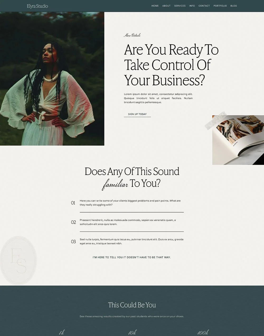
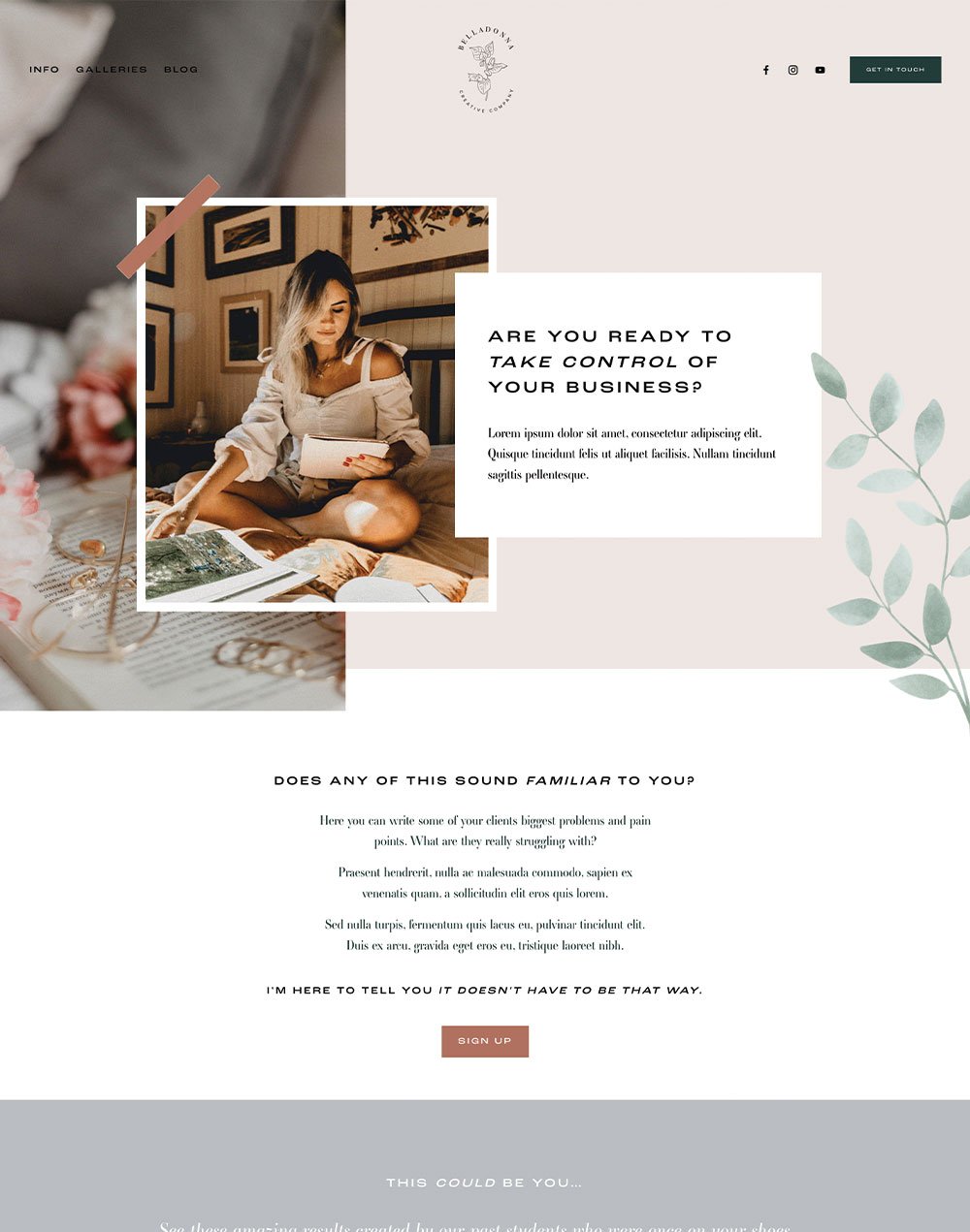
To save you a whole bunch of time that you could be reinvesting into your business instead, we've put together professionally designed, ready to convert sales page templates that are sure to bring in the sales 💰
With strategic layouts that include all the sales page essentials, and copy guidelines that will help you convince your site visitors that your offer is the one, a sales page template will not only save you a ton of time designing everything from scratch, it's easy to use, and a fraction of the cost of a custom design!
If you have an existing Squarespace 7.1 site, we'll install it directly into your site!
Check out our sales page template designs below👇
How to Remove Your Header and/or Footer From Your Sales Page
Once you’ve designed your sales page, you'll notice that you still have your website header and footer on the page.
Best practice says that you should always remove links that could take your visitor away from any sales page or landing page - you want to keep them on that page to the sign up, right?
So the best thing to do here is to remove your header and footer from your sales page so that your visitors won’t get distracted and navigate away!
Here’s how to do it:
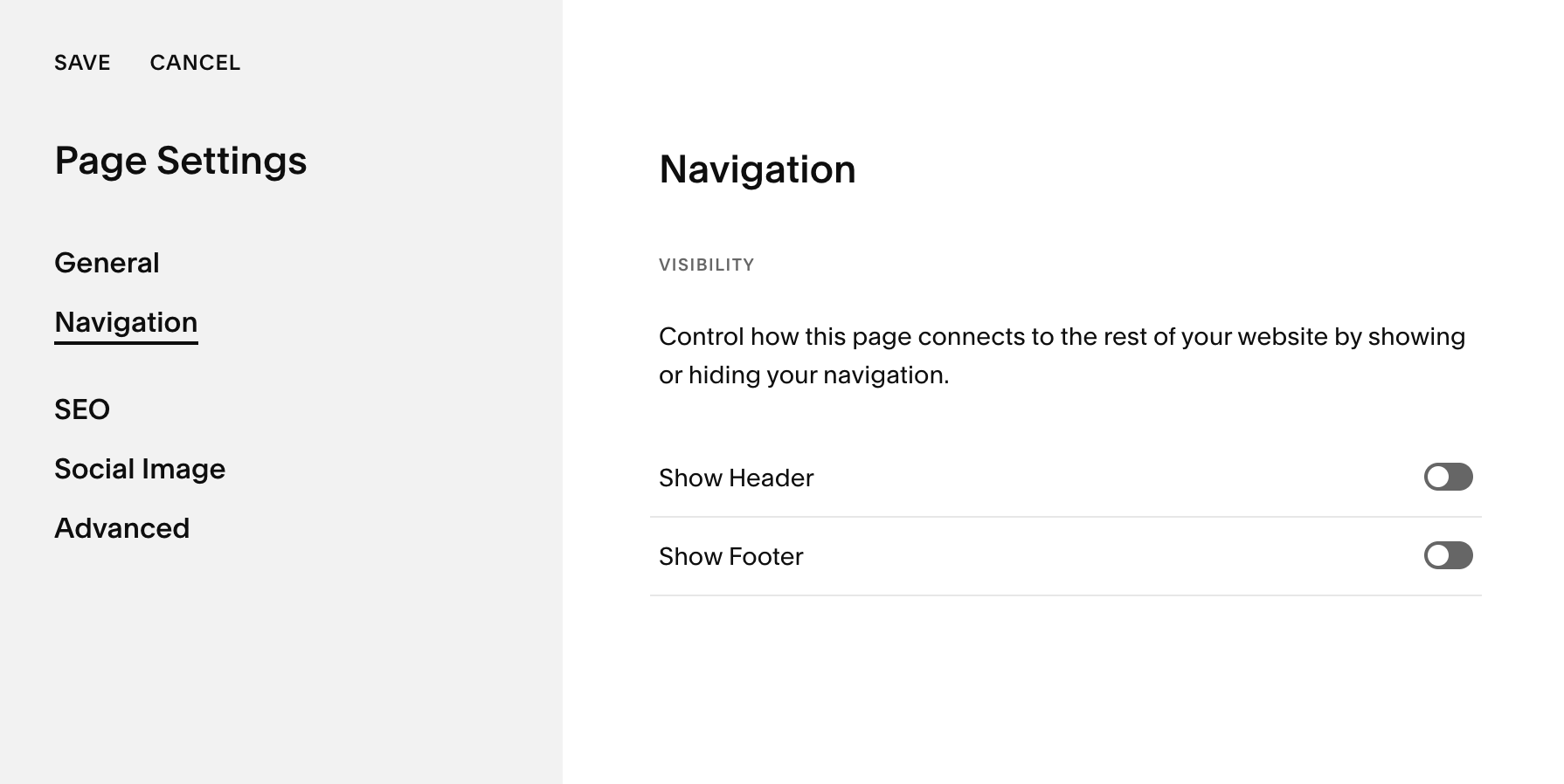
In your Pages panel, hover over your sales page and click on the cog icon to access the page settings.
In the pop up, go to the Navigation tab
Toggle OFF Show Header and/or Show Footer
Hit Save in the top corner and that’s it!
We're looking forward to seeing your amazing sales pages! If you do create one using this tutorial, make sure to DM us on instagram so we can check it out!
Loved this post? Learn more about sales pages here! 👇
The 5 must-haves on your Sales Page
Why you should use Squarespace for your sales pages
Crafting the Perfect Sales Page on Squarespace
Did you enjoy this post? Share the ❤️ and Pin it to Pinterest!


