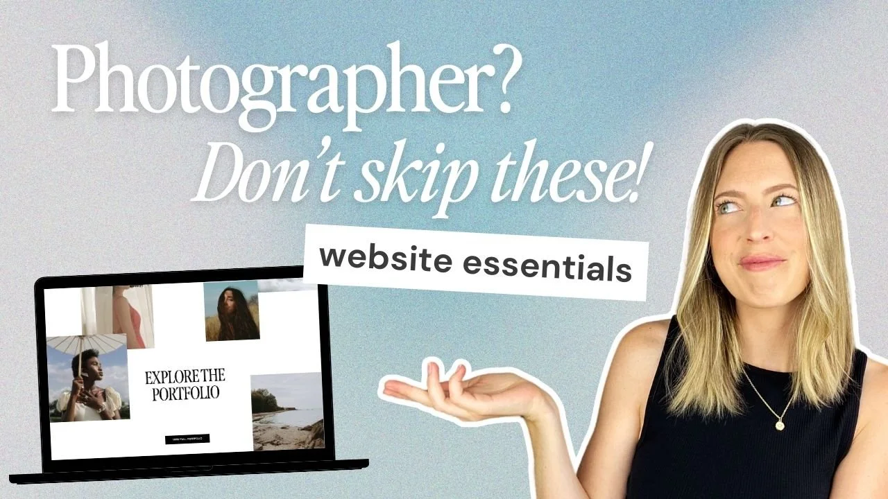
5 Must-Haves for a High-Converting Photography Website
If you're a photographer, you know just how important showcasing your work in its very best light really is and a well-designed photography website is a pretty essential part of that. Not only is it the place for potential clients to form a (hopefully fabulous) first impression of your work but also get a good idea of your style, your services, your prices, and your professionalism.
Whether you’re building a brand new photography website or refreshing your existing one, thoughtful website design can make a massive difference in how visitors experience your work and whether they decide to actually reach out! To help you nail your site, we've put together a handy guide of exactly what you should include and the design essentials that are going to help you land all of those dream photography jobs.
Let's get into it!
What Makes a Great Photography Website?
A great photography website isn’t just about looking good (but yes, that definitely matters too!). It’s about creating an experience that feels easy, clear, and intentional for the people landing on it.
Ultimately, your website should do three things really really well:
Show off your work in its best light
Build trust fast
Make it super clear what to do next
And when those things come together, the real magic happens: Your website stops being just a portfolio and starts quietly working in the background to bring in bookings!
Here’s what we see time and time again on photography websites that actually convert:
Clear messaging, right away
Curated, high-quality imagery
Human touch
Easy, intuitive navigation
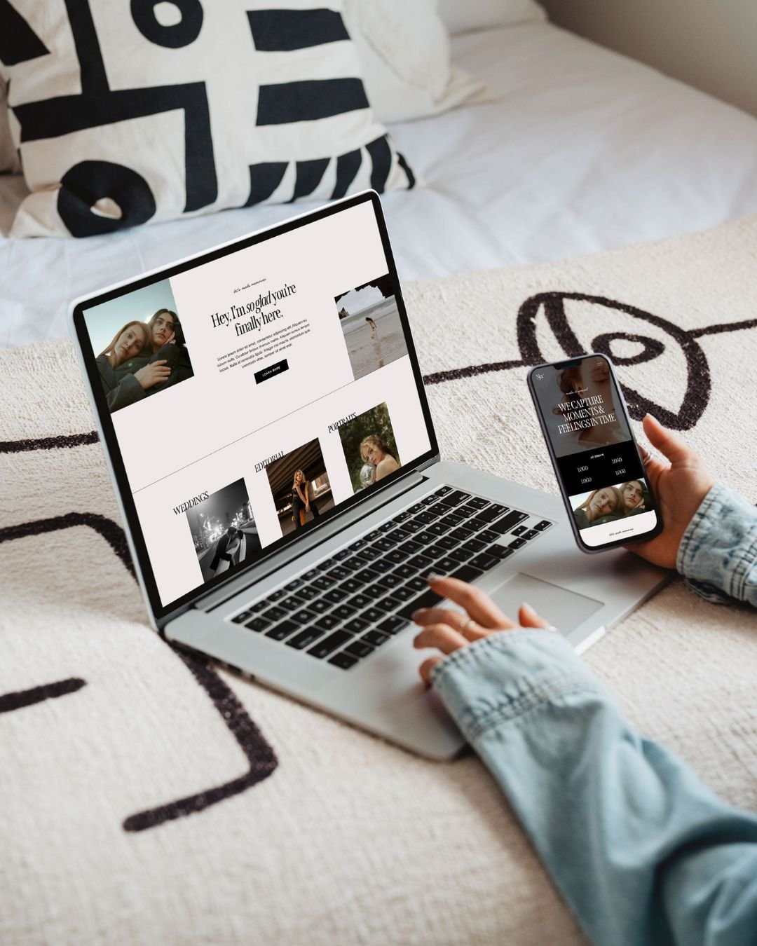
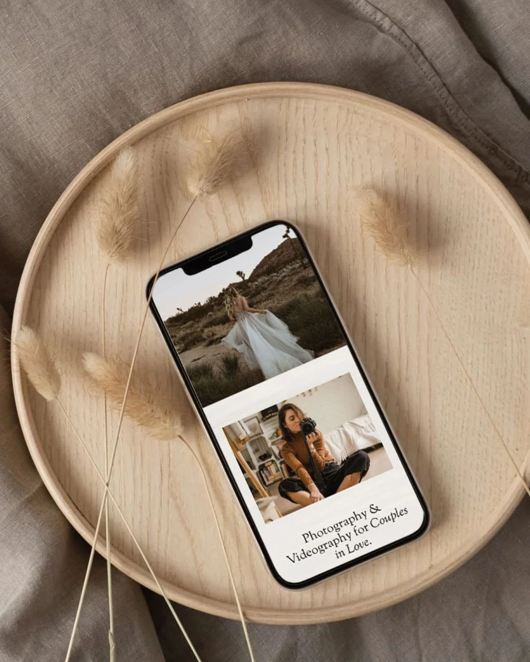
If you're not sure how to make that work on your site, make sure to check out our Squarespace Website Templates for photographers! These have been professionally and strategically designed to help you convert all while providing beautiful layouts to showcase your work:
Essential Elements you Need on Your Photography Website
1 - Where You're Located and What Kind of Photography you Offer
This might sound obvious, but it’s one of the most commonly missed things on photography websites!
Imagine your ideal client landing on your website for the very first time. They’re probably scrolling quickly, skimming headlines, and asking themselves two simple questions:
Is this photographer anywhere near me?
Do they photograph what I’m looking for?
If they can’t answer those questions within the first 5–10 seconds, there’s a good chance they’ll click away and check out someone else, even if your work is beautiful!
So at a minimum, your website should make these two things crystal clear from the get go:
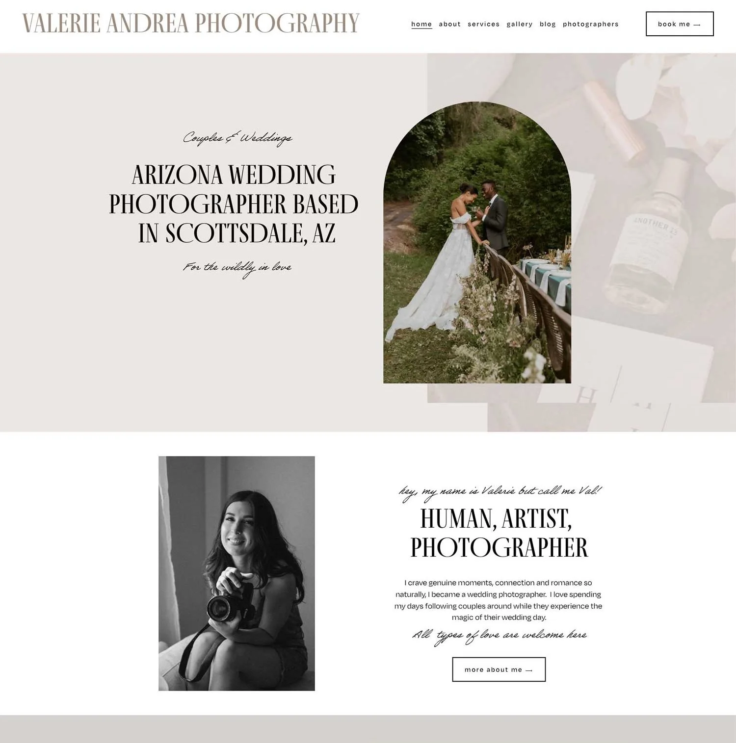
Where you’re based (and whether you're willing to travel)
What type of photography you specialise in (whether that's weddings, branding, UGC, family, or any other combination!)
How to include this (within the first 10 seconds):
In your hero headline deadcentre on your homepage
In a short subheading or intro paragraph
Repeated naturally on your About and Services / Packages pages
Example of a photography website created with our Verano Squarespace Template
👉 Golden rule: Never assume your visitors already know who you are or what you do. Spell it out clearly, confidently, and early.
2 - Client Case Studies + Testimonials
Hiring a photographer is a pretty big decision! It’s often a significant investment, it often involves vulnerable or intimate moments, and for many people, being in front of the camera can feel pretty awkward or nerve-wracking.
This means that potential clients won't just be choosing a photographer by the aesthetic, they're also going to be choosing by the person. They'll be looking for someone that they vibe with, that makes them feel comfortable, and that they can trust, and what better way to showcase this than by sharing your past work and the experiences previous clients had while working with you.
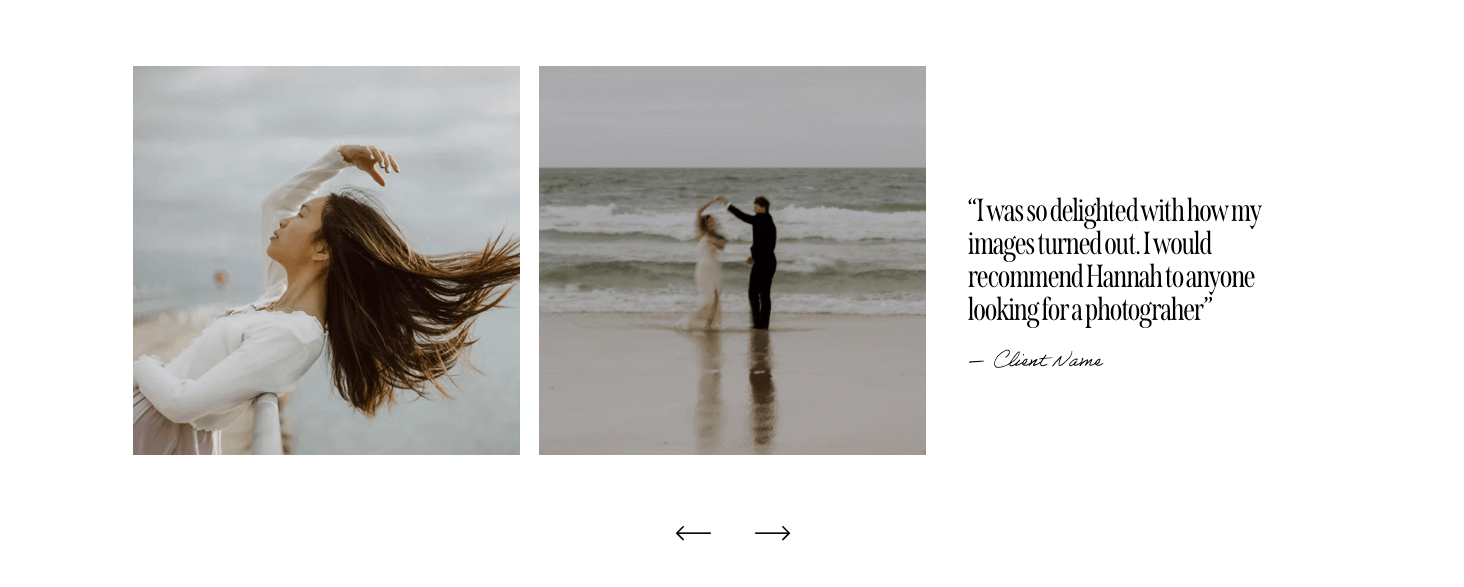
One of the easiest (and most effective) ways to do it is by sharing real feedback from real clients through a simple testimonial slider which lets people scroll through kind words and genuine experiences without having to dig. Testimonial sliders can easily be placed on any page of your site and you can even use a handy plugin to automatically pull in reviews from different sources like Google and Facebook for you.
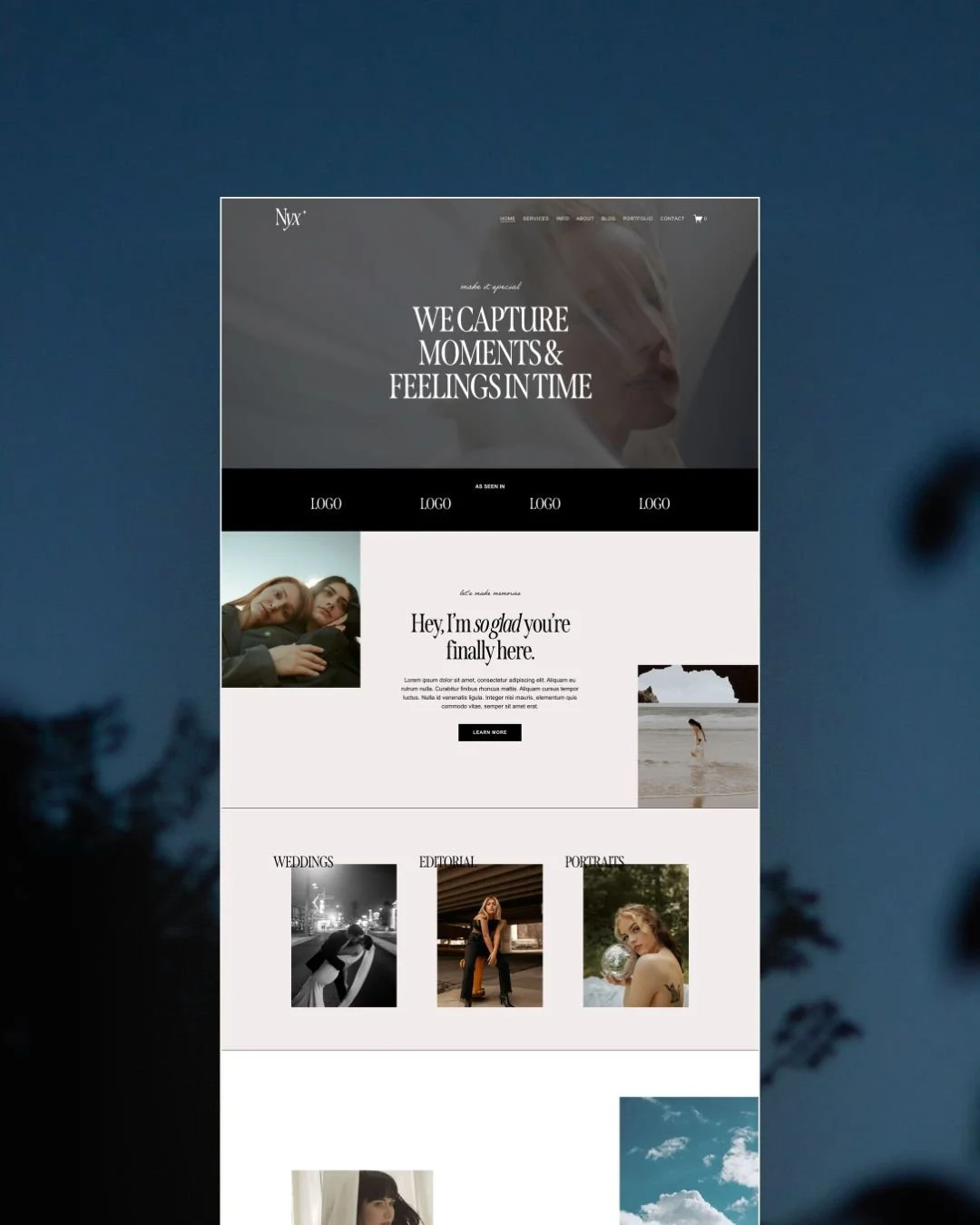
Example of a review slider in our Nyx Squarespace Template
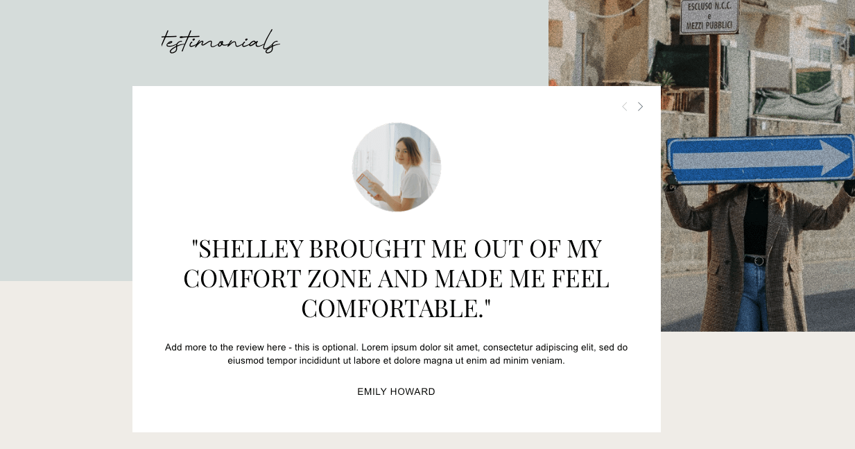
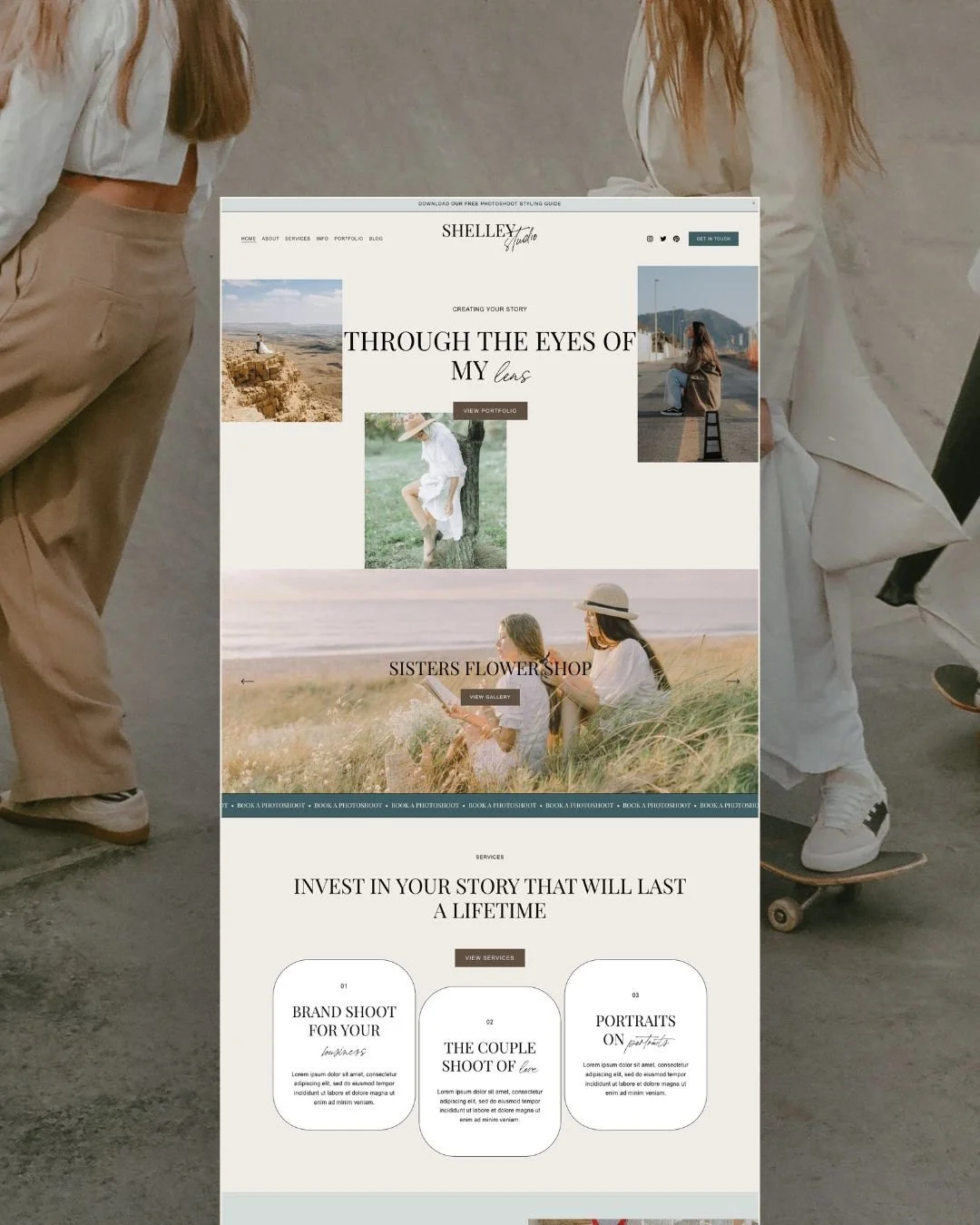
Example of a review slider in our Shelley Squarespace Template
If you want to take things up a notch, this is where client case studies can really boost conversions. While a portfolio shows off your images, a case study tells the full story behind them, helping potential clients picture (pun intended) what working with you is really like.
A great photography case study could include:
A quick overview of the project (who, where, and what type of shoot it was)
How you prepared and approached the job
A peek behind the scenes of the shoot day
Any challenges or special considerations
A little insight into the client (or even a short Q&A)
A glowing client testimonial
A curated selection of final images (the good stuff ✨)
You definitely don’t need to do this for every shoot. Even just 3–5 strong case studies can make a huge difference when it comes to building trust, boosting enquiries, and attracting more of those dream clients.
And if you’re using Squarespace for your photography site, we highly recommend using either the Portfolio feature or the Blog feature to organize your portfolio + case studies with ease!
Example of the Iris Squarespace Template main portfolio page
Example of a portfolio project case study page in the Iris Squarespace Template
👉 Pro tip: Make sure you optimize your portfolio and case studies to include only the work you actually like doing! This will bring you more of those dream clients and dream jobs!
3 - A Thoughtfully Written About Page
Every website needs an About page, but for photographers, this page is extra important to let potential clients know that you are the photographer for them, the one that will make them feel safe, understood, and comfortable throughout the whole experience. The About page is one of the key places for this connection to happen.
While the About page is a great place to show your personality and give some insight into who you are, you want to be very conscious of writing from a perspective of how you serve your clients, rather than writing paragraphs on paragraphs about your life story.
Your visitors want to learn about you in a way that shows them what working with you would be like (they don't want to know about your Aunt Jo - unless that's particularly relevant to how and why you are a photographer).
What to include on the About page:
A friendly introduction (write it like you're writing to a friend)
A professional photo of you (yes, this really matters)
Reassurance around the experience (especially if your clients aren’t used to being photographed)
Clear links to your services, packages, or portfolio
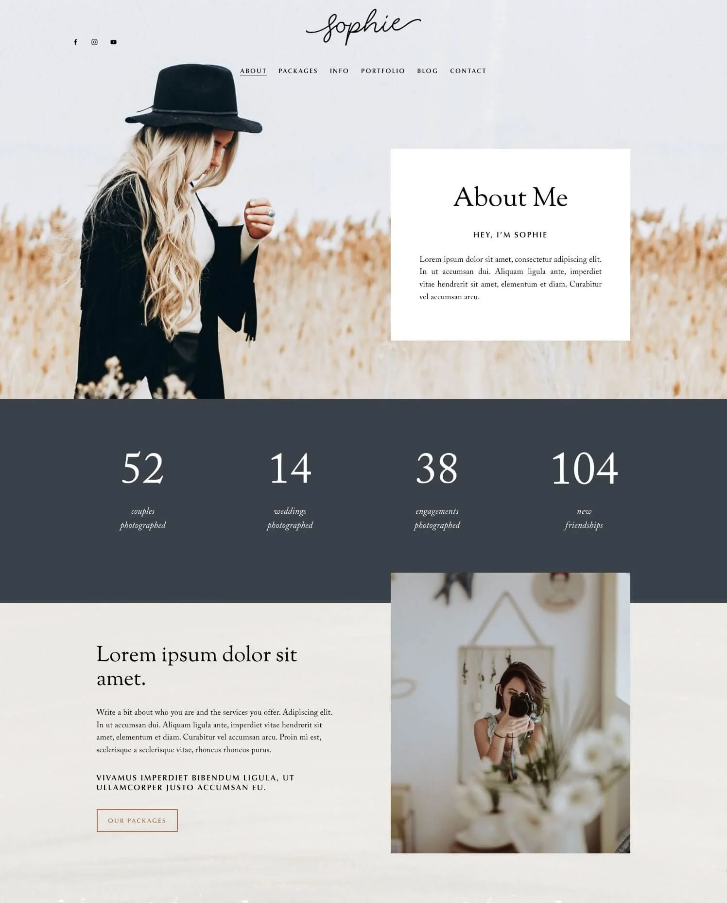
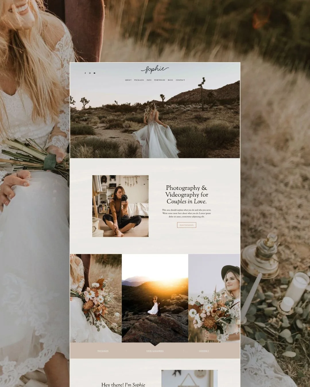
Example About page from our Sophie Squarespace Template
👉 Golden rule: Your future clients aren’t just choosing your images. They’re choosing you. Make it easy for them to learn about you and feel that connection.
4 - Packages and Pricing Details
This is one of the biggest conversion drivers on any photography website (and one of the most avoided!)
Packages
Creating set packages is an amazing way to help your potential clients get an idea of the process and what they are actually going to get before they have to reach out to you.
This doesn't mean that you have to stick to these packages exactly, as every client will probably require some customizations. But it's a great starting point and will really help your clients see what's possible.
We recommend putting these on a dedicated "Packages" or "Work with me" page so your clients can easily see what's available and compare.
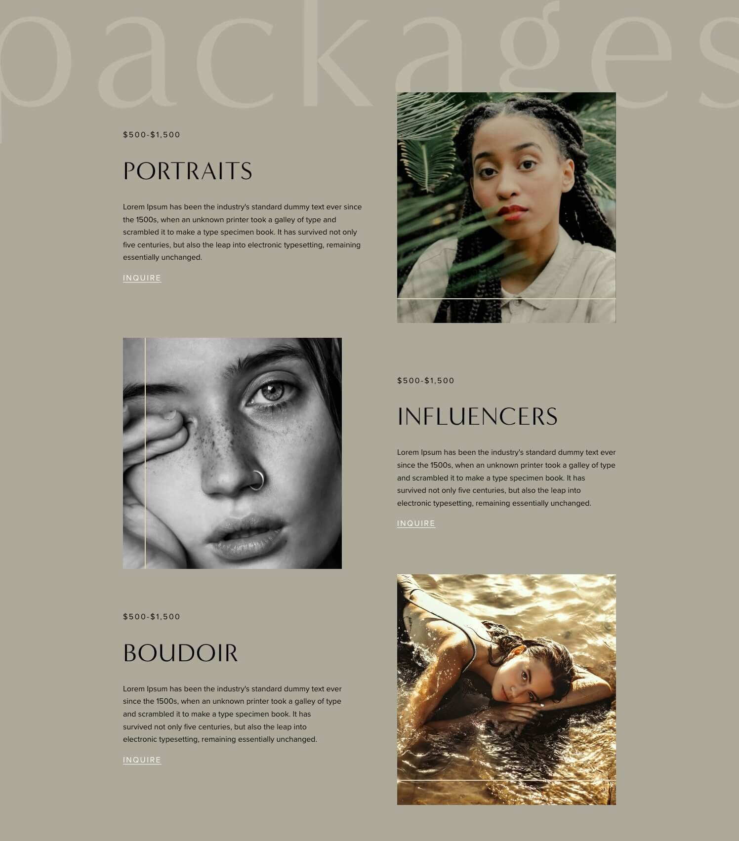
Example of packages in the Noire Squarespace Template
Pricing
Should you post prices on your website? We get this question a lot and our answer is always: YES. This goes for any business, not just photographers.
Including pricing on your website helps to:
Gently filter out enquiries that aren’t the right fit (everyone's budget is different and that's ok!)
Build instant trust and transparency
Cut down on endless “just checking your rates” emails
Bring in better-quality enquiries from people who are actually ready to book
👉 Pro tip: If your pricing varies, a simple “starting at” price works well too.
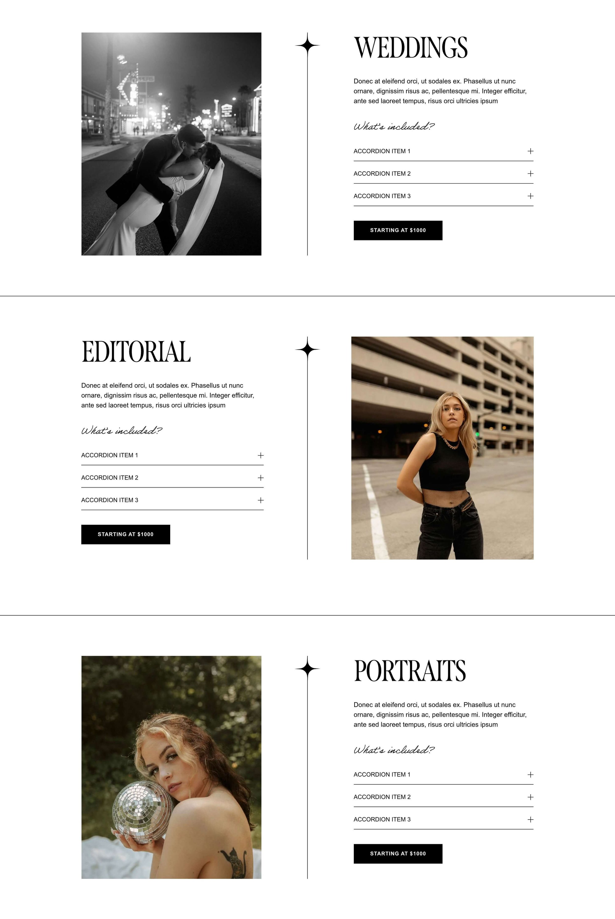
Example of packages and pricing in our Nyx Squarespace Template
5 - Strong Design That Lets Your Photography Shine
Ultimately, you do still want your photography to be the hero. Photography (like design) is an art, and great photography deserves to be displayed in great web design! This means your website design should let your photographs speak for themselves but without competing for the spotlight.
When great images are squeezed into a clunky layout or surrounded by messy design, they can lose some of their magic. But pair those same images with thoughtful, intentional design? Instant glow-up! ✨
That’s why good design matters so much for photographers.
Whether you’re investing in a custom website or using a professionally designed website template, it's so important to get this right.
Make sure your site is professional, works well with your style of images, and of course, puts your photography on display. You want to create a website that has lots of imagery and places to show off your amazing work!
Focus on:
Clean layouts with plenty of breathing room
Big, beautiful image display that let your work shine
Consistent fonts that feel aligned with your brand
Minimal distractions (your photos are the star here)
Clear calls-to-action so visitors know exactly what to do next
👉 Pro tip: Photography websites naturally use a lot of images which means site speed really matters. If your site is slow to load, it can not only frustrate your visitors but also really hurt your search engine rankings so it's super important to optimize all of your images before uploading them!
The Best Squarespace Templates for Photographers
If you want a website that looks high-end without the tech nightmare, Squarespace is a total no-brainer for photographers. And when you pair it with a professionally designed template? The results are *chef's kiss*. 🤌✨
Check out some of our very best templates specifically for photographers below.
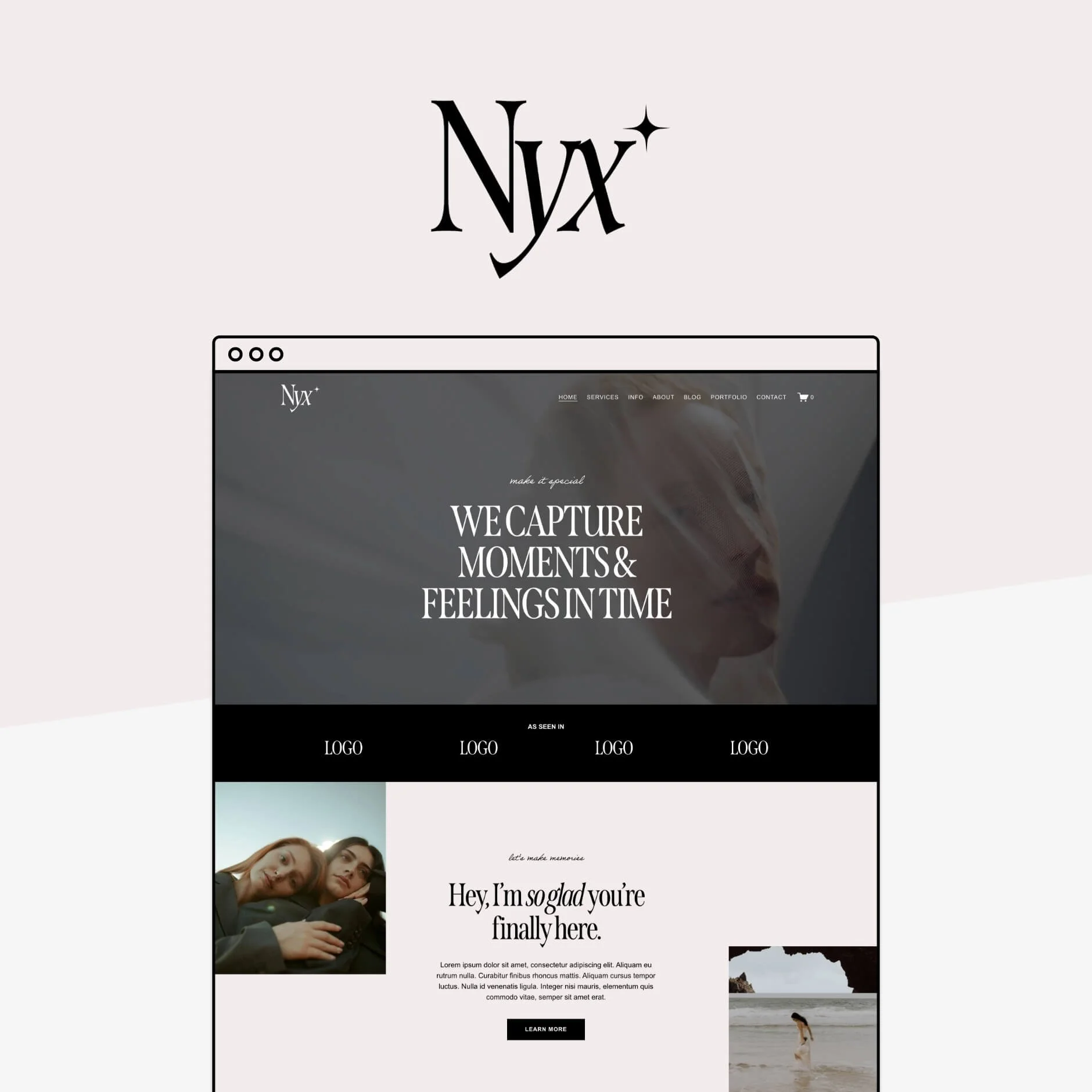
Nyx
Our newest template, Nyx, is bold, editorial, and made for photographers who want their work to feel elevated with a timeless edge.
"I found the Nyx template easy to install and WOW—I really feel it's taken my website to the next level. I can't wait to put it out there and see the response, it's given me a lot more confidence about making information about what I do more seamless and clear. Thank you for creating this, and for the help offered by support when I had a few queries!" - Susannah from Zerrin Studio
Shelley
Soft, stylish, and super versatile, Shelley is a beautiful fit for family, lifestyle, and wedding photographers who want something approachable yet polished and professional.
Sophie
Sophie is the template for wedding photographers, featuring a dreamy, rustic and romantic design, that feels both elegant and timeless.
"I used the Sophie template which was so beautiful and clean - perfect for a photographer. It was so easy to customize and personalize the template and the tutorial videos were so good. I’d been using Squarespace before and learnt lots of new tricks. Thank you for saving me so much time!!" Gabrielle Garcia from Gaby Marie Photography
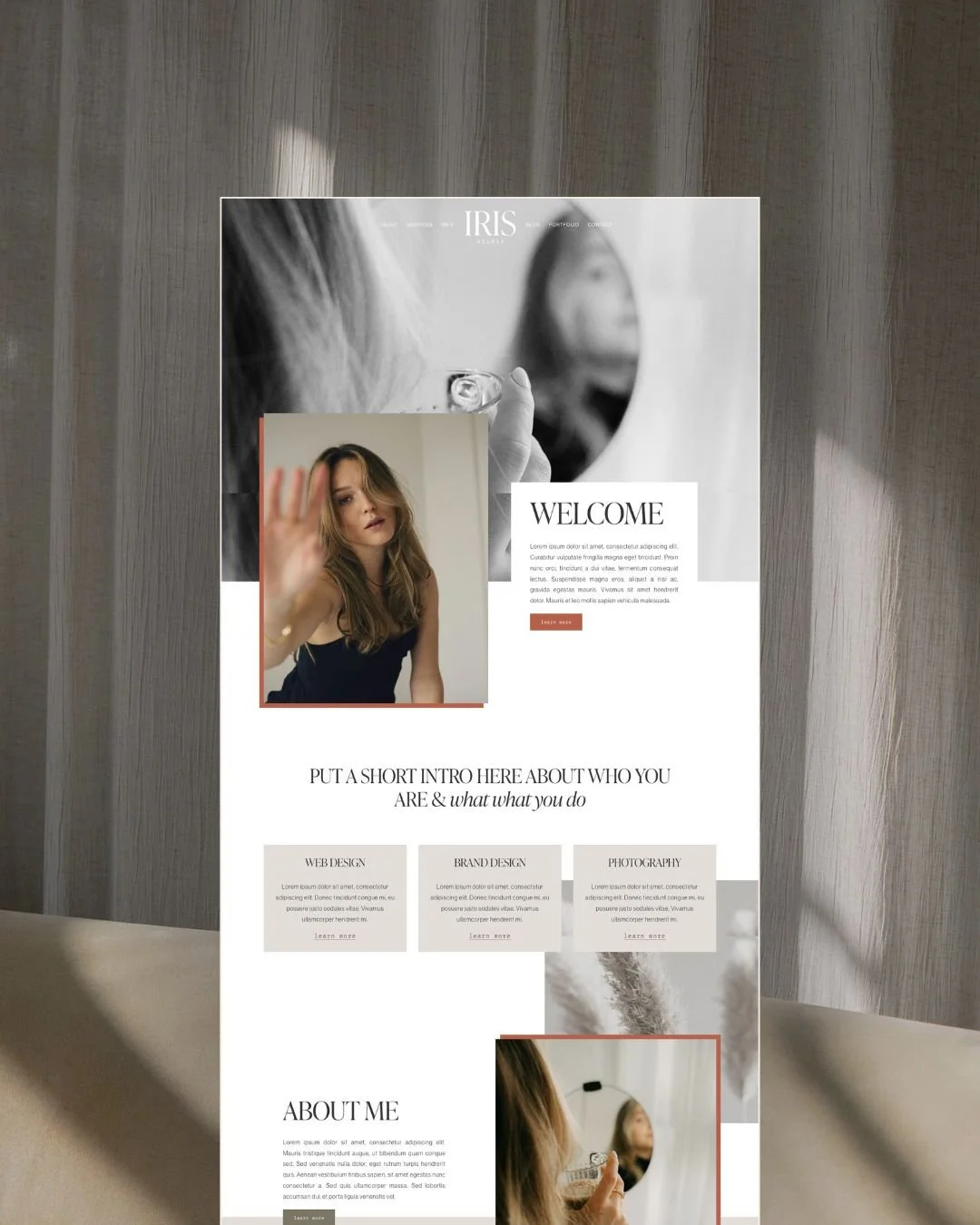
Iris
Full of movement and beautiful overlapping effects, the Iris template feels both sleek, modern, and visually engaging, bringing a whole new dimension to your work.
Noire
Dark and moody, the Noire template offers a truly unique and sophisticated platform for photographers that want to make a strong visual impact.
"One of my best business purchases of the past decade! Loved the NOIRE template, gorgeous, easy to customize & just what I needed for my relaunch!" - Jimena from The MMM Sanctuary
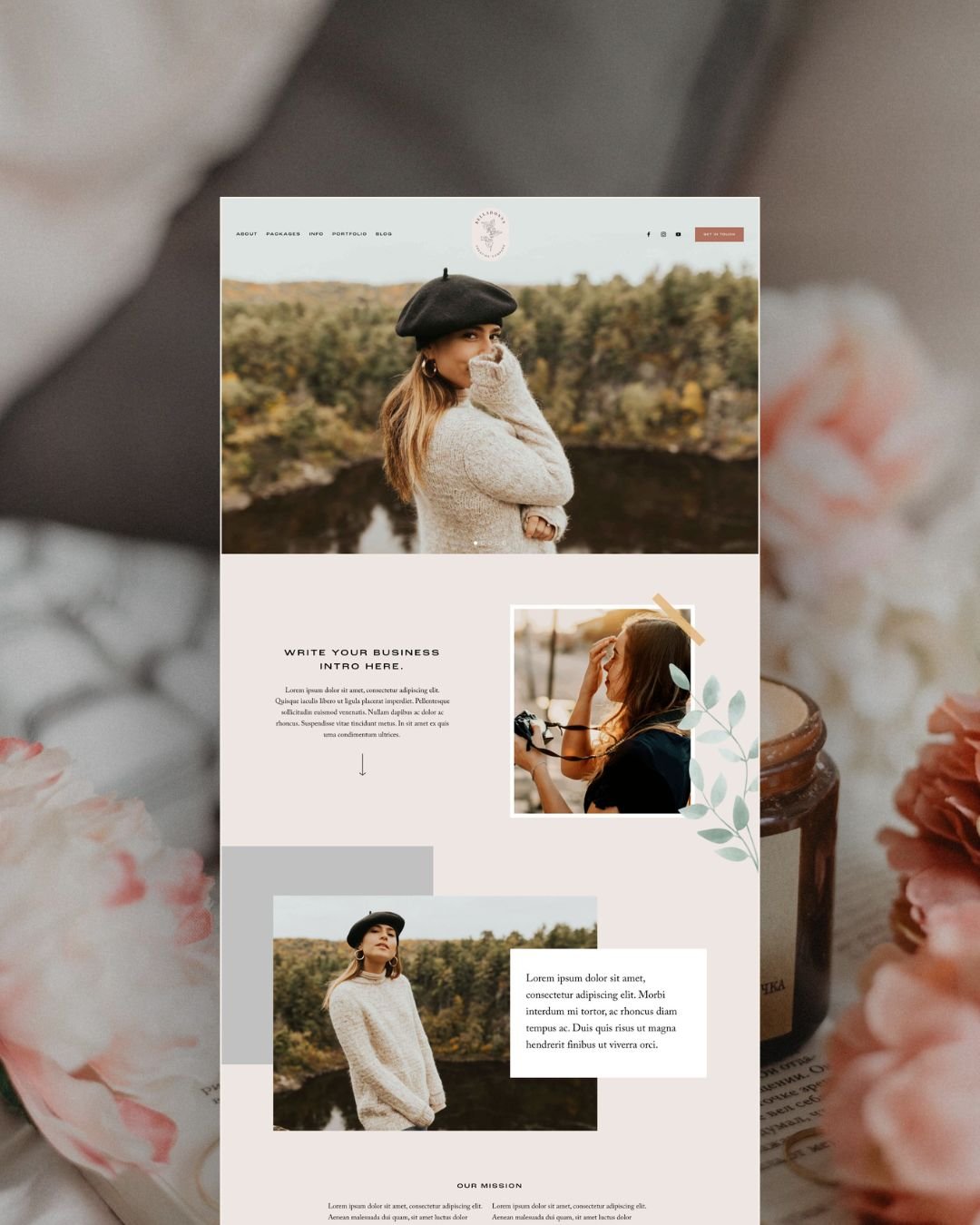
Belladonna
Belladonna is a feminine and romantic template with tons of space to show off all of your work in a unique way.
"I’m so in love with my new website. I got the Belladona template set and it’s perfect for my photography business. It was easy to customize the images and graphics in Canva and whenever I needed help they were prompt with answering my questions and guiding me through the process." - Edina Merkel Photography
👉 How to Pick the Best Squarespace Template for your Business
And that’s a wrap! If you take away one thing from this post, let it be this: A great photography website is about clarity, connection, and showing your work in its very best light. Nail these essentials, and your website won’t just look good, it will help you attract more of those dreamy, aligned clients too!
Want more website tips? Check out the posts below:
How to add a photo slideshow header to your Squarespace 7.1 site
Different Portfolio Styles to add to Your Squarespace Website
A Complete Guide to Unique Image Layouts in Squarespace
How to Get Your Squarespace Website on Google: A 5-Step Guide
How to Customize Squarespace Forms (and Say Goodbye to Boring Contact Forms)
If you liked this post, Pin it to Pinterest! 👇🏻


