Maison Iggy: Brand and Squarespace Website Design
Maison Iggy is an e-interior design shop inspired by SoCal's eclectic and free-spirited lifestyle founded by Jen Beyor. This little design shop is oozing with cool cali vibes and modern-retro tones. Jen is a mother, an animal rescuer and a long time business woman passionate about Interior Design. She started Maison Iggy to pursue her love for interior design and to offer people a simple fun and affordable way to bring creativity and design into their home. Inspired by her Dog Iggy, and as a keen animal rescuer, a portion of each project gives back to homeless animals in Los Angeles - how cool is that?
With all of the information we gathered in the initial questionnaires and consultations, I was able to start on her brand mood board. This mood board was all about honing in on a few different styles and making them cohesive. We went for a cool retro vibe with beachy-california elements while still trying to keep it modern and professional.
MOOD BOARD
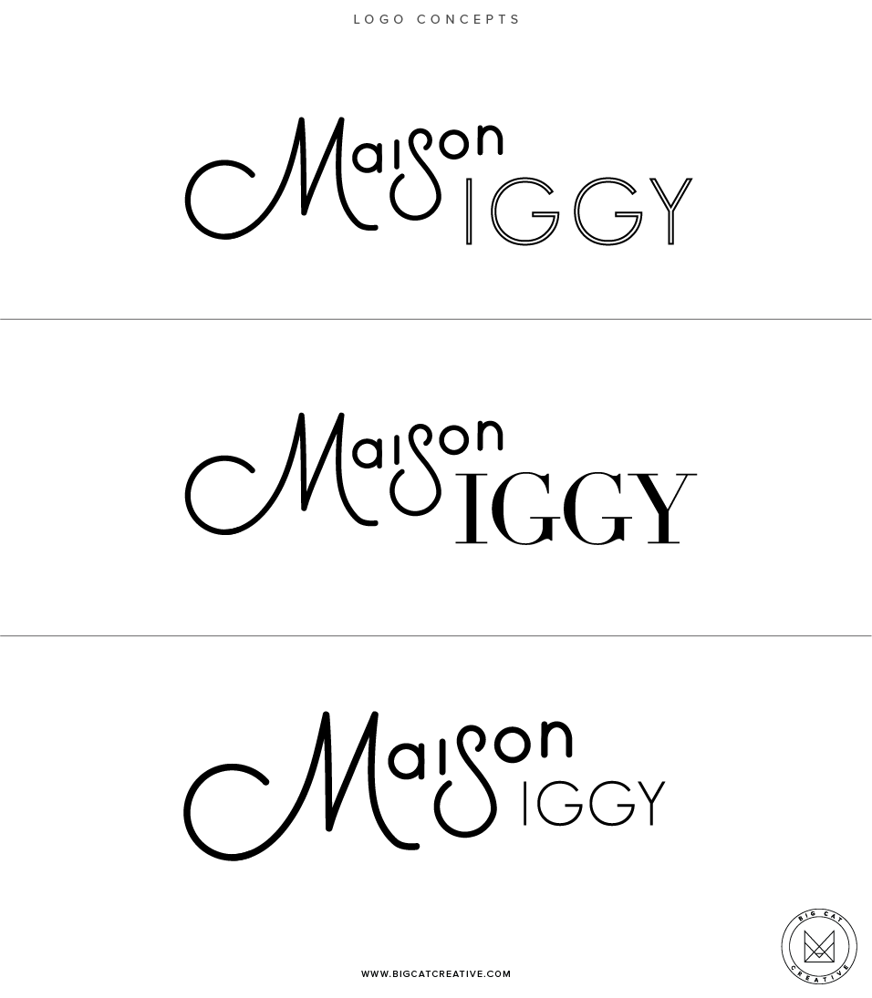
After we perfected the mood board, we moved onto the logo design process. Jen had a lot of ideas of what she wanted to see for the logo, so I created a lots of examples for her to look at.
LOGO DEVELOPMENT PROCESS
After lots of consideration and development we were able to decide on the final logo and submark (which features her dog, Iggy!)
FINAL LOGO + SUBMARK
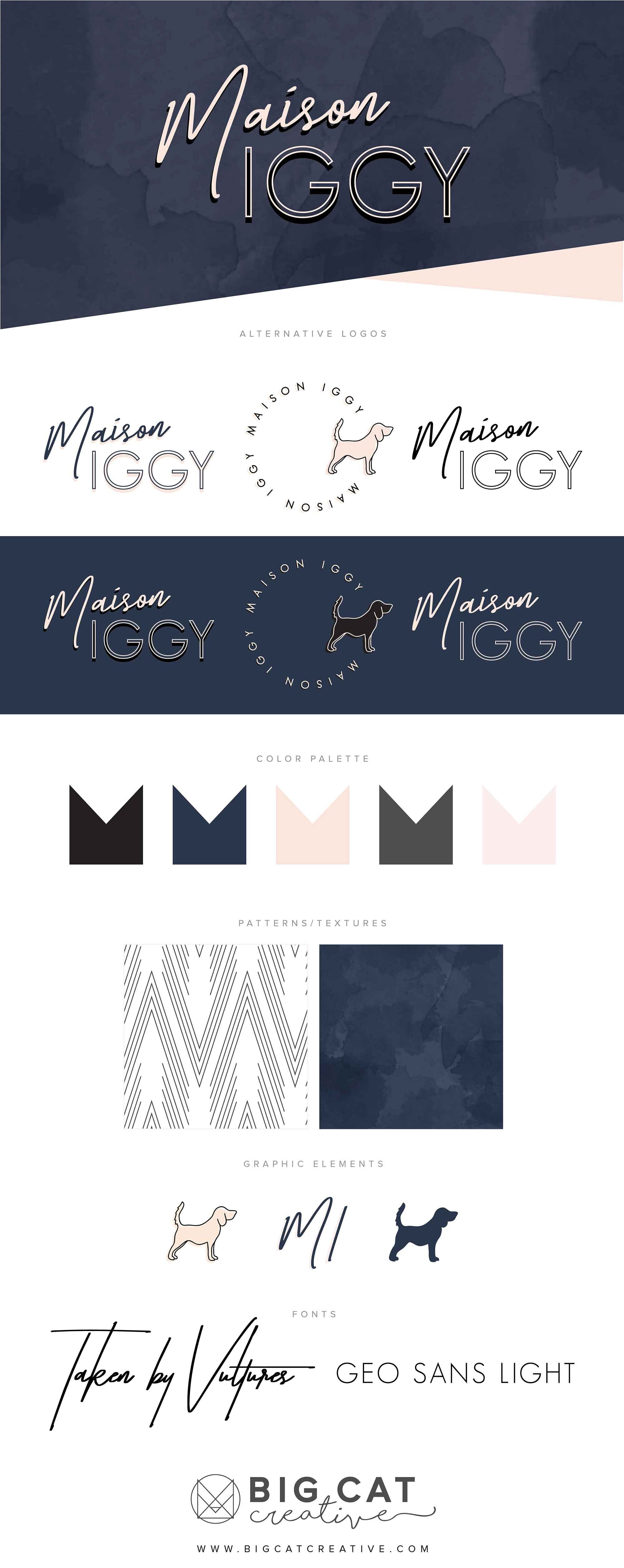
Once the logos were finalised, we got to work on the final pieces of the brand that all come together in the branding style board. We decided on the color palette, a geometic pattern and navy water color textures. I included lots of variations of logos to use in different instances.
Branding Style Board
As a bonus I also designed Business Cards. They are single sided, and I included 4 variations for Jen to choose from.
BUSINESS CARDS
Once the brand was all set to go, we got started on the website. The website followed the brand perfectly and was the cool, professional, retro and modern website we had both envisioned. The color palette and patterns were super modern while the color blocking and fonts gave a cool, retro vibe.
The website was built on Squarespace, go check it out!


