Absorb Skincare: Brand and Squarespace Website Design
Absorb Skincare is a Wildcrafted and Organic Skincare line handcrafted by Kelly Gray, in Austin, Texas. Kelly is so passionate about natural skincare and eco-friendly products for the health of people and the environment, so her brand and website needed to reflect that.
With all of the information we gathered in the initial questionnaire and consultation, I was able to start on her brand mood board and color palette. This mood board was all about finding the perfect balance between natural and luxurious.
MOOD BOARD
Color Palette
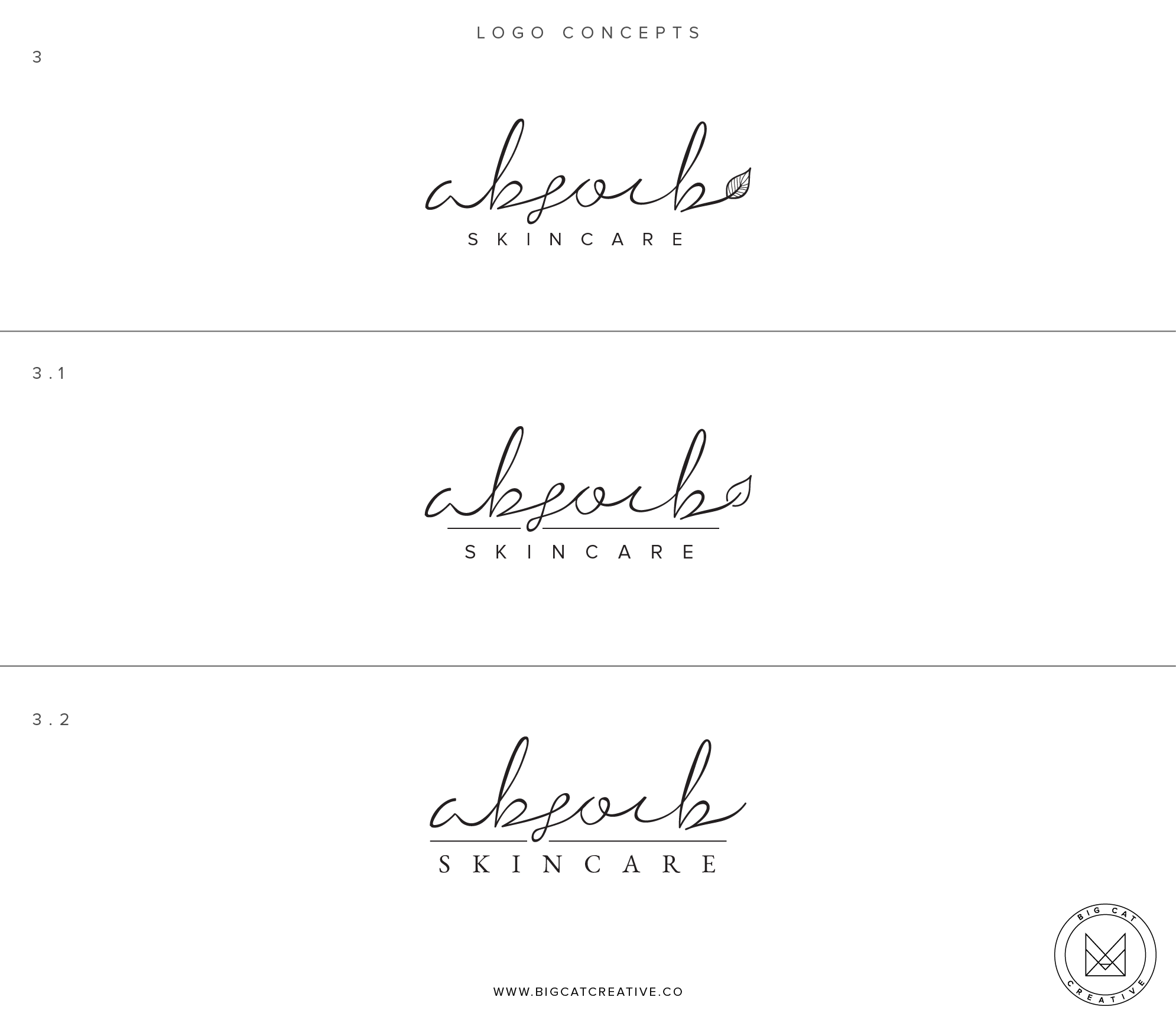
After we perfected the mood board and color palette, we moved onto the logo design process. Board #2 was a resounding winner, so I went on to develop logo 2.1, which included creating an alternative logo/submark.
LOGO DEVELOPMENT PROCESS
FINAL LOGO + SUBMARK
Once the logos were finalised, we got to work on the final pieces of the brand that all come together in the branding style board. We decided on a pattern and lots of variations of logos to use in different instances. We were both over the moon with this brand board, it's gorgeous and was exactly what Kelly had envisioned for Absorb Skincare.
Branding Style Board
As a bonus I also designed labels for the skincare bottles and containers. They are printed dark grey with a smooth matte finish, and the logo is foiled with a rose gold. These labels are so luxurious and really speak to the quality of the products inside the bottles.
PRODUCT LABELS
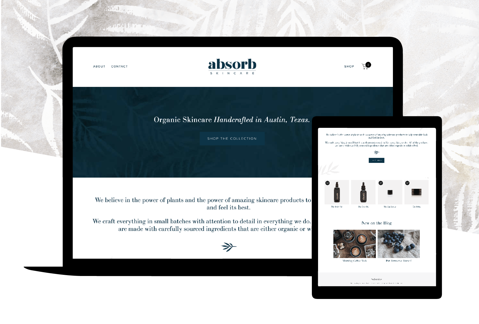
Once the branding and labels were all set to go, we got started on the website. Absorb Skincare is not just organic skincare, it's also thoughtfully crafted and luxurious, high end skincare. The website followed the brand and found the perfect balance between natural and decadent. The deep blues and rose golds exuded luxury, with subtle leaf patterns, motifs and lots of white space to portray the natural, organic feel.
The website uses Squarespace built in e-commerce and blog, and is so easy to navigate.


