Claire Rhodes Photography: Brand and Showit Website Design
Claire Rhodes is a Photographer based it Florida. She specicalises in seniors, families, portraits, and personal branding. Her experience and skills in photography are clear by just looking at her images, but her great reputation and popularity comes from her true ability to connect with her clients and make them feel confiendent in front of the camera.
"What do I love about my vocation? The emotions I get to share with my clients on their reveal day - seeing themselves in a completely new light, all the self criticism and doubt swept away - it’s magical, and it gets me every time."
- Claire Rhodes
Claire has a booming business, but her brand and website at the time didn't truly reflect her style. She wanted something that displayed her photographs well, but also expressed her unique point of view and attracted her ideal clients.
I had such a great time working with Claire on this project, it was very much a collaborative process. Claires aesthetic was really fun to work with and it meshed so well with her imagery, so it was great to be able to capture that in her new brand and website.
After Claire completed her Questionnaires and Pinterest board assignments, the first step in the design process was to create a mood board. The mood board is a collection of images that reflect the overall style/mood/vision of the brand. These are essential to make sure your visions align and that the design is heading in the right direction. After a couple of revisions, this is what we came up with:
Mood Board
We loved the bold black and classy feel of this mood board, and the hint of nudes and metallics brought it to life and gave it the glam that Claire wanted.
After the mood board was finished we got started on logo designs. We start with a bunch of different ideas and we refined, refined and refined it down to the final product. Here are some of the initial concepts:
Logo Concepts
We continues to refine the logos until we both LOVED the final logo. Together with the mood board, the rest of the brand fell into place. We chose a modern muted feminine color palette and some metallic features like gold and glitter to give it a bit more glam. Claire obviously had an incredible range of imagery for her brand, so it was important to make sure that the design meshed well with the photographs. Check out all of the final elements below in the brand style board!
Brand Style Board
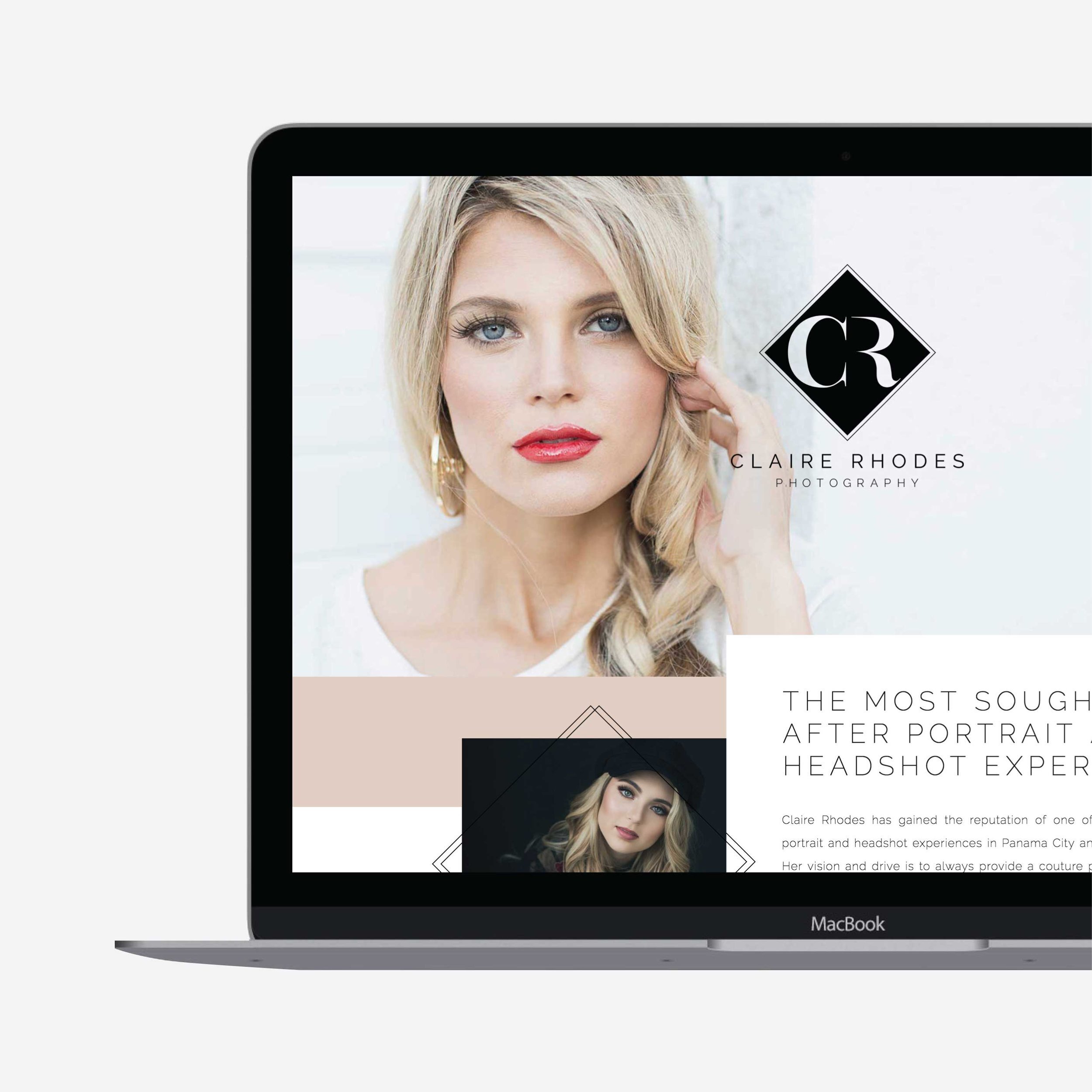
We built Claires website on Showit because she was craving a lot of the interactive design features that are readily available with Showit. The website was fun to create because we played a lot with the interactive and animated features, while tying everything together with the incredible photography. To me, this website is more than just a website, it's an experience. The way the site works as you scroll down the pages is captivating and really brings everything to life.
It's gorgeous, but it's also super easy to navigate and contains everything you need to know about working with Claire, her process and all of her incredible photographs from past clients.
Check out the final product below, but make sure you view the live site so you can experience all of the features we worked so hard on!
Overall, this project was a mountain, but I couldn't be more pleased with the outcome! You can see the hard work that went into this brand and website through all of the small details, and those details are what makes it truly incredible.
Claire is an amazing photographer and I can't wait to see what she does in the near future!


