How to edit in Squarespace 7.1 with Fluid Engine - Best practices & tips
Today, we're going to jump into how to edit in Squarespace's new Fluid Engine Editor.
If you've never used Squarespace before, or even if you have, and you're wondering what Fluid Engine means, basically, it's a new editor that Squarespace recently brought out – a new way to edit within Squarespace 7.1!
We've done two quite important posts on Fluid Engine recently. Most importantly, we've covered what Fluid Engine is, the pros and cons, how to use it, and if you should use it. And we've also covered the main differences between the old Classic Editor and the new Fluid Engine so that you could compare them and decide for yourself what would be the best to use.
In this post, however, we're diving into the meat and potatoes of the new Fluid Engine and we’re going to show you the fundamentals of actually designing in the Fluid Engine, including some best practice tips.
Remember that Fluid Engine is only for Squarespace 7.1. If you are using Squarespace 7.0, you will have access to the existing Classic Editor. We've got tons of other tutorials about the Classic Editor on our YouTube and Blog, but today we're going to be talking about 7.1 (which also previously used the Classic Editor but is now transitioning into the Fluid Engine editor).
If you've never used Squarespace 7.1 before, and you're watching this video or reading this post today, we're just going to be talking about editing on-page with Fluid Engine specifically. And while that does cover a lot about on-page design, if you are completely new, we do recommend checking out other 7.1 tutorials about site styles, how to use pages and other design settings as this will help you learn other aspects of how to use your Squarespace site.
Which sections are affected by Fluid Engine?
If you've used Squarespace 7.1 before, then you'll be happy to know that the new Fluid Engine update only affects Block-Based page Sections. Everything else on your site is going to be the same.
While having a whole new editor does sound a little bit daunting, knowing that it only affects regular page Sections that use Blocks makes it a little less scary to learn!
Every Squarespace 7.1 page is made out of different Sections and you can build your page up with Sections.
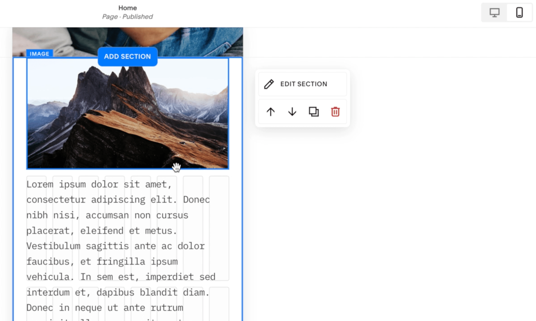
You can move the Sections up and down using the arrow keys, you can duplicate Sections by clicking on the Duplicate button and edit Section settings by clicking the edit Section button. All of those things are still the same as in the Classic Editor. The biggest difference here is the way that we edit these regular Block Sections is changing.
When you click Add Section, a ton of different Section types will appear in the pop up menu, mostly just preexisting layouts that you can choose from. But what you'll want to take note of is the LIST and the GALLERY Sections. Although they are sort of integrated into this list, these two types of Sections are actually different from regular Block Sections. The LIST and GALLERY Sections on Squarespace 7.1 aren’t changing either and will keep using the same Classic Editor style of editing.
The only thing that's changed is the Sections that use Blocks.
Can I still use Classic Editor Sections?
If you are using a 7.1 site, you should have access to Fluid Engine now. All new Sections you add will be in Fluid Engine.
Currently, if you scroll to the very bottom on the Add Section layout list, you can ‘Add a Blank Section with the Classic Editor’, or you can click through to find some prebuilt Sections:
BUT – we don't believe this is going to be around for too much longer. Squarespace has said they are planning to roll this out and just have Fluid Engine indefinitely. If you don't see that option, you can only use Classic Editor now by duplicating any existing Classic Editor Sections around your site.
How can I convert existing Classic Editor Sections to Fluid Engine?
If you do have an existing 7.1 site with Classic Editor Sections, you can convert your Classic Editor Sections to Fluid Engine by clicking the Upgrade button:
Before you go through and convert all of your Sections, first know that you can't convert them back! You can only upgrade to Fluid Engine. You can't downgrade back to Classic Editor.
You want to be really sure that this is something that you want to do before you click that button. And we would recommend getting really familiar with Fluid Engine first before you go and convert any of your existing Sections, because you just really want to make sure that the layout that you want to achieve is possible in Fluid Engine and you know how to create it.
Adding Blocks in Fluid Engine
Fluid Engine Sections still use Blocks. Blocks are the building Blocks of our site. Click Add Block in the top left to add a Block to your Section:
This will open a Block menu. This is basically how we build sites. We add Blocks for text, buttons, images etc. Essentially anything you want to add on your page, there is probably a Block for it somewhere.
It's really as simple as clicking Add Block, adding one to your Section and then positioning it where you want it to be.
Revealing the Fluid Engine Grid
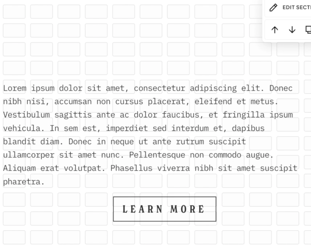
When you start building in Fluid Engine click the letter 'G' on your keyboard. This will reveal the Grid to build on.
Accessing Block Settings
Every Block will have a container with transform controls around it, so you can resize the whole Block. You can also click and drag your Block anywhere around the Grid. Every Block will have its own settings and every Block's settings are different.
You'll notice when you click on the Block once, a little panel of settings pops up. There might be more settings here depending on which Block you're using, but it's really important to note that every Block has settings and to adjust anything within that Block, this is where you will find the settings for every Block.
You'll see alignment settings here for most Blocks. And you'll also see the little edit (pencil) icon. If you click on this, this is going to open up another panel of settings.
If we click on the pencil icon to reveal more settings, you'll immediately see that there's more settings within the pop up panel. That’s something to be very aware of.
Just knowing how those settings can be accessed is really important because this is going to open up a whole lot of extra design options for you when you know how to access and play around with the Block settings.
Adjusting the Grid and Section Settings
Open up the Section settings by clicking Edit Section in the top-right of the Section:
You can increase or decrease the Row Count of your Section here.
If you want to either increase the space between elements, or decrease the space between elements, you can adjust the Grid Spacing Settings.
If you want to adjust the padding on the top or the bottom of your Section, you can play around with the Section Spacing and Padding Settings down at the bottom of the panel.
If you toggle off ‘Fill Screen’, it's going to use the Grid settings only and no padding, and you're going to have that Grid flush all the way to the edge of your Section, which you can create really cool designs with!
Block Alignment Settings
Because we're using the Grid as a guide, we can adjust the height of Blocks and because we can adjust the height of Blocks, it's possible to make the Block much bigger than the actual text that's in it. We like to call this the Block container and the Block content:
In the Fluid Engine you can adjust the Block container to be a completely different size than whatever's inside the Block (you're probably wondering why!) and a cool new feature in the Fluid Engine, is that we can now adjust the content Alignment. This will align the content within whatever Block container you've set.
For example, you can see here we’ve aligned the text vertically within the container:
While a little bit more advanced, this is a really cool feature that you can use to make some super interesting designs!
You don't have to use it, but just know that it's there because you might wonder why we can adjust these containers to be larger, or why everything has this alignment adjustment. And this is why! But of course, if you can't find a use for it in your design, don't use it.
Block Order Settings
Another setting that you're going to see that is really important is the Move Forward or Move Backward setting.
When we overlap Blocks (which we couldn't do before in the Classic Editor) you'll see this new setting appear, which allows you to move Blocks backward or forward.
We can use this to choose which images are in the foreground or background, which is obviously very important if you are planning to overlap things.
Note that if you move those two elements away from each other so that they are no longer overlapping, that Move Forward and Backward option will disappear.
Image Block Settings
If we open up Image Block Settings, everything about the Image Block is the same as it used to be in the Classic Editor. If you've never used Image Blocks before: you can upload your image, add a link, you can even access a library of your images.
In Fluid Engine, there are new settings for FIT and FILL, and then you also have the same options for SHAPE.
SHAPE essentially just crops your image into different shapes, and this is actually a really cool feature and we hope they continue to bring out more shapes!
But the two settings that are really important for designing within this Fluid Engine Grid are the FIT and the FILL.
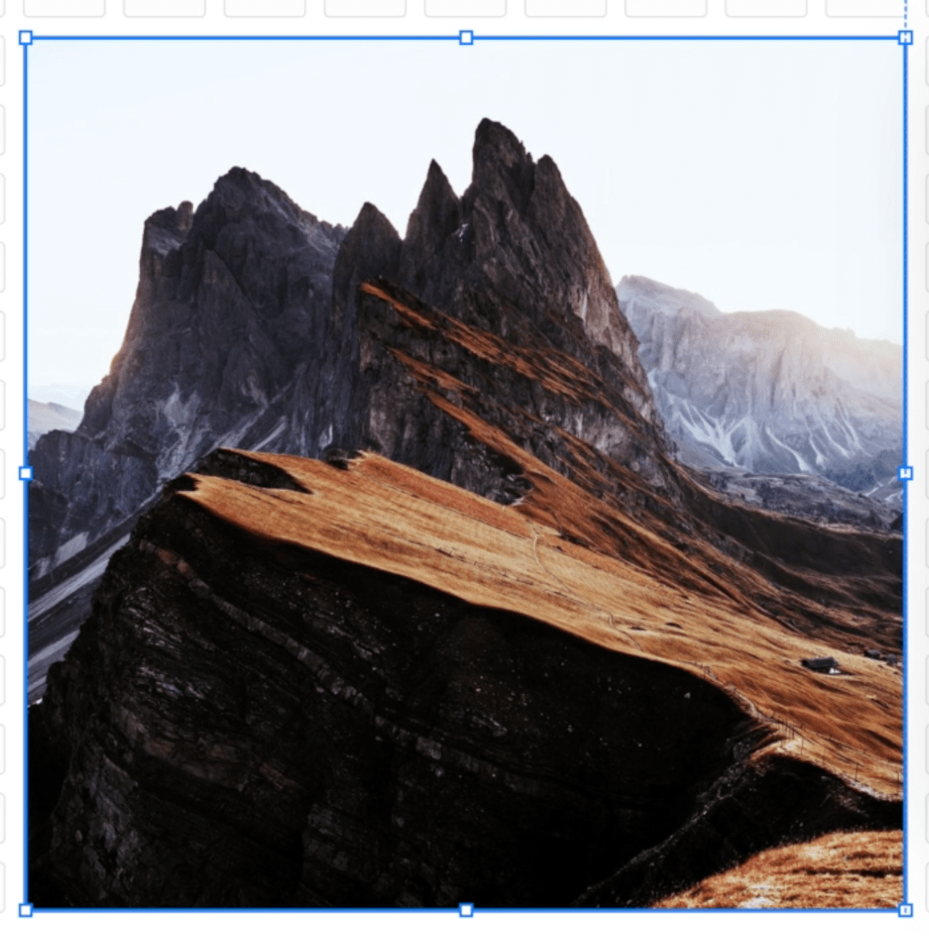
Essentially, FIT will leave your image in the same ratio as exactly how you uploaded it. FIT is not going to crop your image at all:
If you choose FILL, it's actually going to crop your image and stretch it to fit within the container that you've set:
Both of these options are quite essential:
FILL is great if you have an image that you don't mind being cropped, depending on how it's stretched, and if you really want to fill up a certain amount of space.
FIT is perfect if you have an image where you really want to display the whole thing, you don't want any part of it to be cropped, and it's going to retain that same size while the screen scales up and down.
There's also some other fun settings in here. You can add a corner radius and of course we have those shapes that we just touched on. There's a lot you can do with your images in this new Fluid Engine and even just those three settings, Fit, Fill, and Shape, are going to open up many fun things you can do with your design.
Button Block Settings
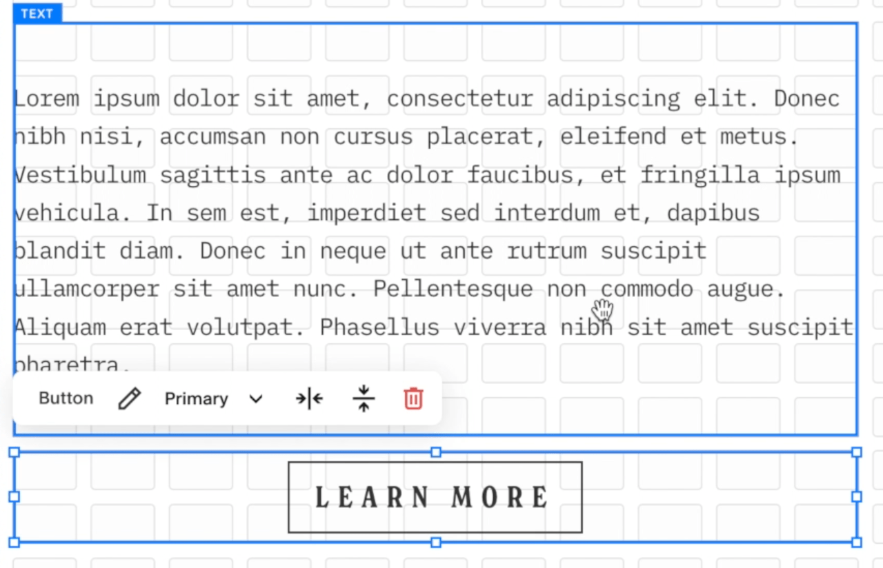
Similarly, Buttons now also have a FIT or FILL setting.
In the Button Settings, we have a content Section and we have a design tab.
For the content, this is just where you add your text and button link. You can link directly to a page around your site, an external website, a file to download, an email or even a phone number.
If we come over to the design tab, we're going to have three button options. These are the button options that you set up in your Site Styles under Button Settings: Primary, secondary, and tertiary.
If you haven't set those up yet, definitely go into the Design > Site Styles section of your site and set those up.
You’ll also see the FIT or FILL options in the design tab:
If we look at FIT, you can see that the button doesn't span the whole Block container and we can change the Alignment. It's sort of floating inside this container and it's holding its shape, much like how the image holds its original shape. When the button is set to FIT, the button will hold its original Shape and Padding – as set up in your Site Styles:
Alternatively, if you change your button settings to FILL, the button will now fill up whatever container you've set on the Grid. You can see that if we make the container bigger, the button will follow whatever shape we've set on the Grid:
Best Practices
The last few things we want to talk about is how to adjust the Blocks within the Grid and the best practices you can use for making sure that things look good on all screens.
This is something that is a little bit more advanced, but we think is quite important and might actually help you with any issues you're having with overlapping, Blocks running into each other and any other issues.
1 - Only pull graphic elements outside of the grid
Obviously with this Fluid Engine we have a lot of flexibility. We can overlap Blocks, we can move Blocks anywhere within the Grid, and while that's really fun, it can cause a few issues if you're not paying attention to what you're doing.
Our first best practice tip would be to only pull images or graphics outside of the grid container.
You have your set Grid width, but you can actually pull things beyond that width. Things that you pull all the way out to the edge of your screen will stay fixed to the edge of your screen no matter how wide your screen gets:
If you are going to be dragging anything to the edge of the screen, you want to be very intentional about what that is. And, again, we would only really recommend doing it with images.
If you do it with text, you’re not going to have any space down the side to read the text and it’s not going to be easy to read! So we would recommend keeping elements that need to be readable or usable, and aren't just design features, within that set Grid and not pulling them all the way out to the edge of the screen past the grid.
2 - Intentional overlapping
The next thing that we want you to be conscious of is overlapping Blocks intentionally. As we talked about earlier, we can now overlap Blocks (very exciting!).
Where things can get a little bit tricky is when you're overlapping things unintentionally or accidentally. We talked about earlier how every Block has its own container and how these containers can span basically to wherever you want to drag them.
But just know that if something is within a container, depending on the screen size, it will move anywhere within that set container.
Example:
If we click out of the containers, the text and the button technically aren't touching or overlapping. But if we hover over these elements, you can see that the text container goes all the way below the button. And the button container goes up into the text Block. The containers are overlapping.
If we adjust the screen size, we’ll eventually see that there's some overlap here that we weren’t intending on and that doesn't look very good:
To avoid that unintentional overlap, just make sure that you haven't overlapped containers unless you've specifically meant to. This means dragging the Block Containers into their own Grid space so you can see there is no overlap of the containers:
3 - Tidy up extra Block and Section spacing
You’ll probably also notice a lot when you are designing and moving things around here in the Fluid Engine that particularly with Text Blocks and also just the size of your Section, these will change and adjust as you're editing and you might need to come back and trim things up.
We find very often that when we're editing in Sections, the Rows will just keep adding themselves and the section will get bigger and bigger.
And the same thing often happens with the Text Block. There is often a lot of white/dead space in a text block that gets added.
When you're happy with the positioning of your elements, just make sure you grab the bottom of your Text Block container and drag it right up so it’s nice and flush. This will also ensure those containers aren't overlapping.
And then the same thing again, with your rows at the bottom, you can either click and drag your section rows up, or you can open your Section Settings and reduce your row count in the panel.
Those are just two things to keep an eye out for that we've noticed happening quite a lot when we've been designing within this Fluid Engine.
Mobile Editing in Fluid Engine
It's very important to mention with Squarespace 7.1 Fluid Engine, the mobile editing experience is completely separate. We are going to record a separate video on mobile editing where we dive a bit deeper into that, and post it here when it’s ready.
But if you are editing right now and you just want to jump into it, do know that if you click on the mobile view, you're going to see your Section and you can essentially edit it just as you would your desktop section.
Right now it will look very different from what you have on your desktop design.
It's a completely separate editing experience, which is very exciting and means you can completely redo your mobile site with a totally custom mobile design. Although you don't have to, you can just keep it simple if you want, but it's very exciting because we have tons more design options:
We wanted to mention that at the end of this post, because we don't want you to think you're just done when you're finished with the desktop Section – you always need to be checking your mobile site, and you may need to slightly rearrange things on mobile too!
What do you think?
Let us know how you're getting on with Fluid Engine! We know a lot of people were very reluctant about it in the first place, but hopefully you've had a bit more time to play around. Especially if you're coming over from Classic Editor, maybe now you realize it's actually not that much different!
A lot of the stuff is still the same, and some of that newer stuff is actually really beneficial.
If you have any complaints or problems with Fluid Engine, please reach out to Squarespace support directly because they actually track those support tickets and submitting them is actually going to help us make this platform even better for everyone.
Fluid Engine Squarespace Templates
We do think it's important to mention too, that if you don't want to start from scratch with Fluid Engine and you're struggling figuring out how to create a great layout, all of our Squarespace 7.1 templates have all been adapted to Fluid Engine!
Not only do they come with a beautiful design to start with so that you don't have to start from scratch, but they also come with our full Fluid engine tutorials. We've recorded hours of tutorials on Fluid Engine, so if you really want to learn Squarespace and Fluid Engine quickly, and get a site up quickly without having to do it all from scratch, definitely check out our templates!
If you liked this post, Pin it to Pinterest! 👇🏻
